
DIA SA/NT 2017 Branding
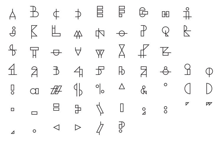
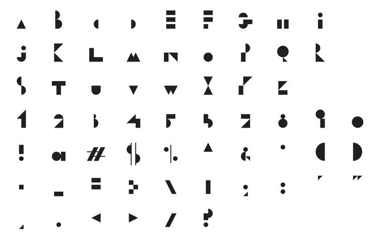
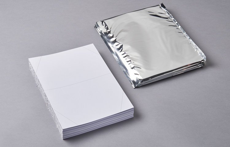
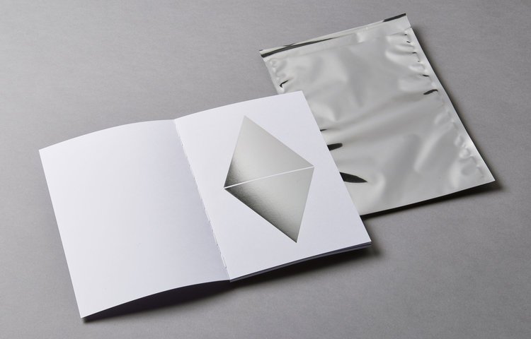
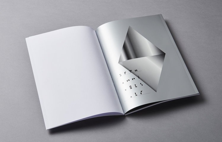
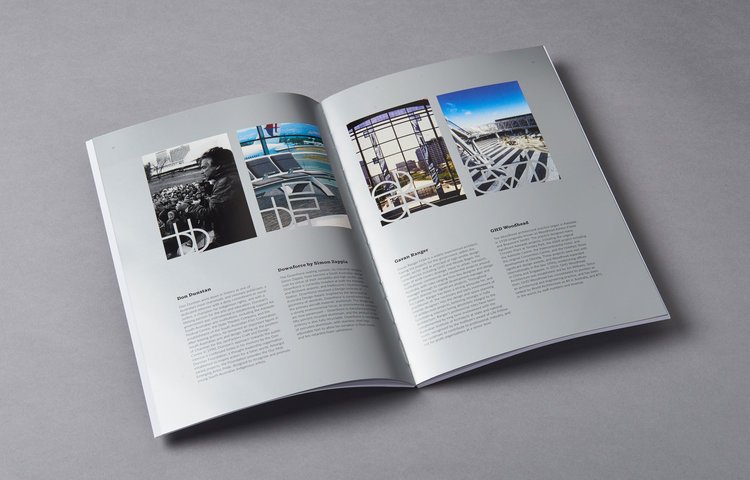
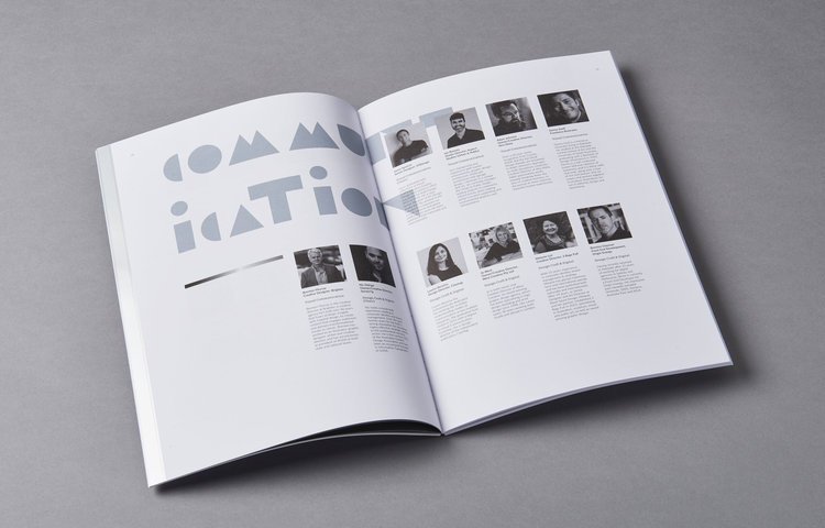
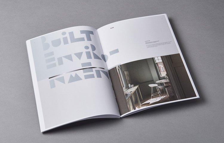
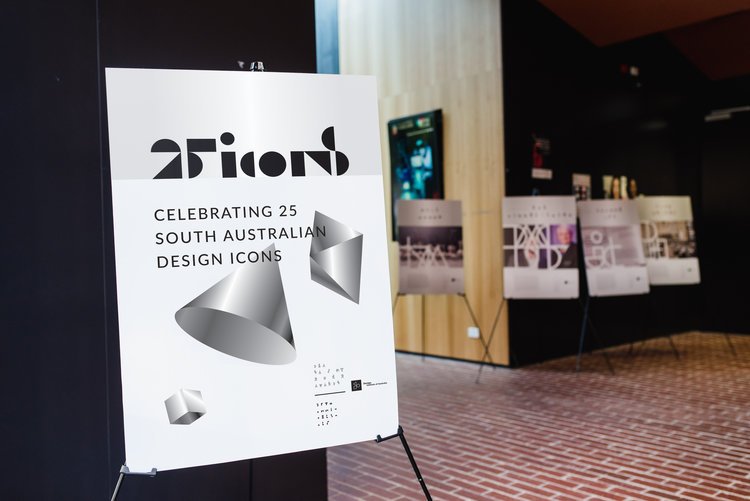
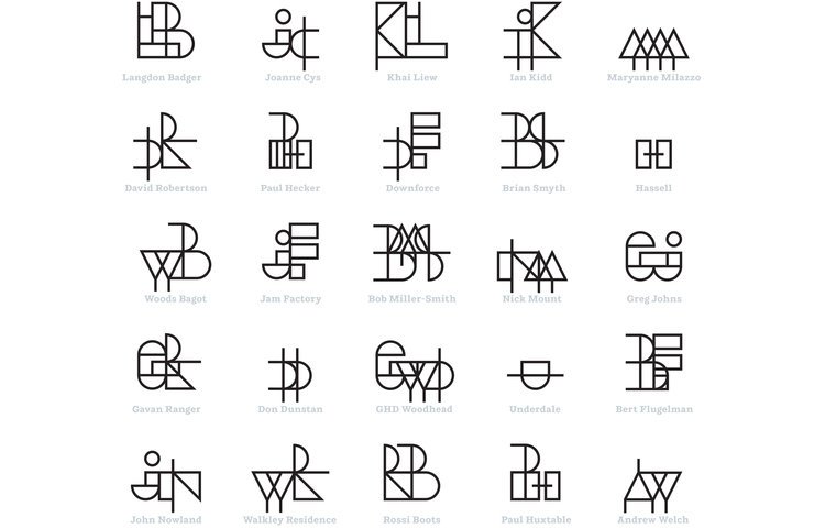
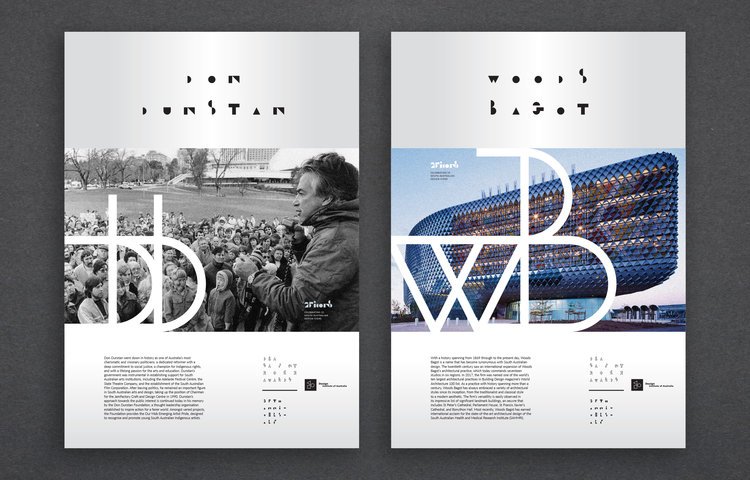
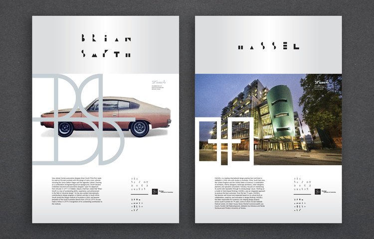
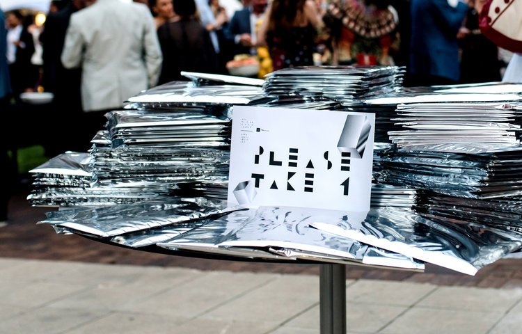
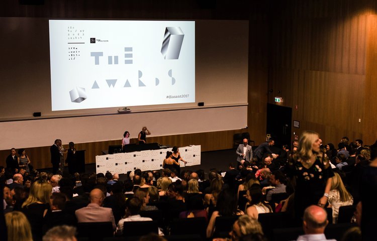
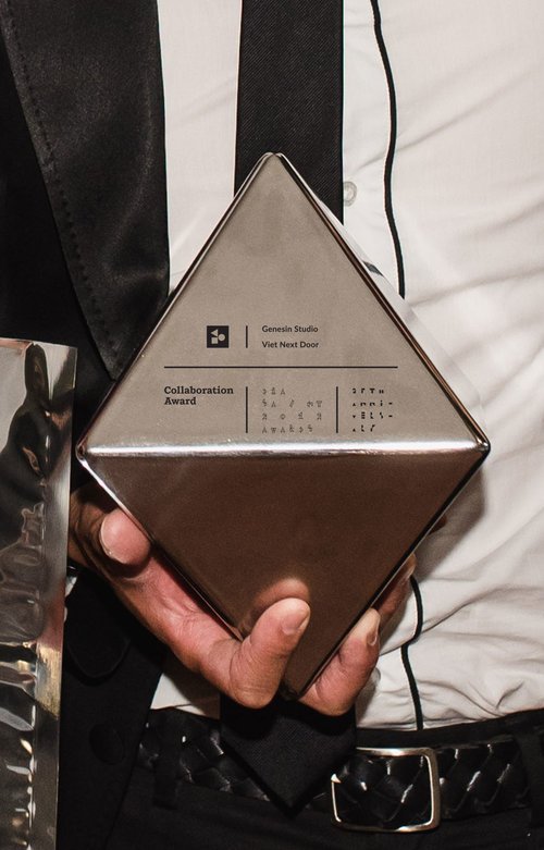
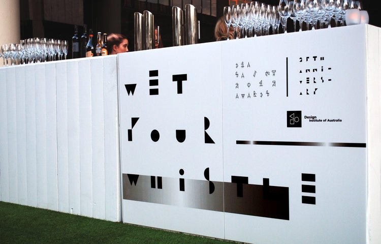
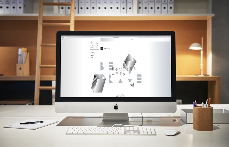
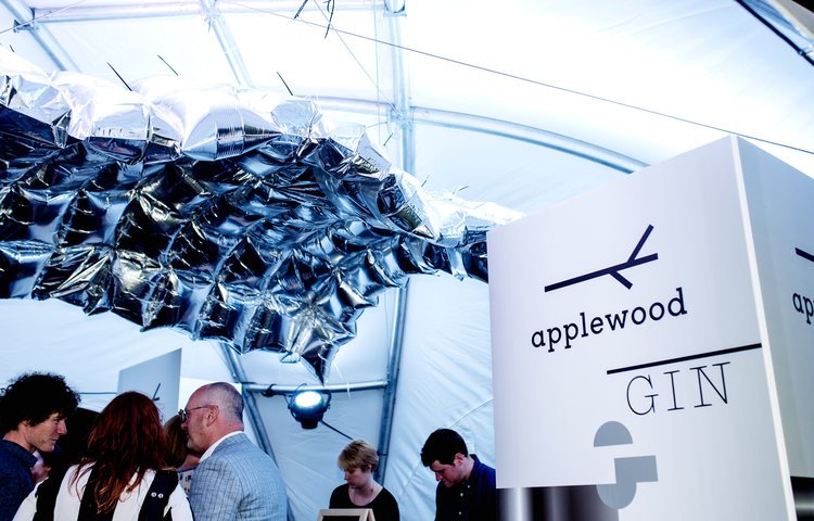
As part of the organising committee Enoki developed the branding for the DIA SA/NT Awards 2017. The year was auspicious as it was the 25th anniversary of the SA/NT Awards Program. Silver was selected as the connecting colour across multiple applications. Blow up silver bladders were used at the Awards night, the Awards book celebrating all entrants and 25 design icons was delivered in a silver envelope, and the Awards trophies were silver diamond prisms. A unique typeface was developed to form part of the identity. The idea of silver prisms of all kinds floating in a pristine environment became the graphic underlay used to communicate the different design disciplines of built environment, communication and product.
Photographer: Evolved Images and Meaghan Cole Photography
Award: Silver – Communication, 2017 DIA SA/NT Awards
Bird in Hand Rebrand
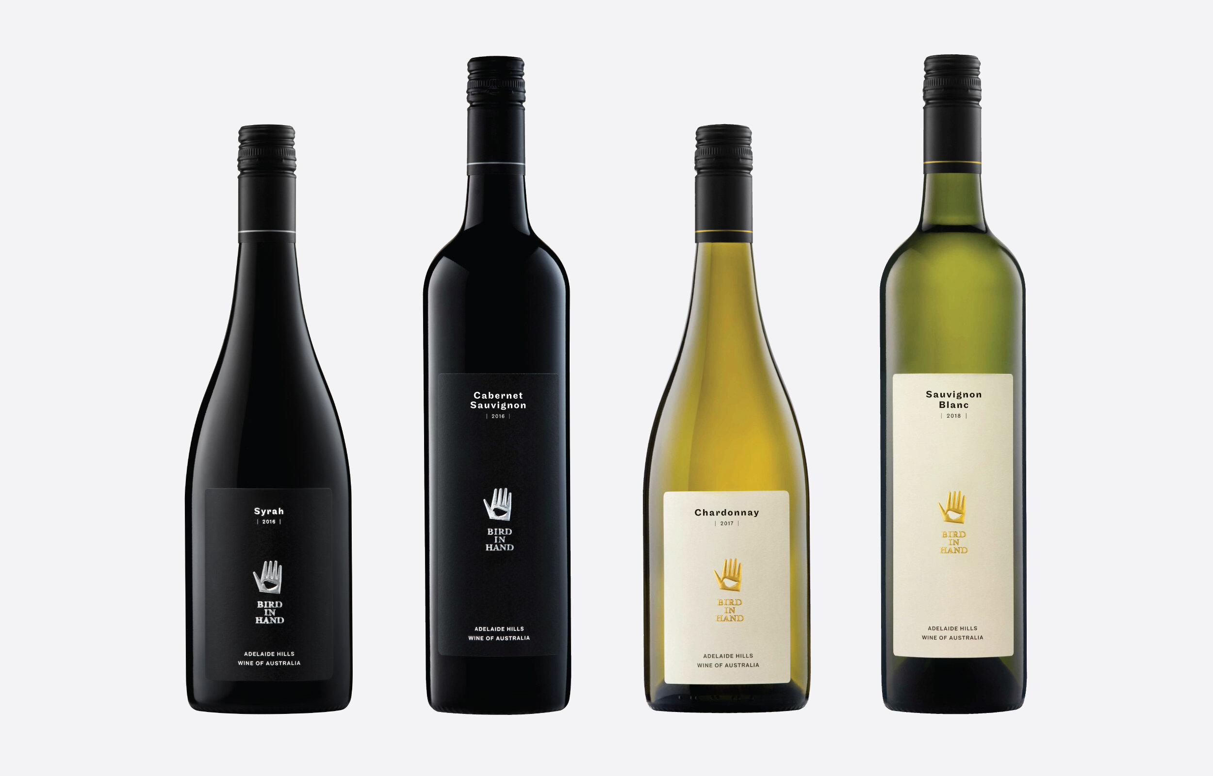
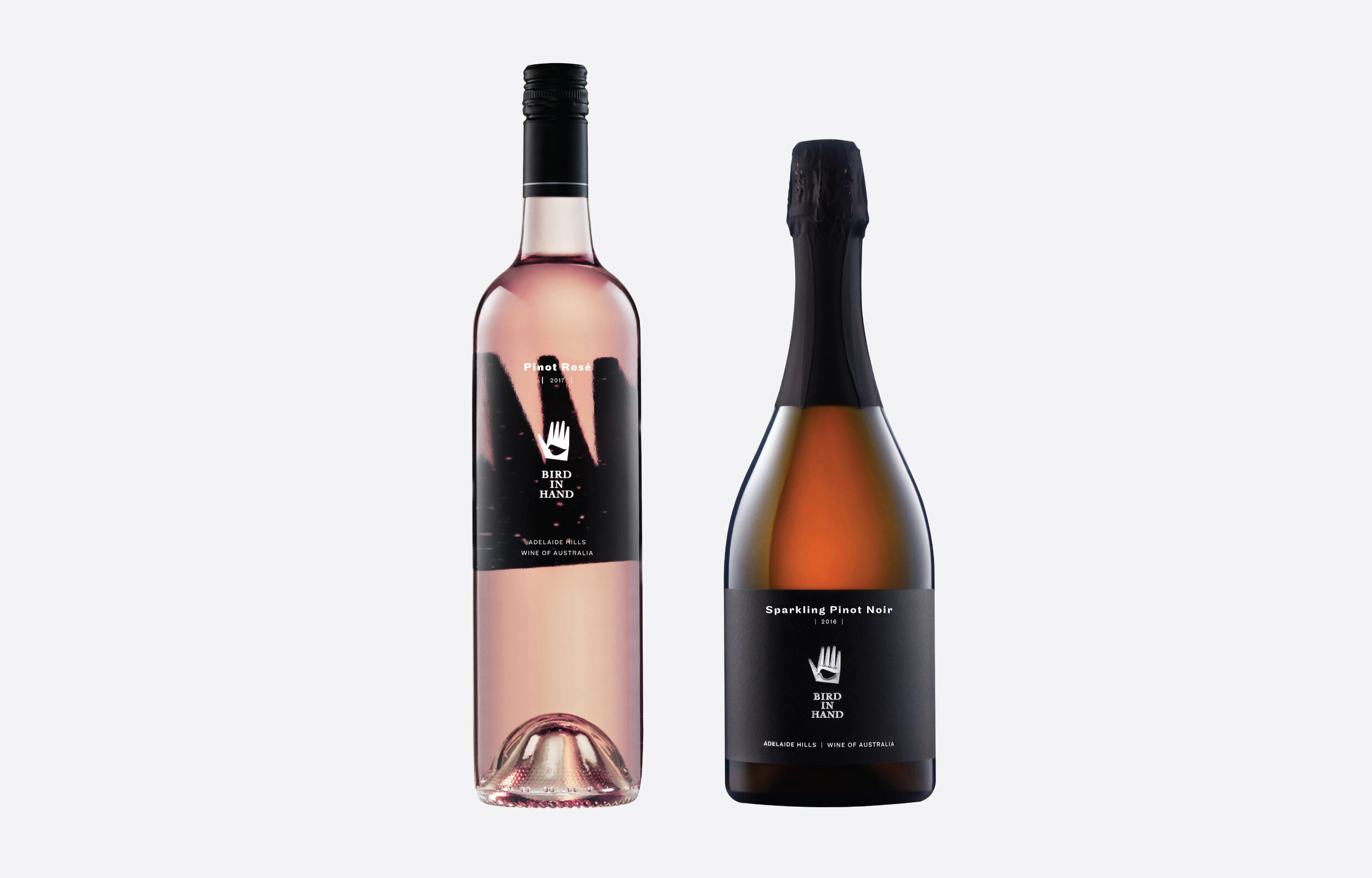
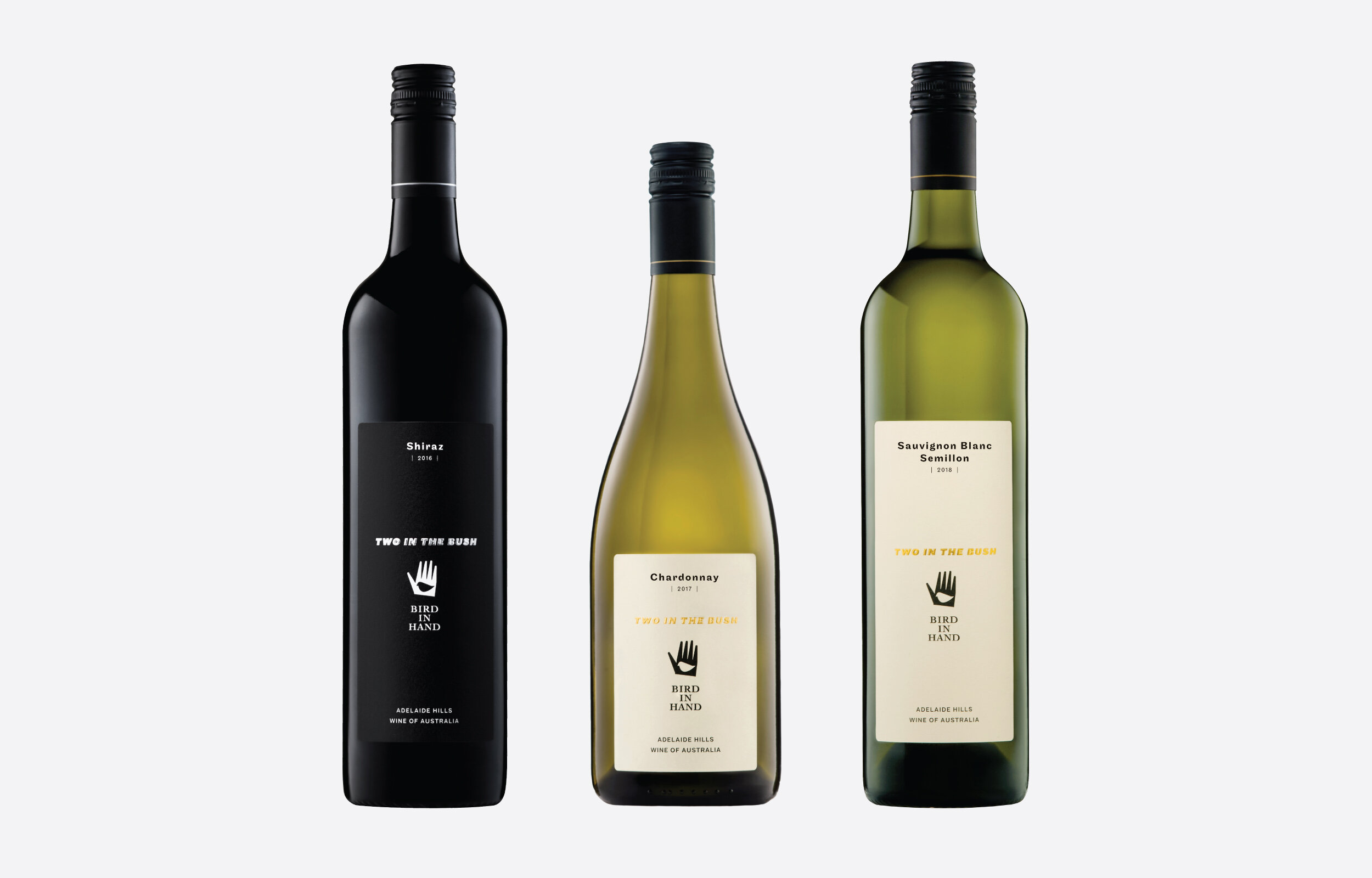
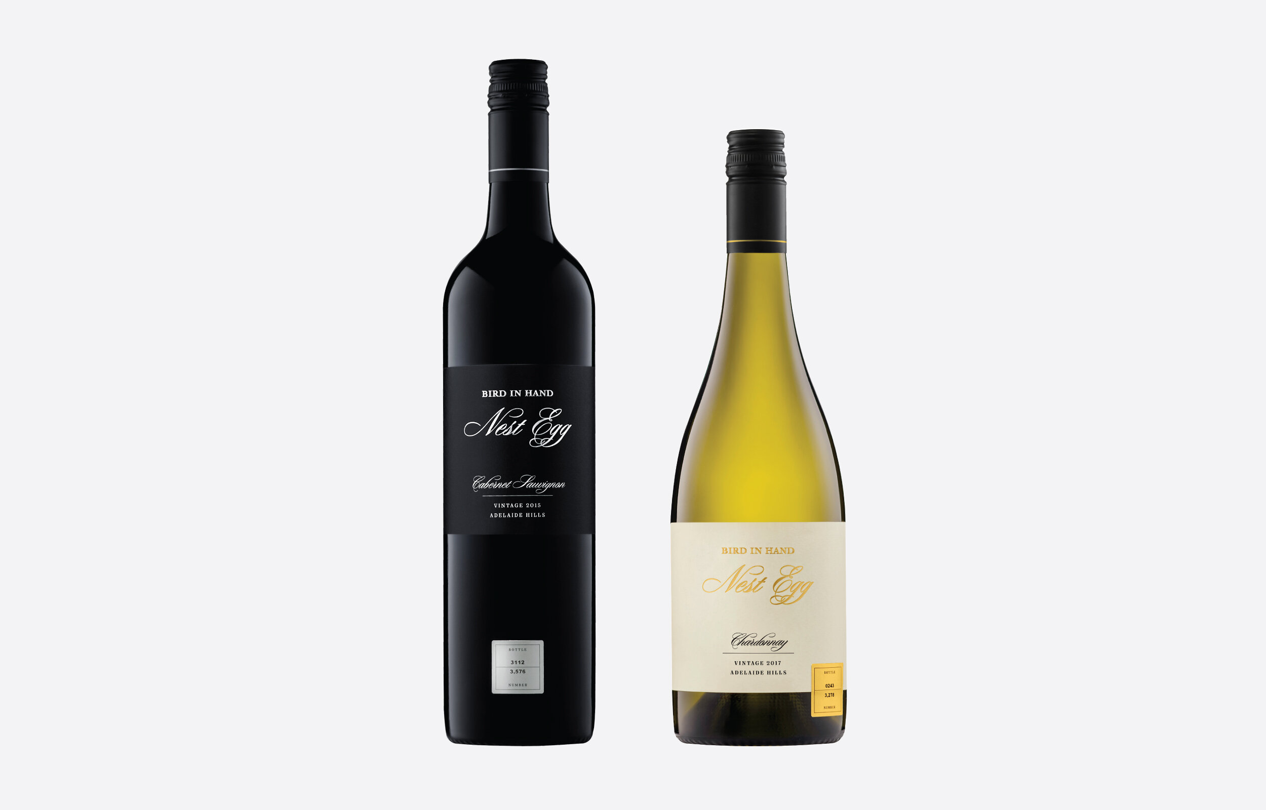
The Bird in Hand rebrand was undertaken with a sympathetic eye on the past. Enoki created a brand that is immediately recognisable as Bird in Hand with more clean and sophisticated characteristics. The main objective for the new labels was to create a ’super family’ that allowed all bottles from the different ranges to sit on the shelf side by side. The labels display subtle hierarchy throughout the ranges while focusing strongly on the brand.
Channel 9
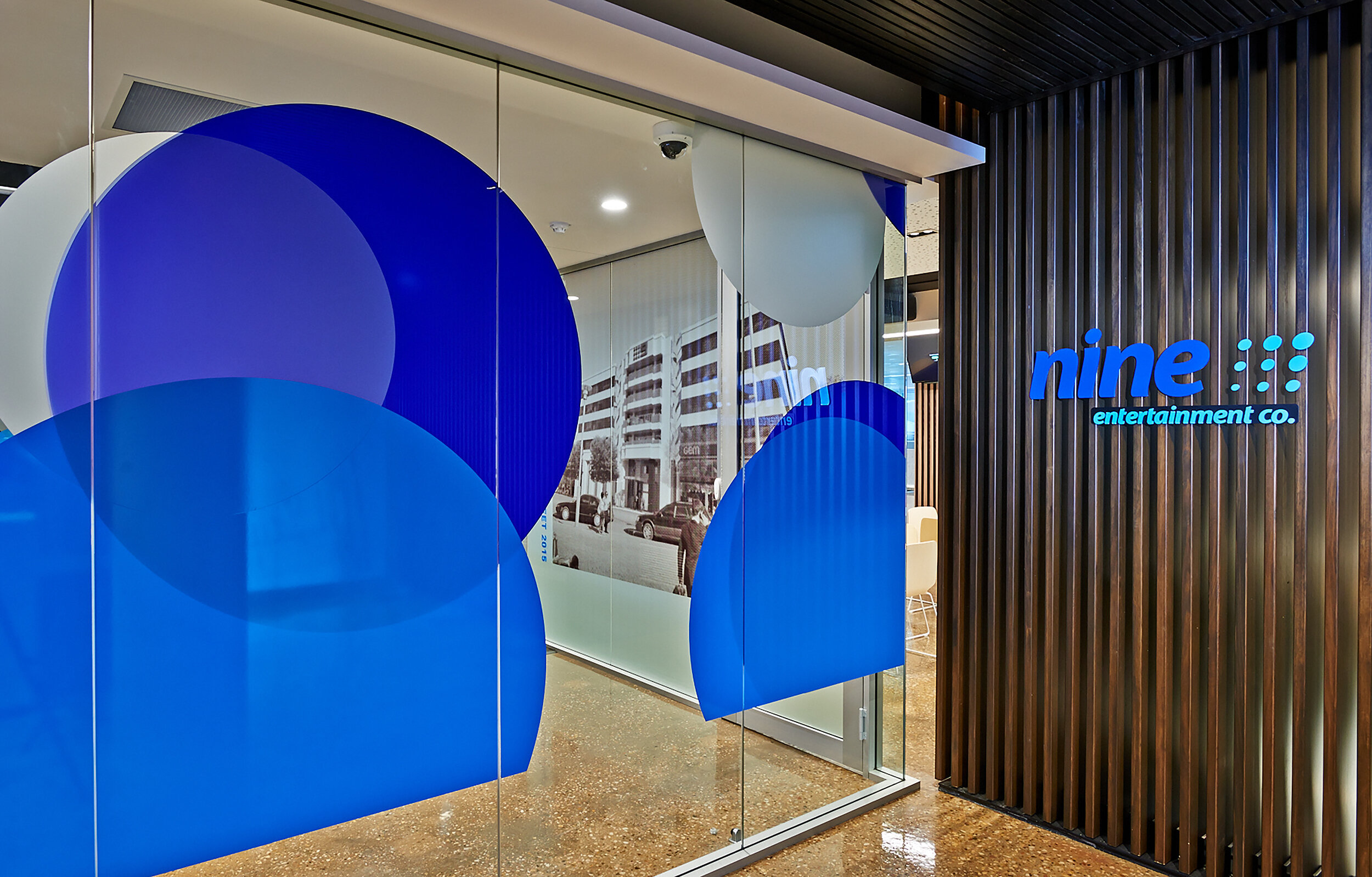
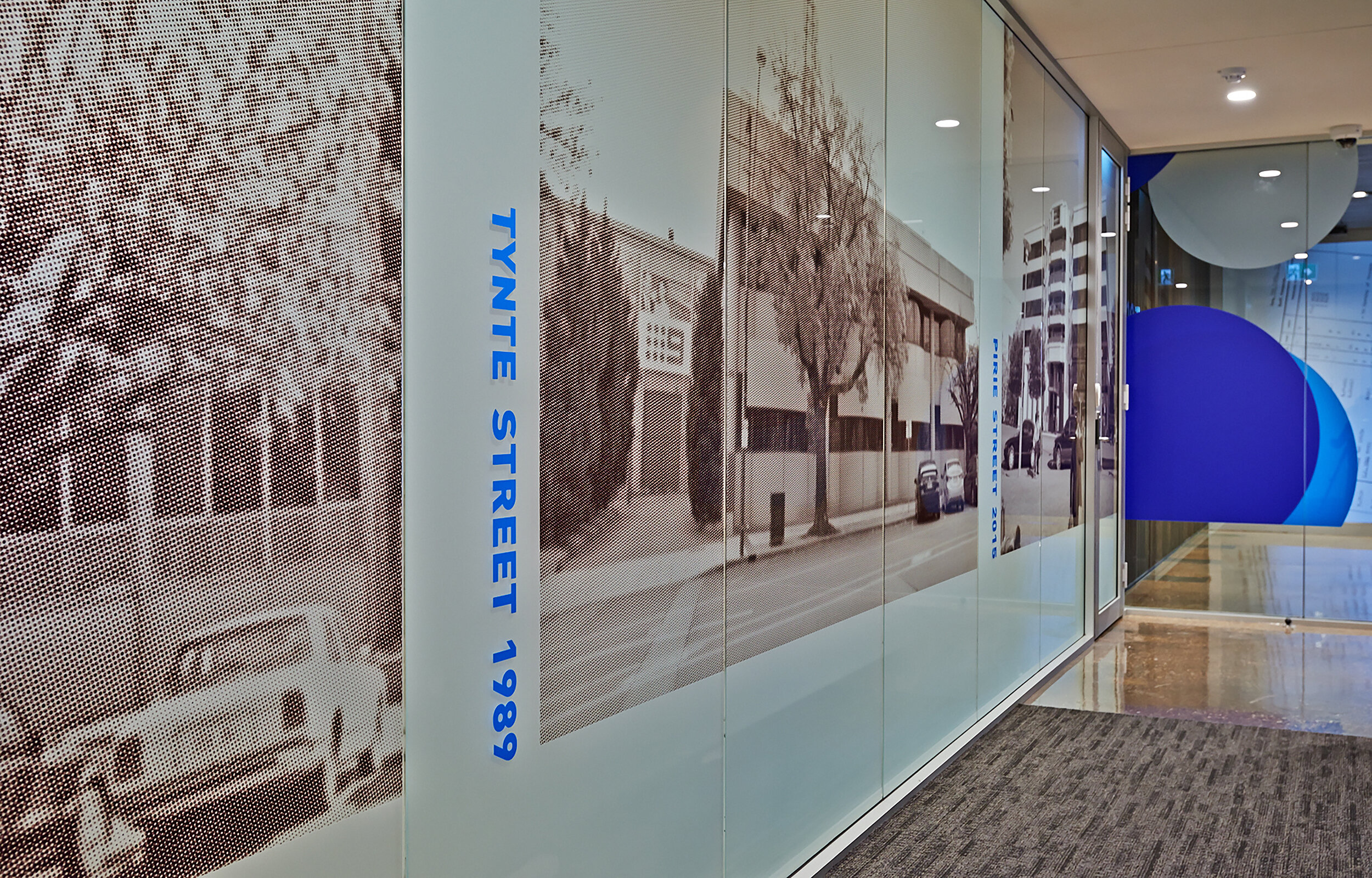
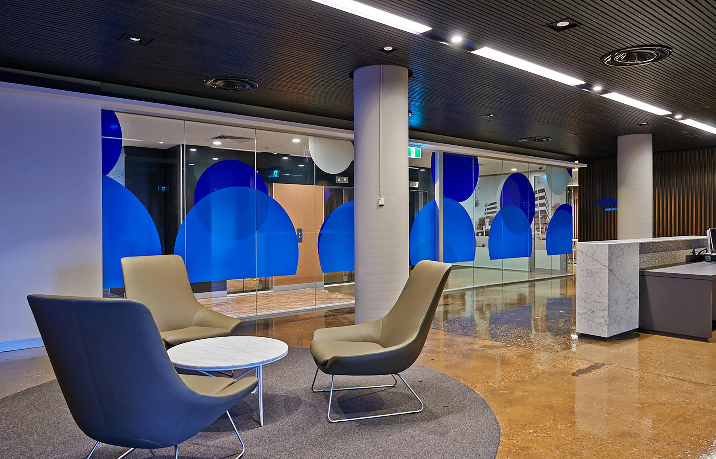
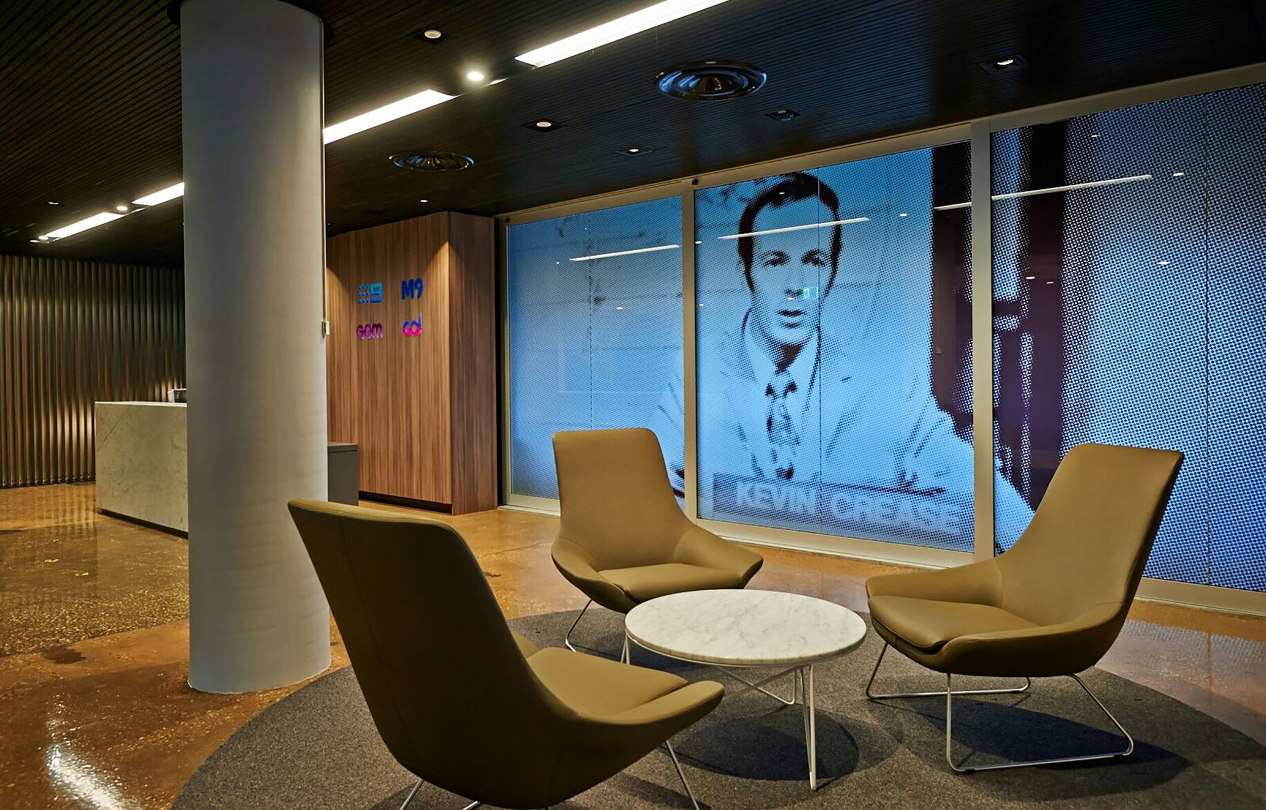
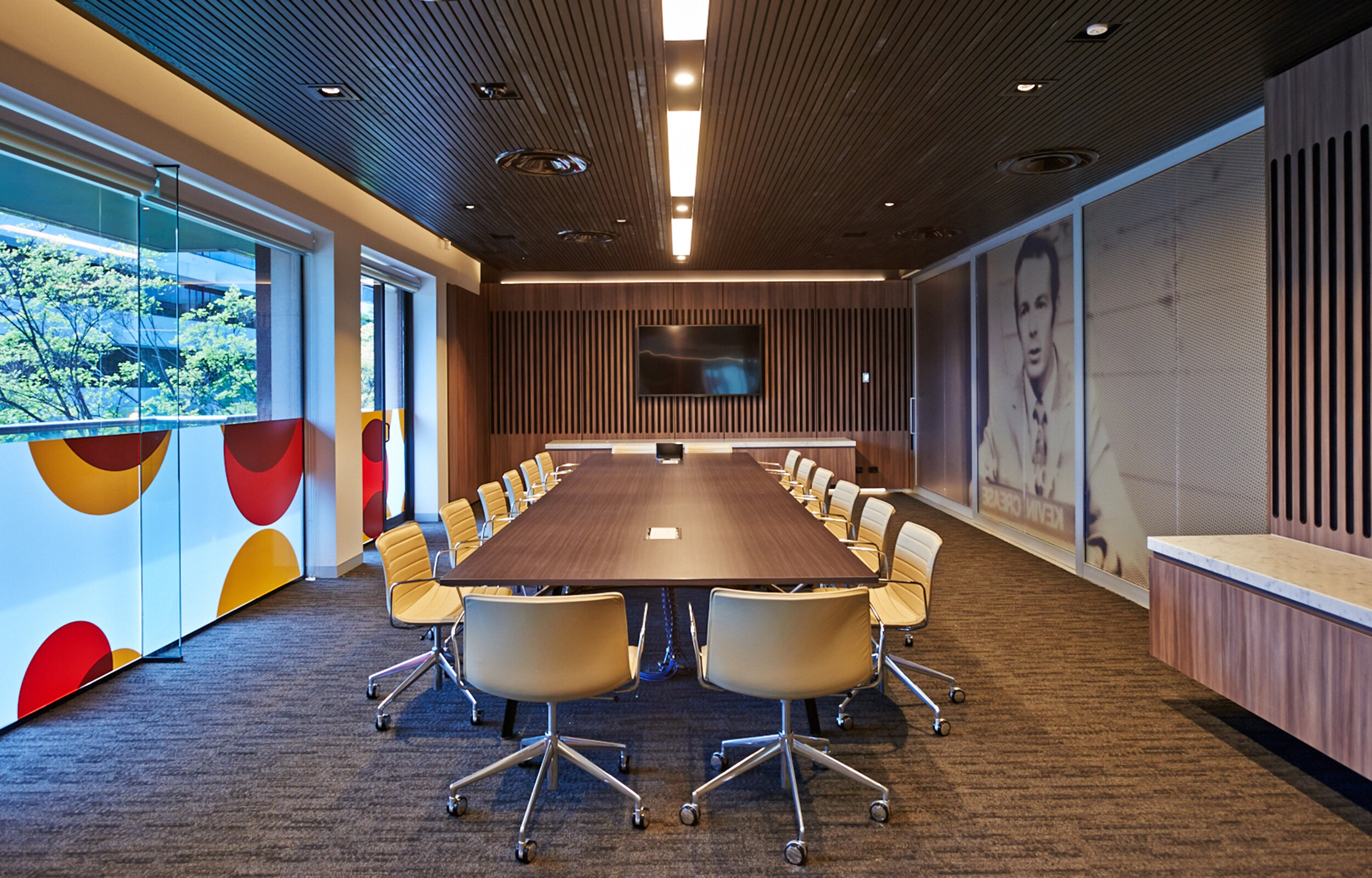
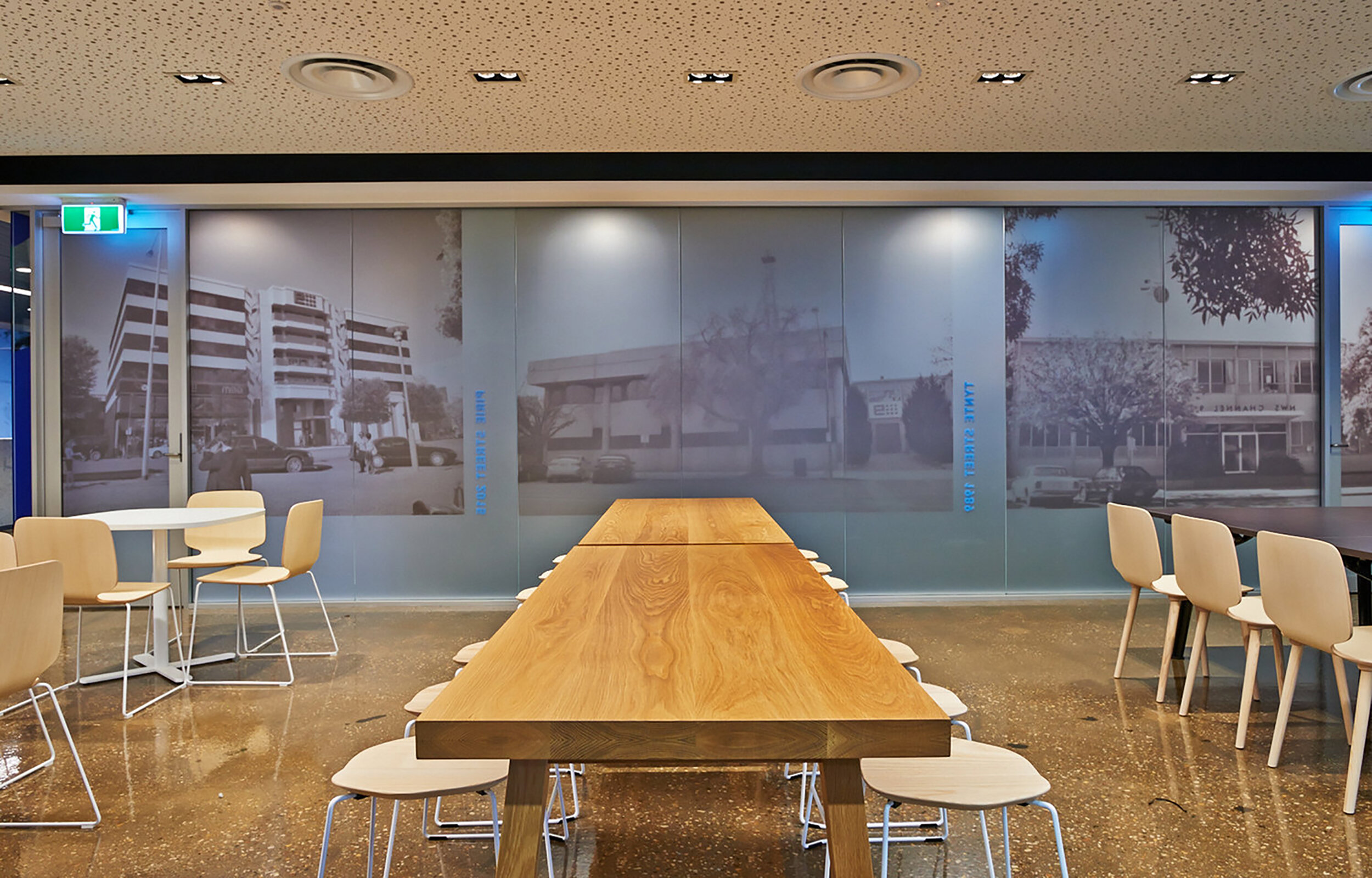
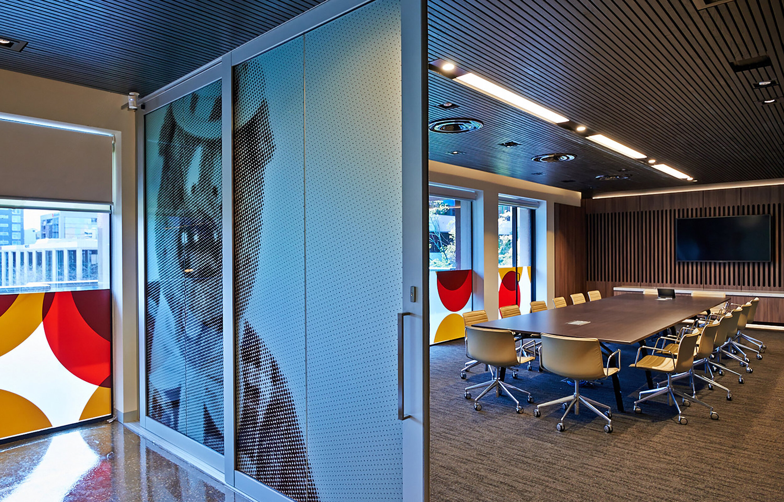
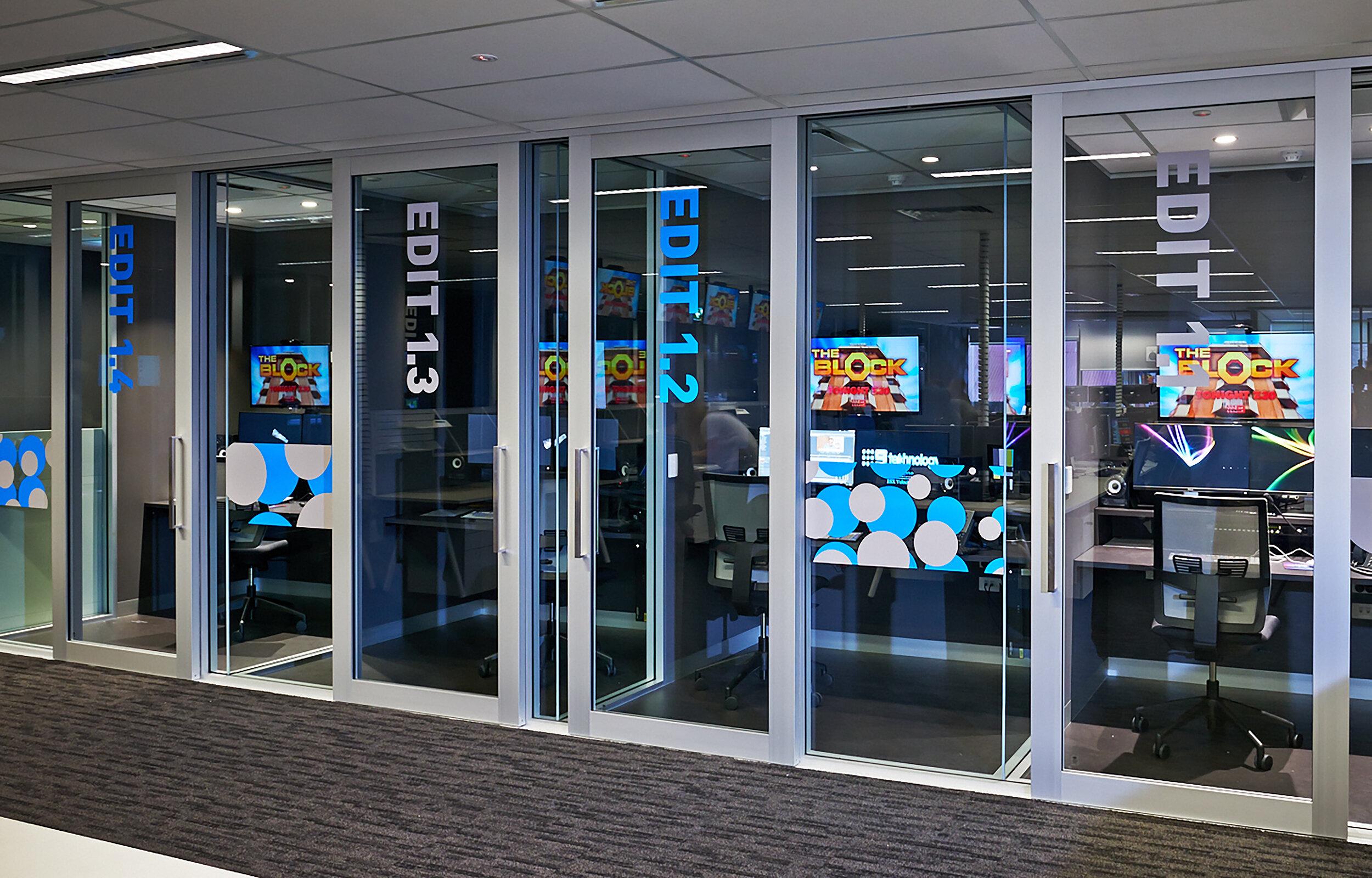
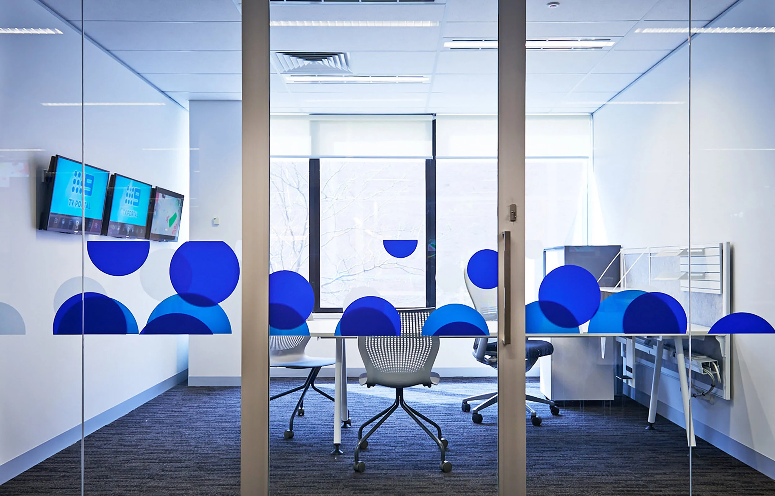
Photographer: Evolved Images
Bodycentric

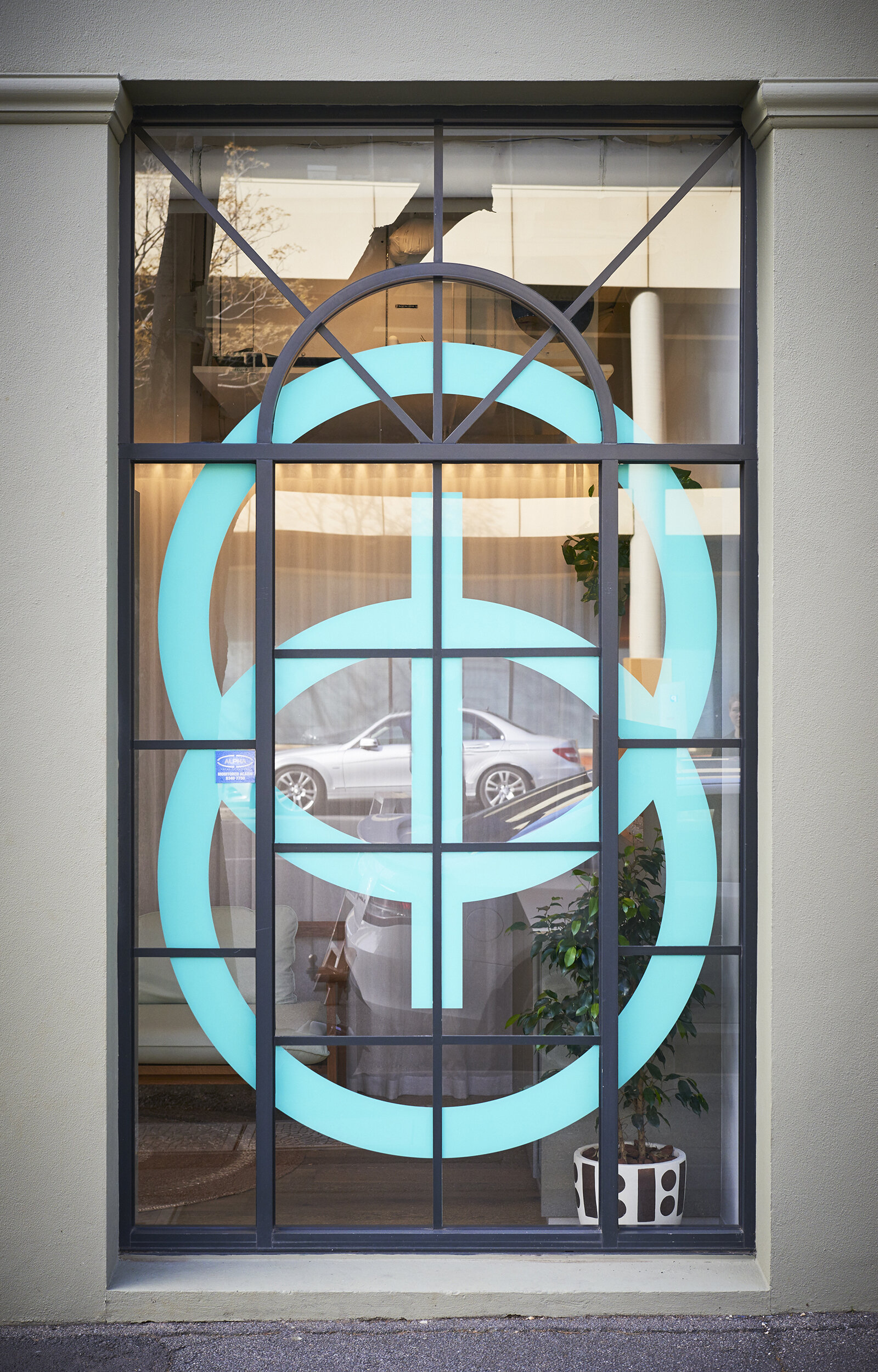
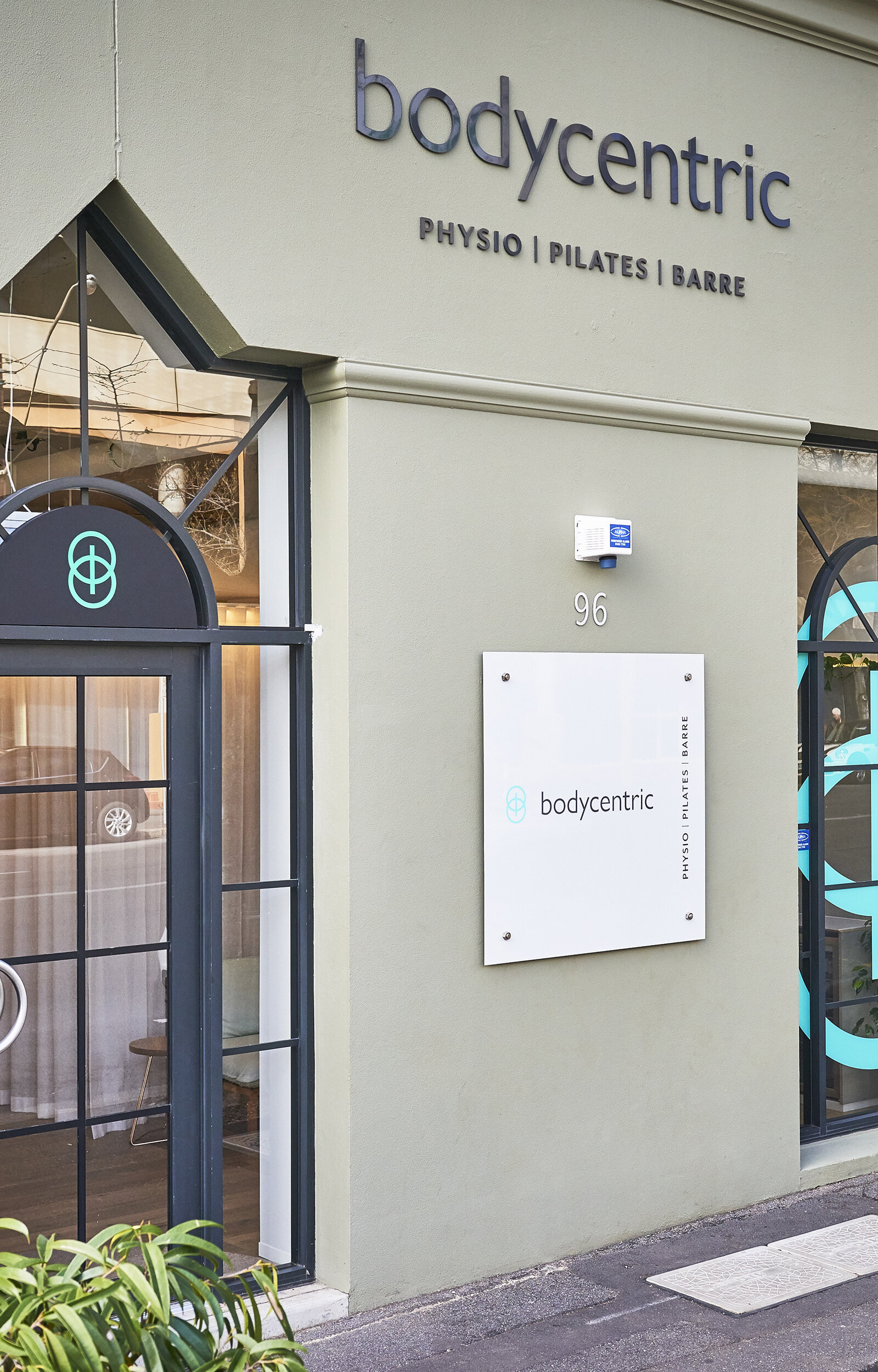
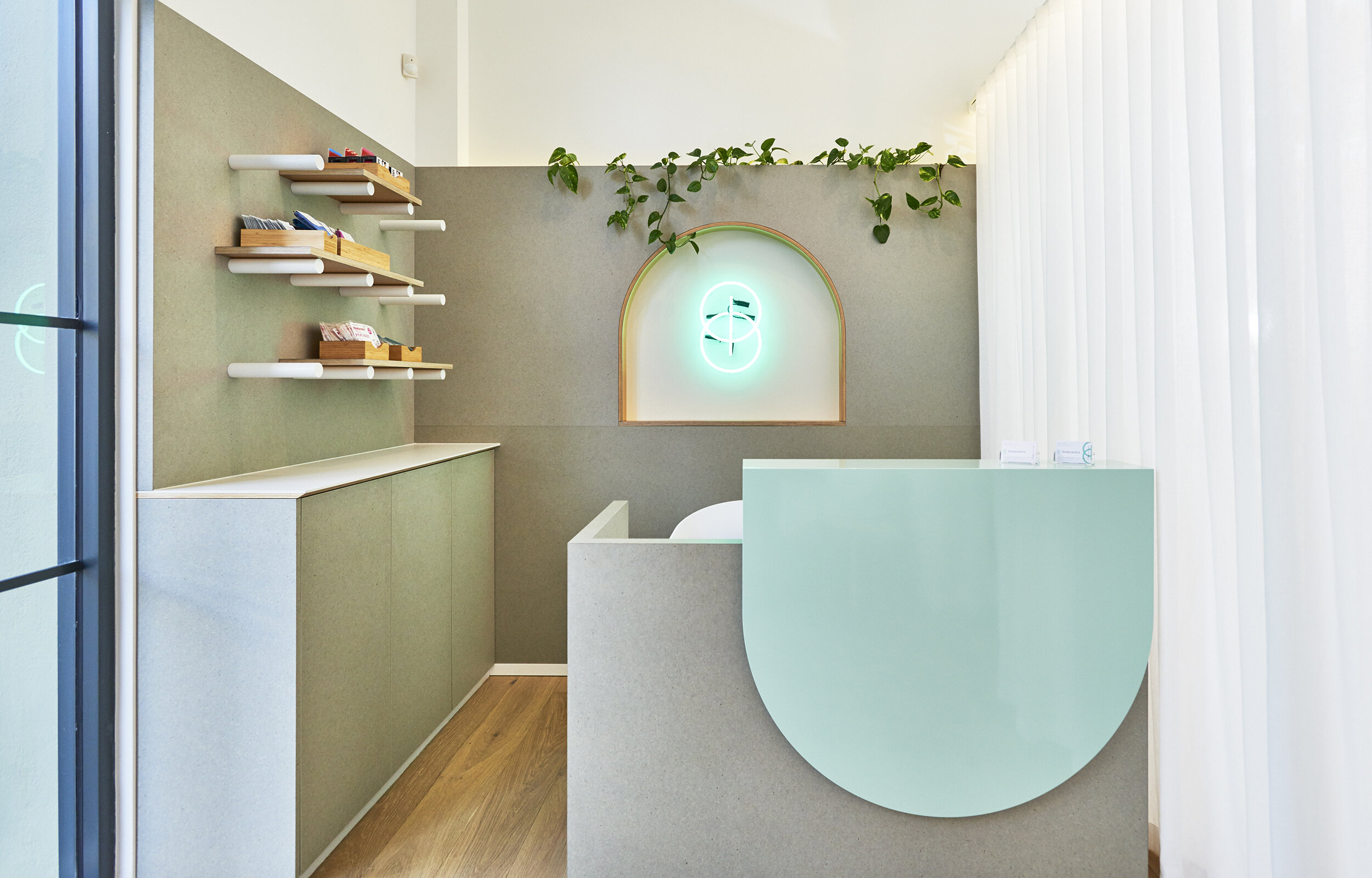
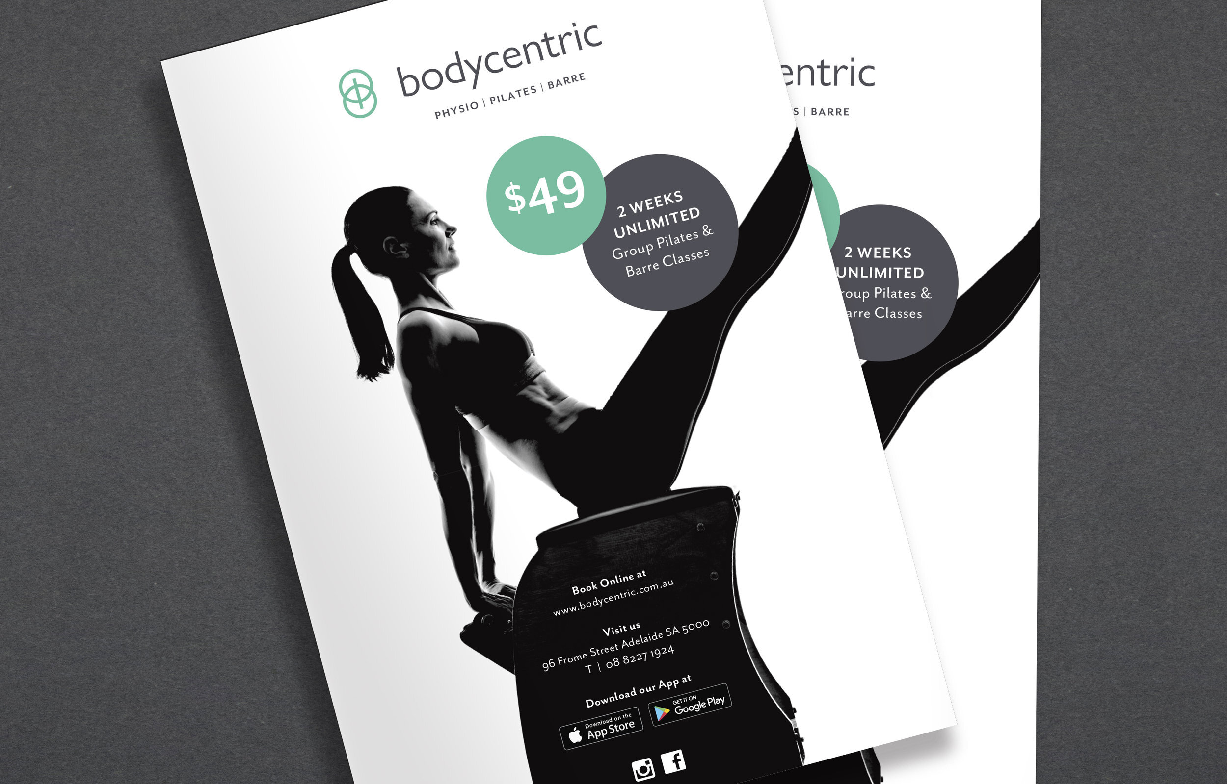
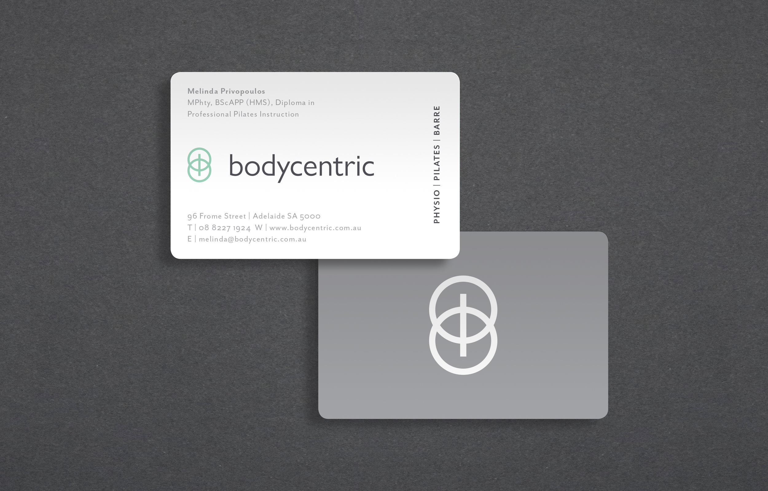
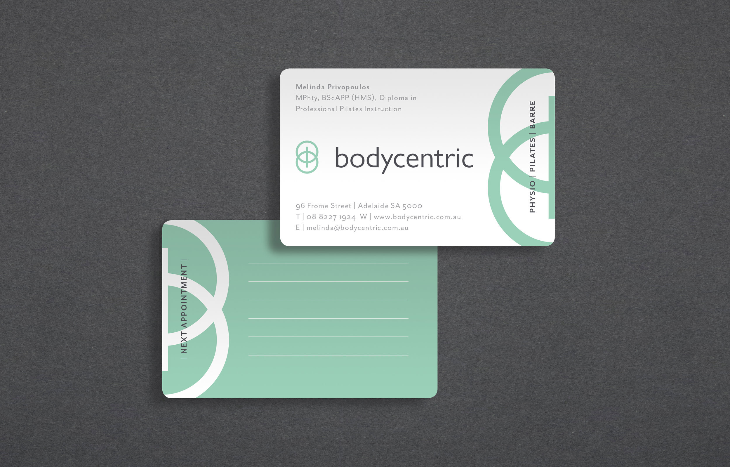
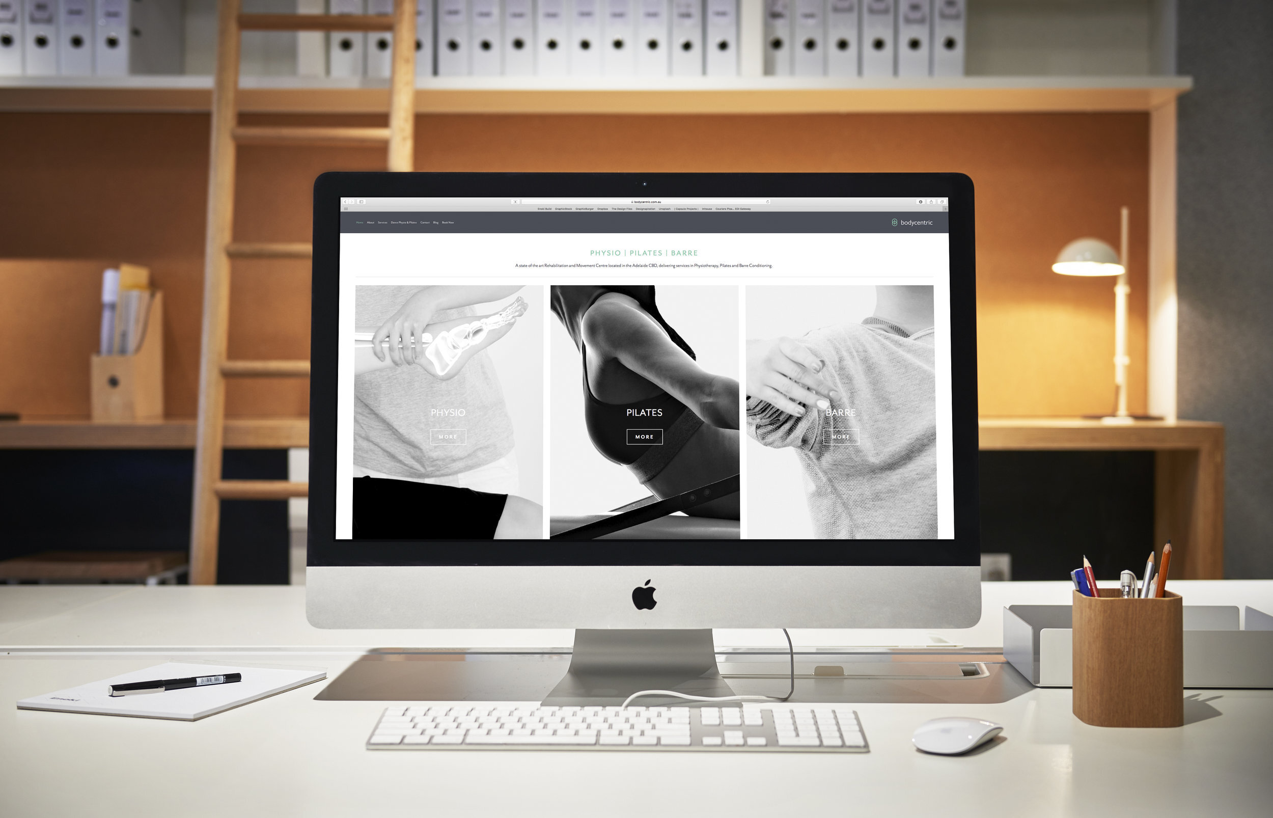

Photographer: Evolved Images
Pasta Deli Norwood
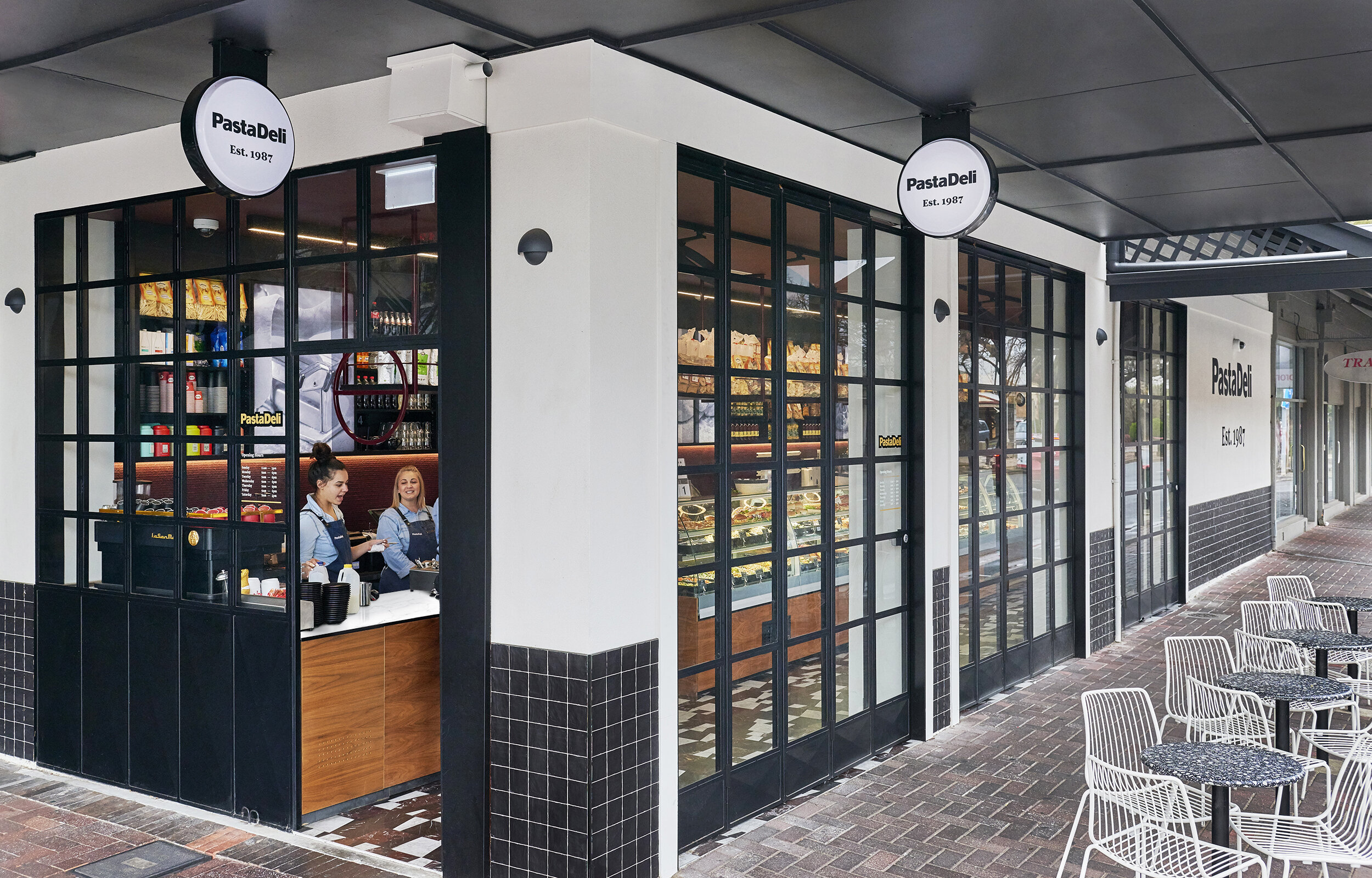
Pasta Deli engaged Enoki to design the environmental graphics for their new store on the Norwood Parade. Using the existing graphic language developed and used in both the Burnside and Glynde stores, Enoki applied backlit imagery to rear wall shelving, a super-graphic to the cool room wall, a menu board for coffee and drink offers, and exterior naming signage.
Photographer: Evolved Images
Dirptado
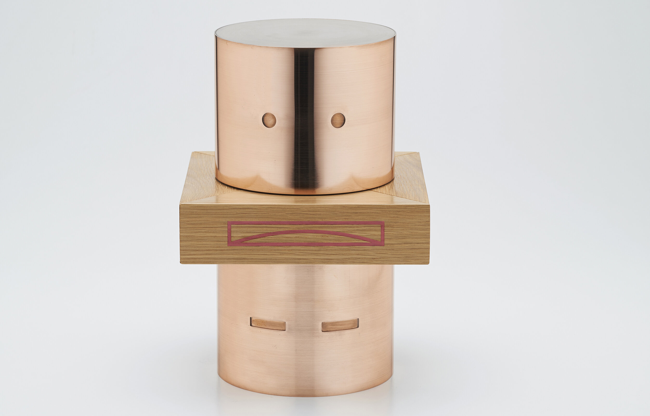
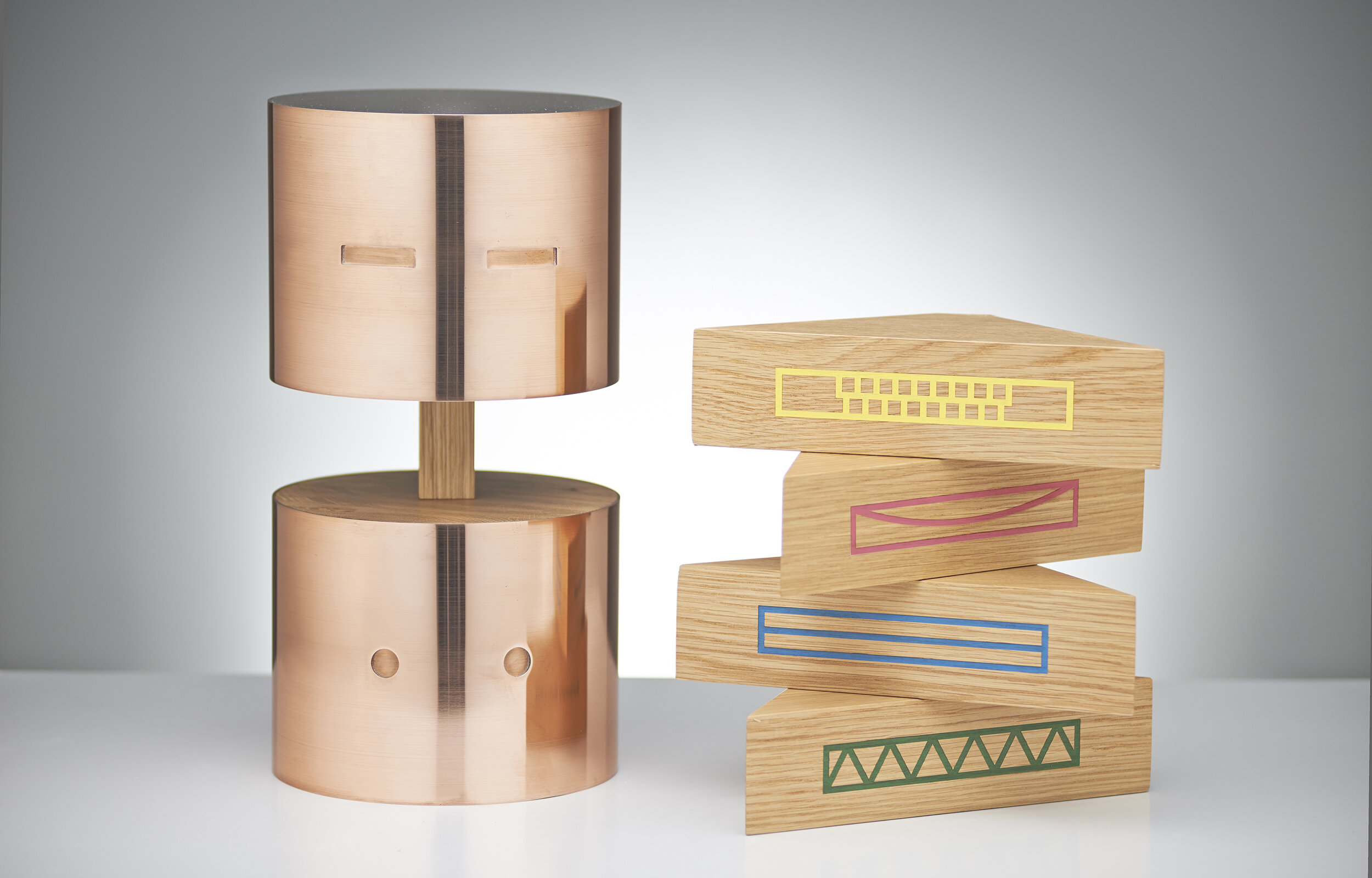
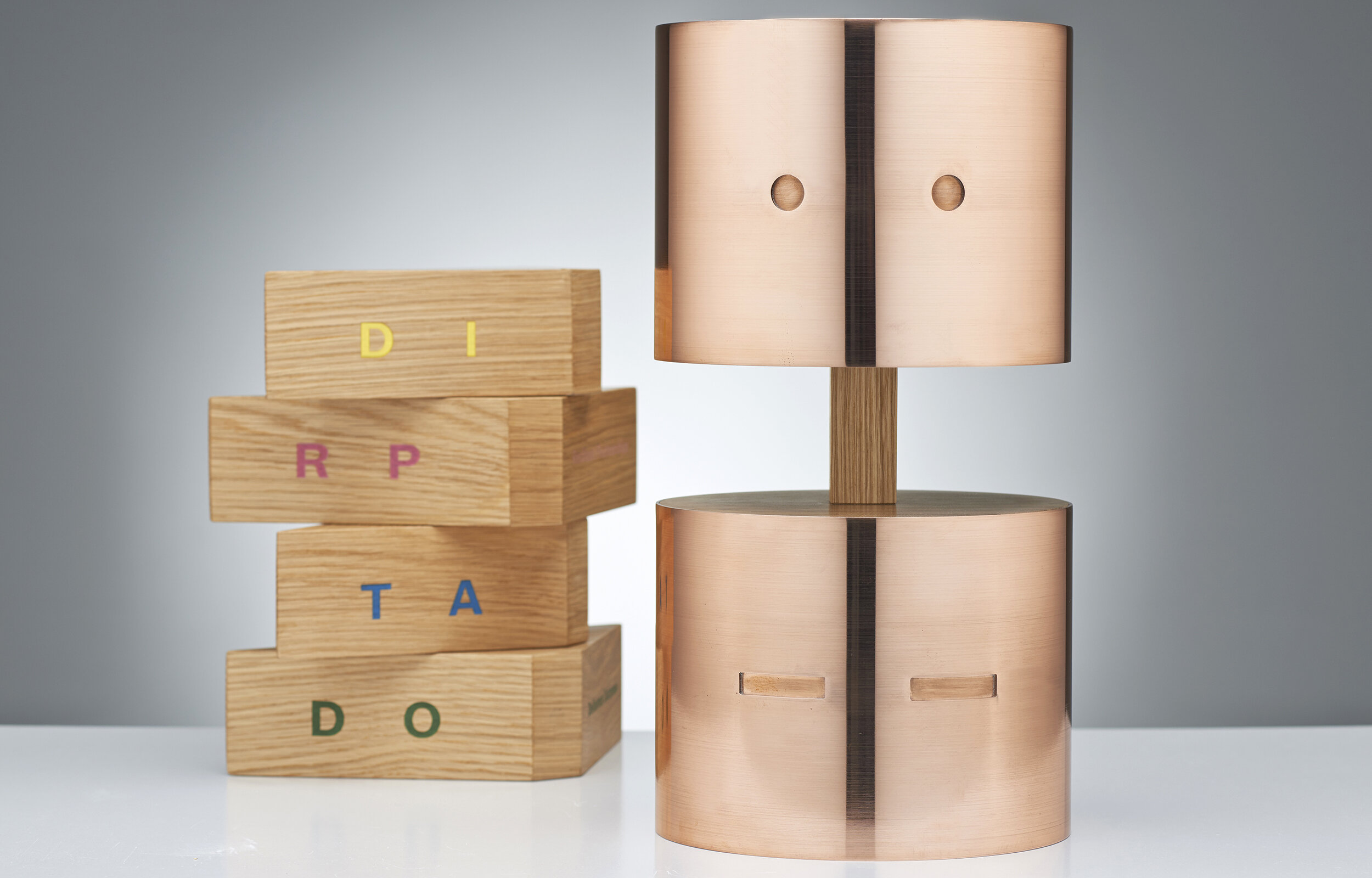
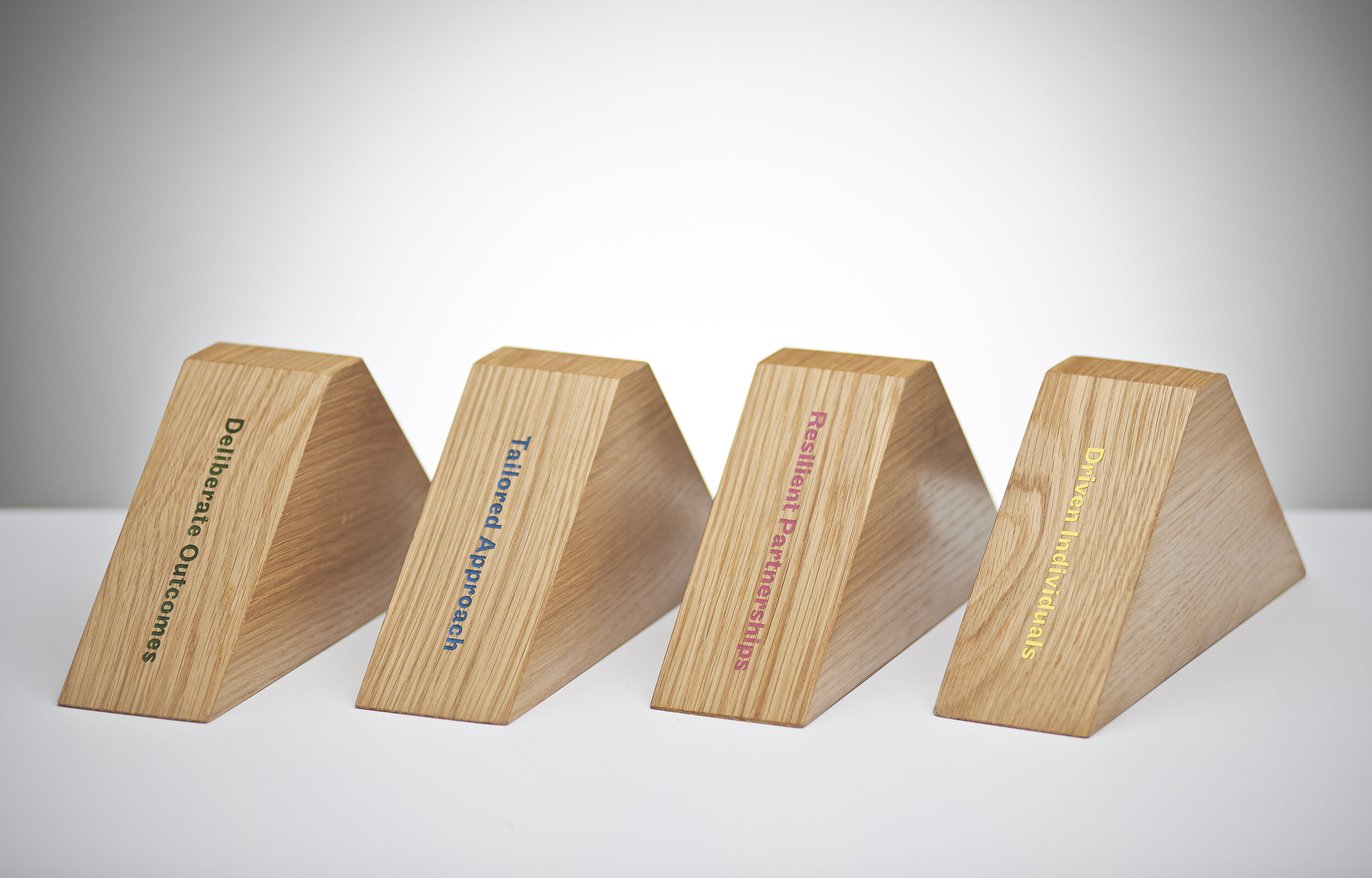

Enoki were approached by Leedwell Property looking for something to represent their company's core values. These were DI: Driven Individuals, RP: Resilient Partnerships, TA: Tailored Approach, and DO: Deliberate Outcomes. There was no limit to what form it might take except that it needed to be light enough to carry to the bar down the road, or to bring along to a work function. From this exciting brief DIRPTADO was born. Dirptado is made up of four solid timber 'mouth' pieces, each representing a core value and two different copper 'heads' which speak of partnerships and give DIRPTADO a personality of his own. The final piece was handcrafted by the Jam factory and has been embraced wholly by the staff at Leedwell.
Photographer: Evolved Images
Award: Silver, The Laminex Group DIA SA Awards 2014
Pickle in the Middle
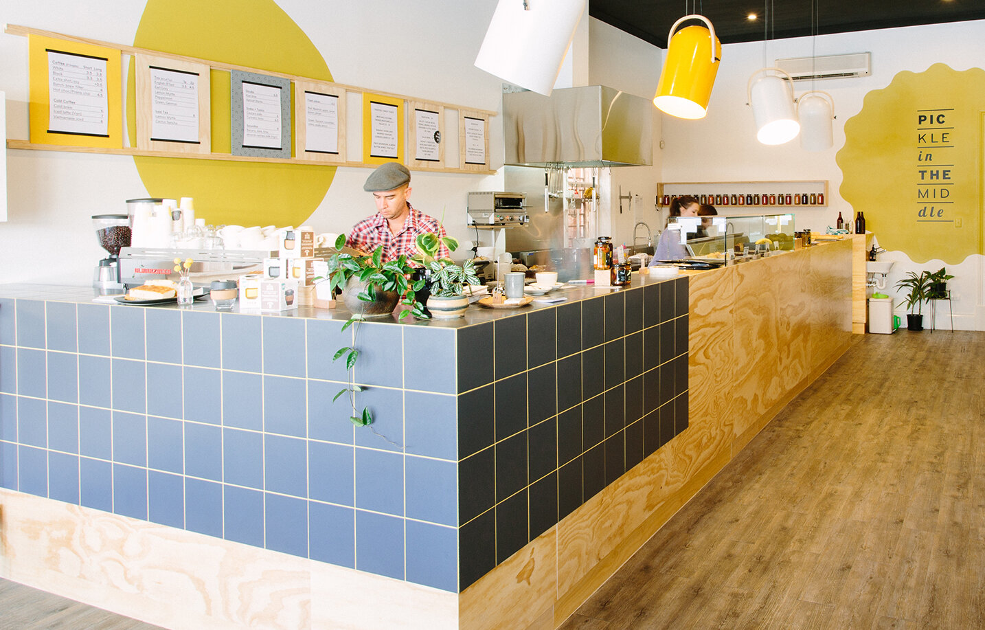
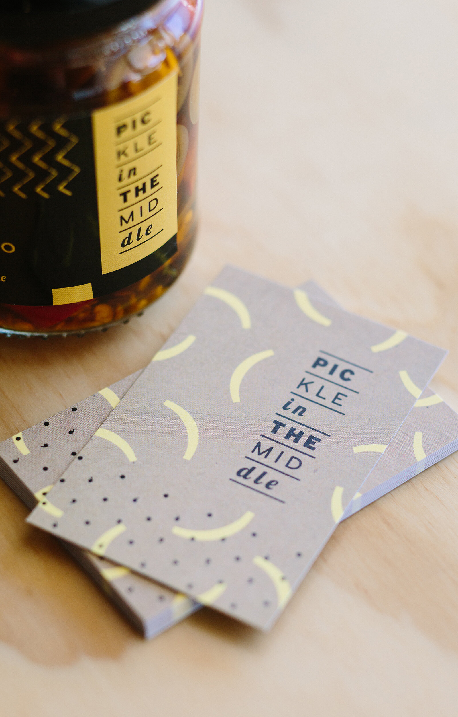

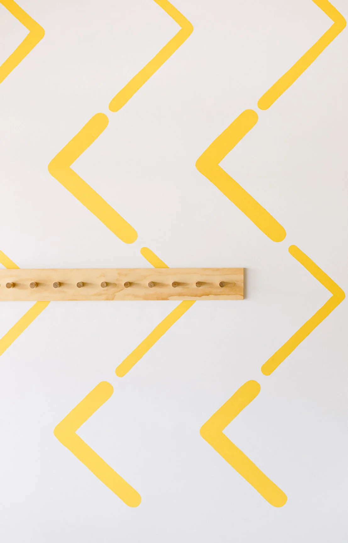
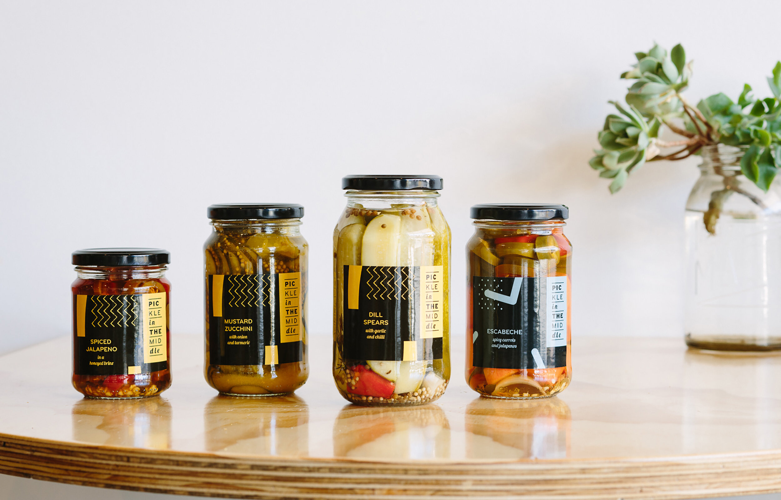
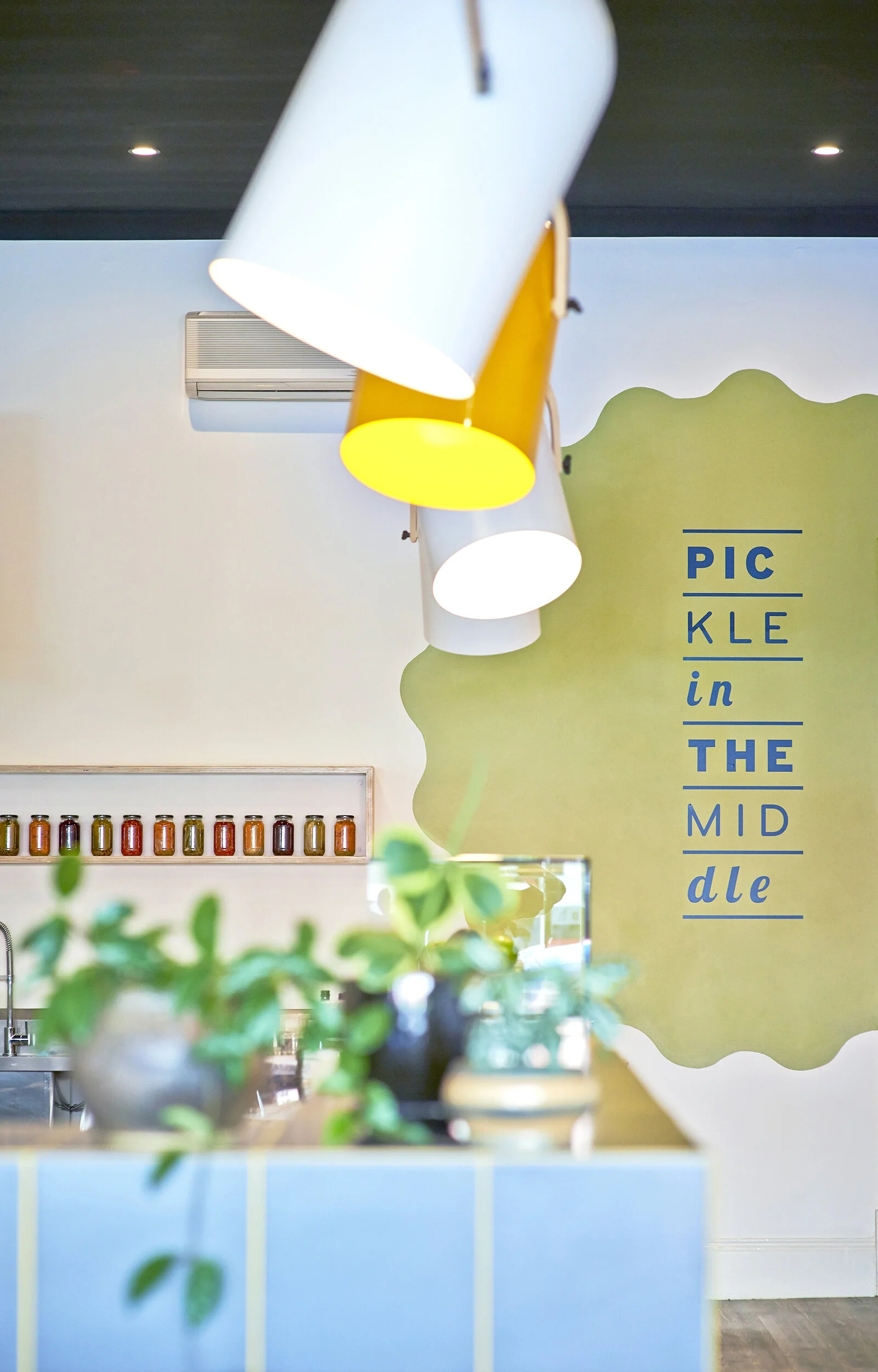
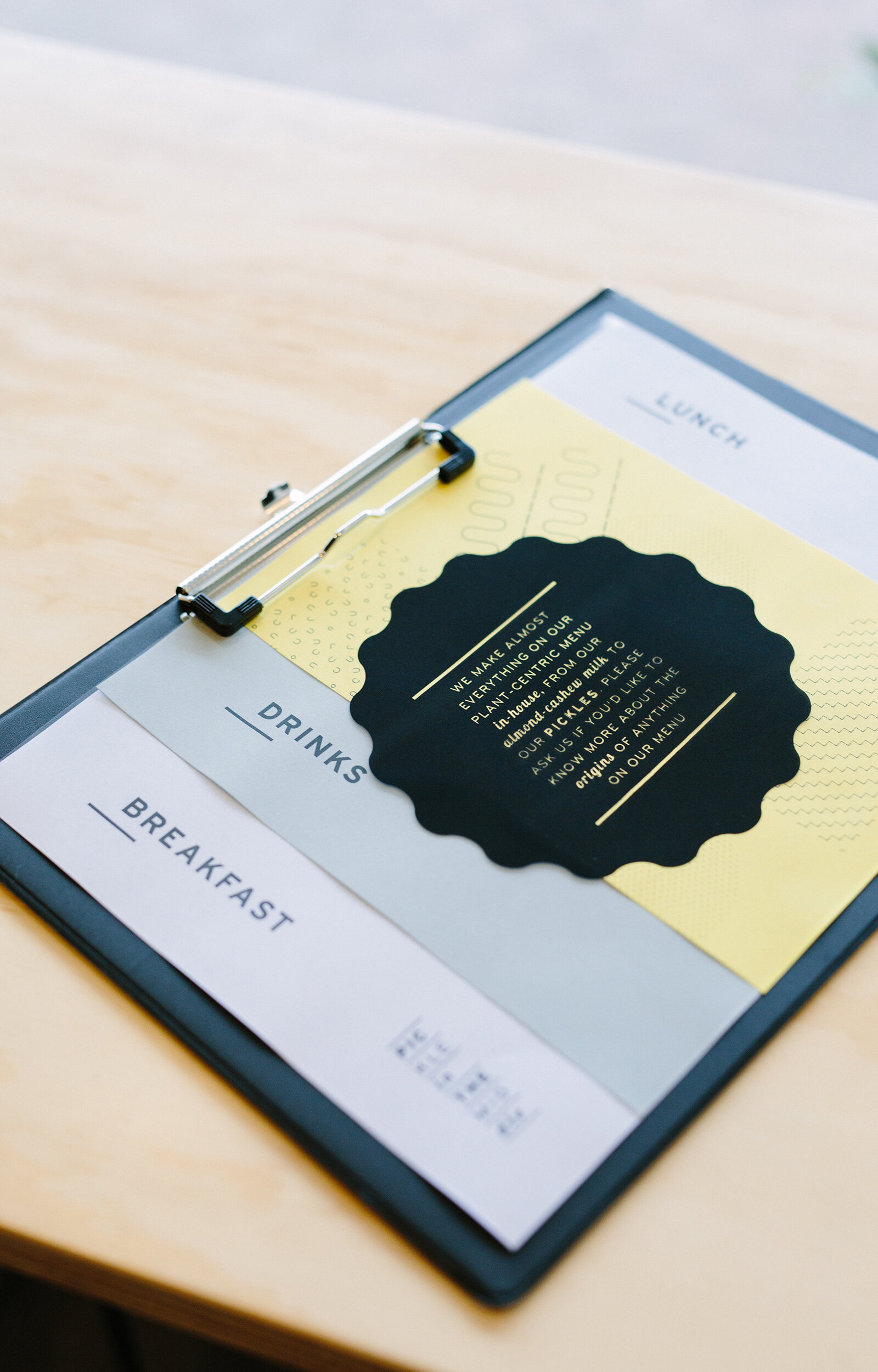
Pickle in the Middle is a vibrant new breakfast and lunch destination based on Unley Road. Enoki were asked to create an identity for this new cafe including it's name and various graphic applications such as the logo, business cards, environmental graphics and packaging. The name and identity are based around the cafe's central offering of sandwiches. The various typefaces used in the logo are stacked upon each other like the layers of ingredients in a sandwich. Similarly, a set of typographic supporting patterns were developed, each inspired by a sandwich fillings, such as cucumber, tomato or bread
Photographer: Evolved Images
Award:
Shortlisted – Best Identity Design, 2015 Eat Drink Design Awards
Shortlisted – Best Café Design, 2015 Eat Drink Design Awards
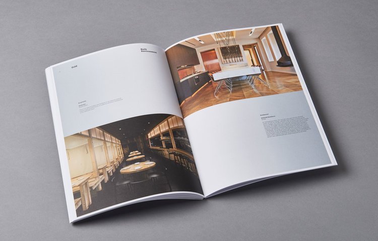
Warradale Hotel
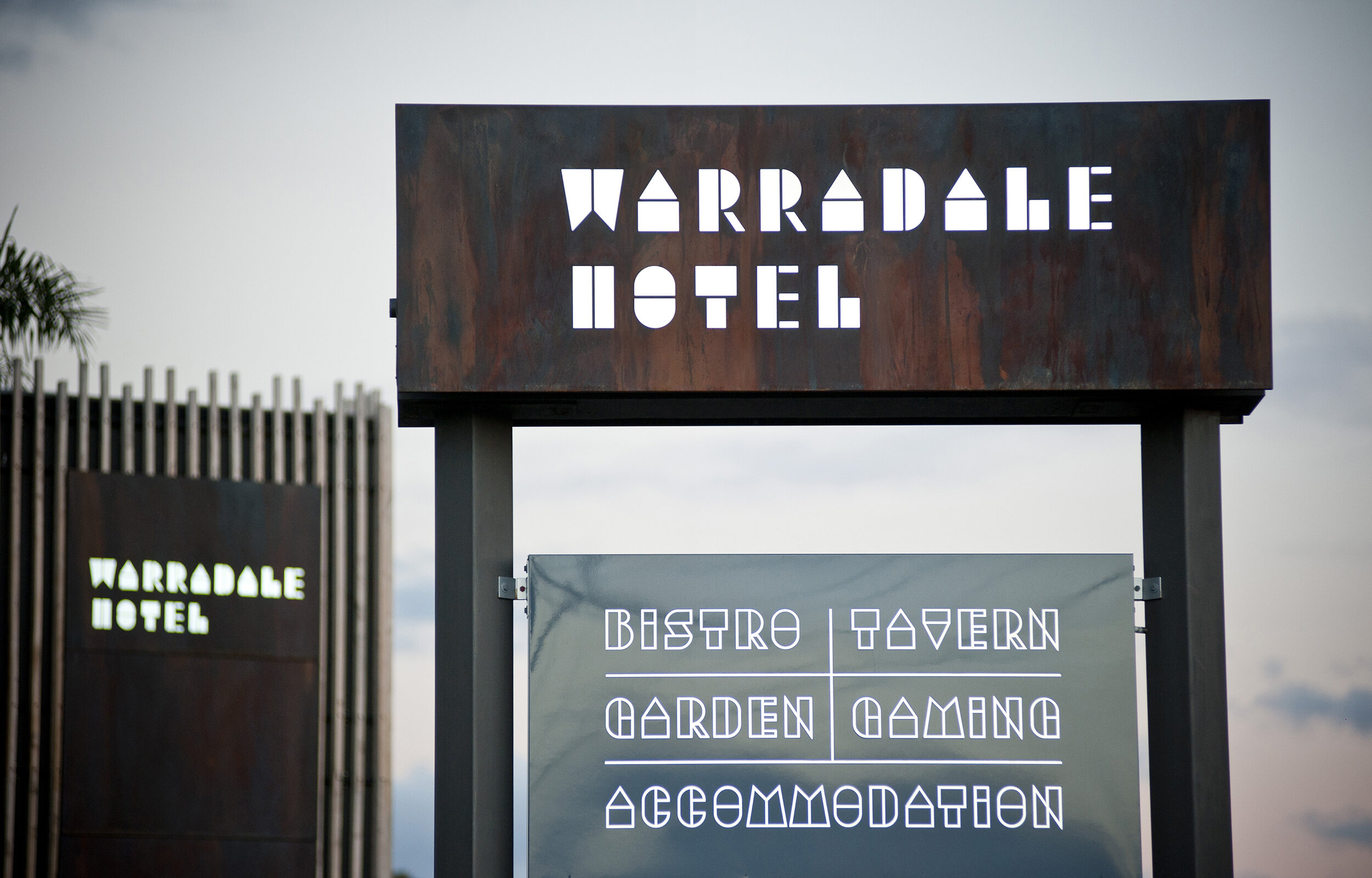
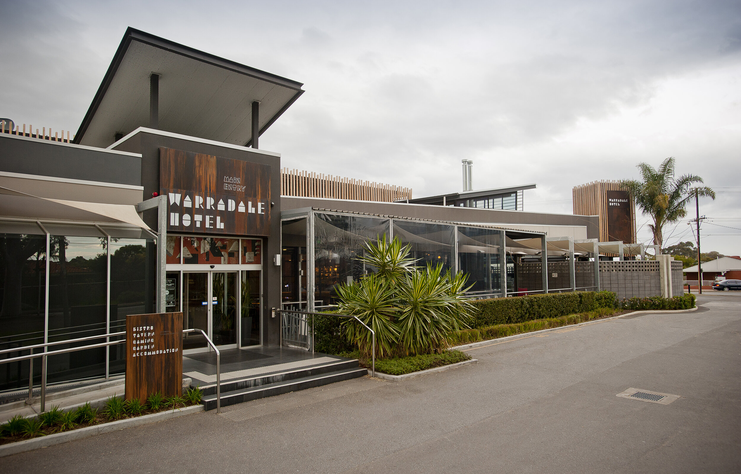
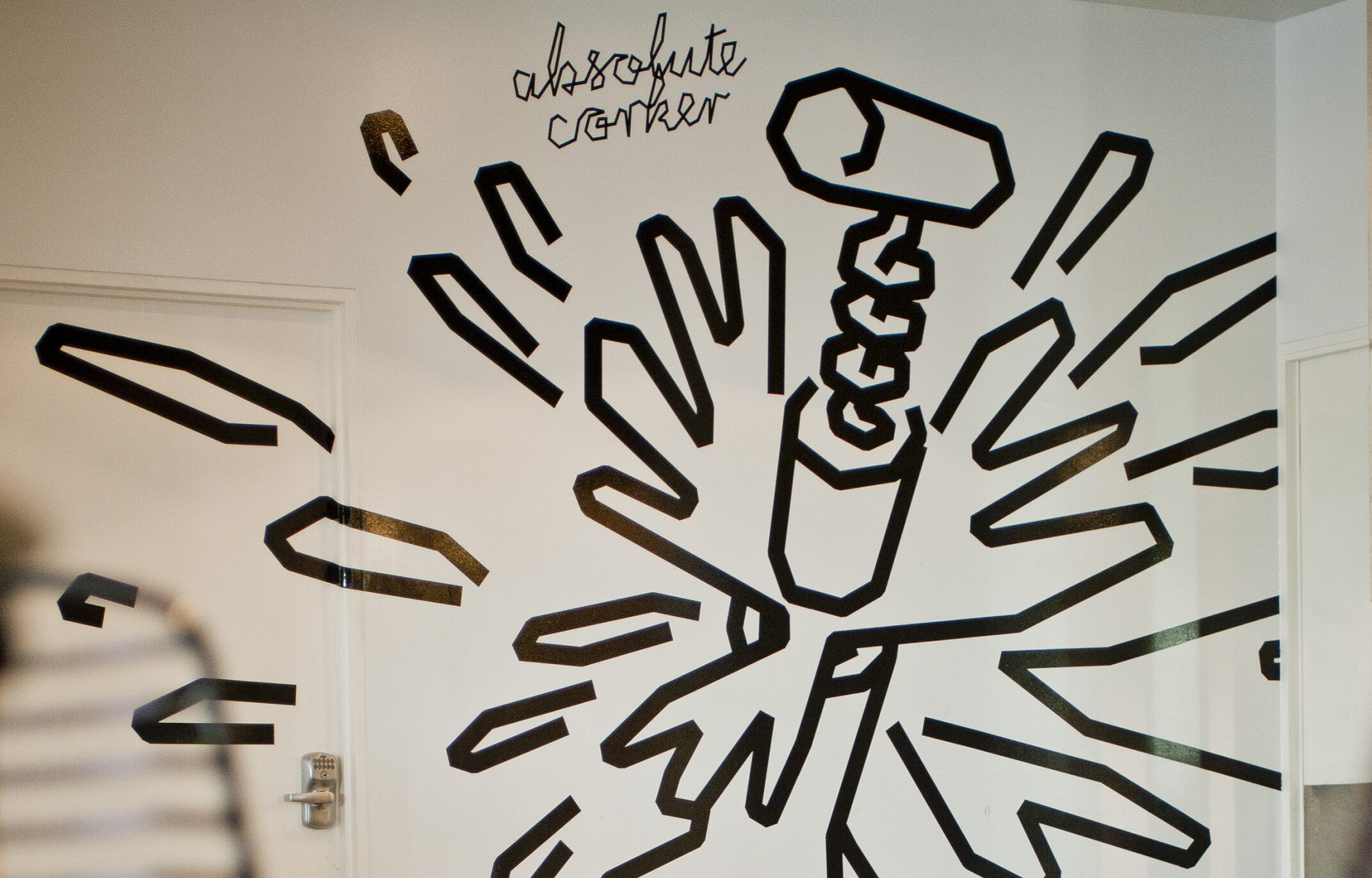
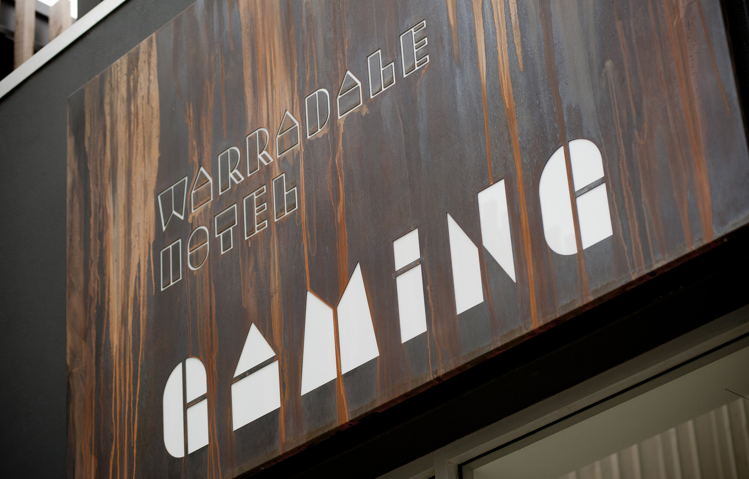
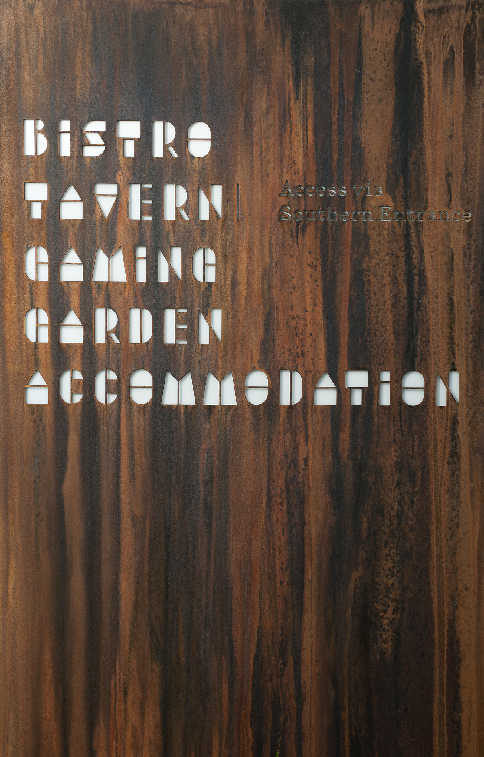
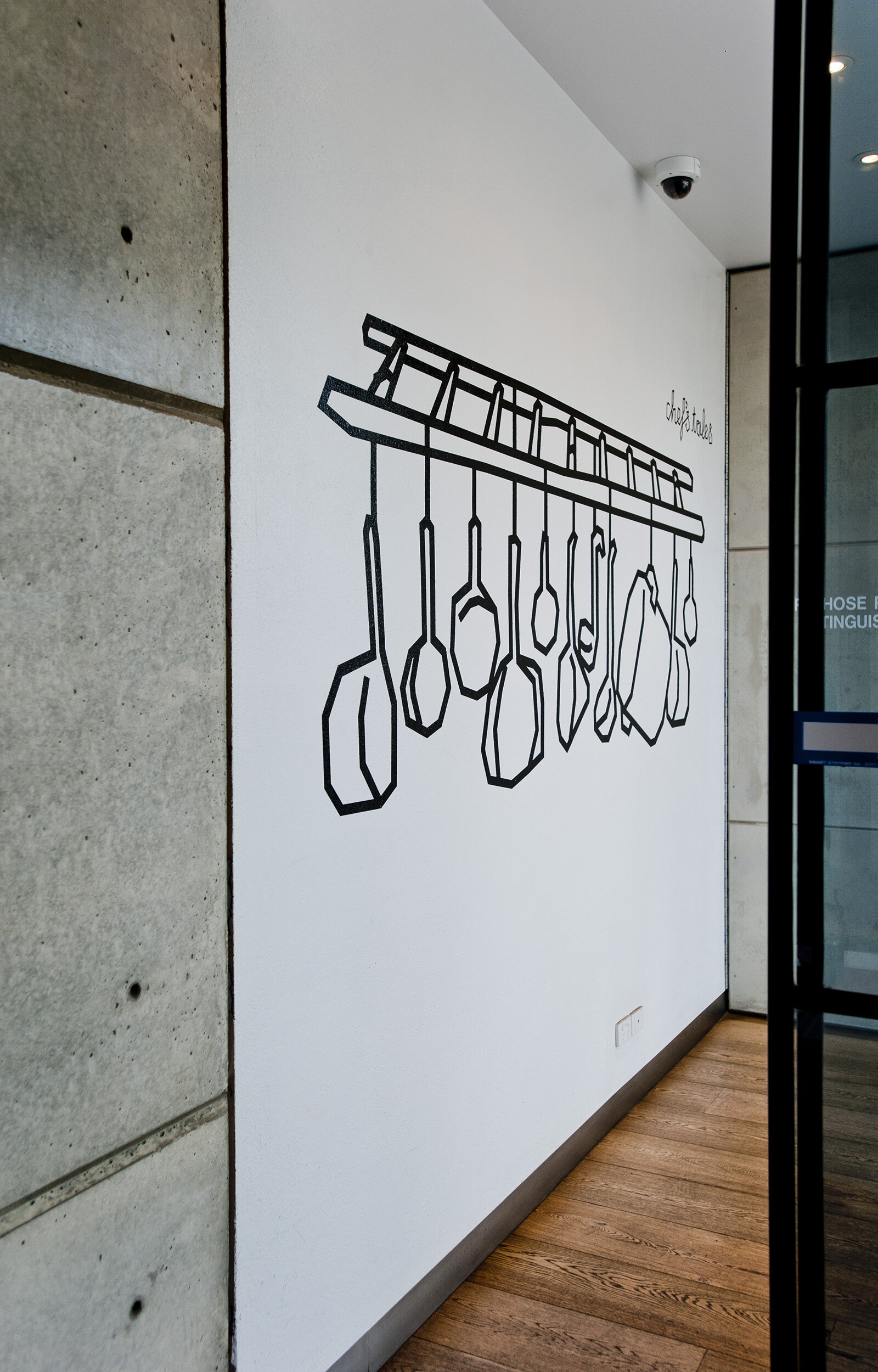
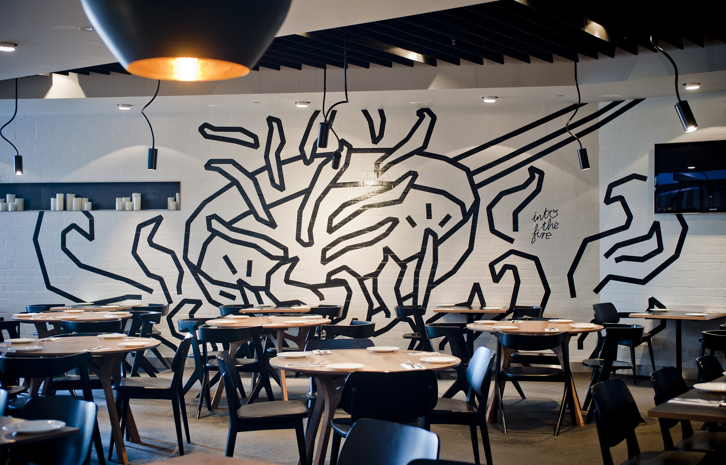
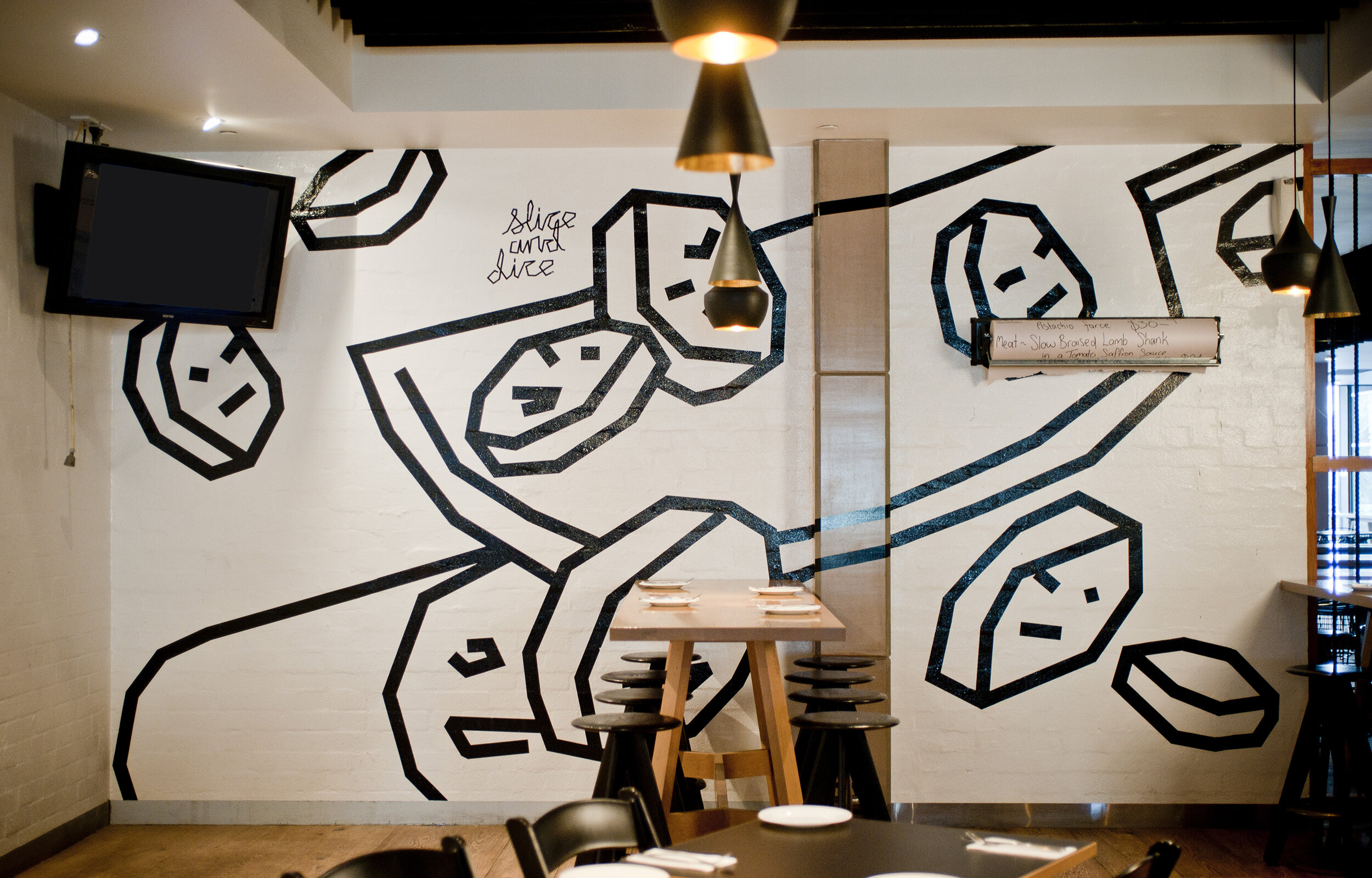
The area of Warradale was largely farming land before the hotel existed. The identity for the Warradale Hotel is derived from the idea of found objects during excavation - rusty sheet metal, and old pieces of timber carved into abstract shapes. Through the design of several typefaces based on this idea there is a richness of visual flavour and a connection with the past. In addition to the logo, the 'Chef's Tales' series was developed for the Bistro, depicting stories that might be told in the kitchen during food preparation and included common sayings like 'into the fire', or 'slice and dice', or 'absolute corker'.
Photographer: Evolved Images
Award: Silver, The Laminex Group DIA SA Awards 2013
DiPalo Hair
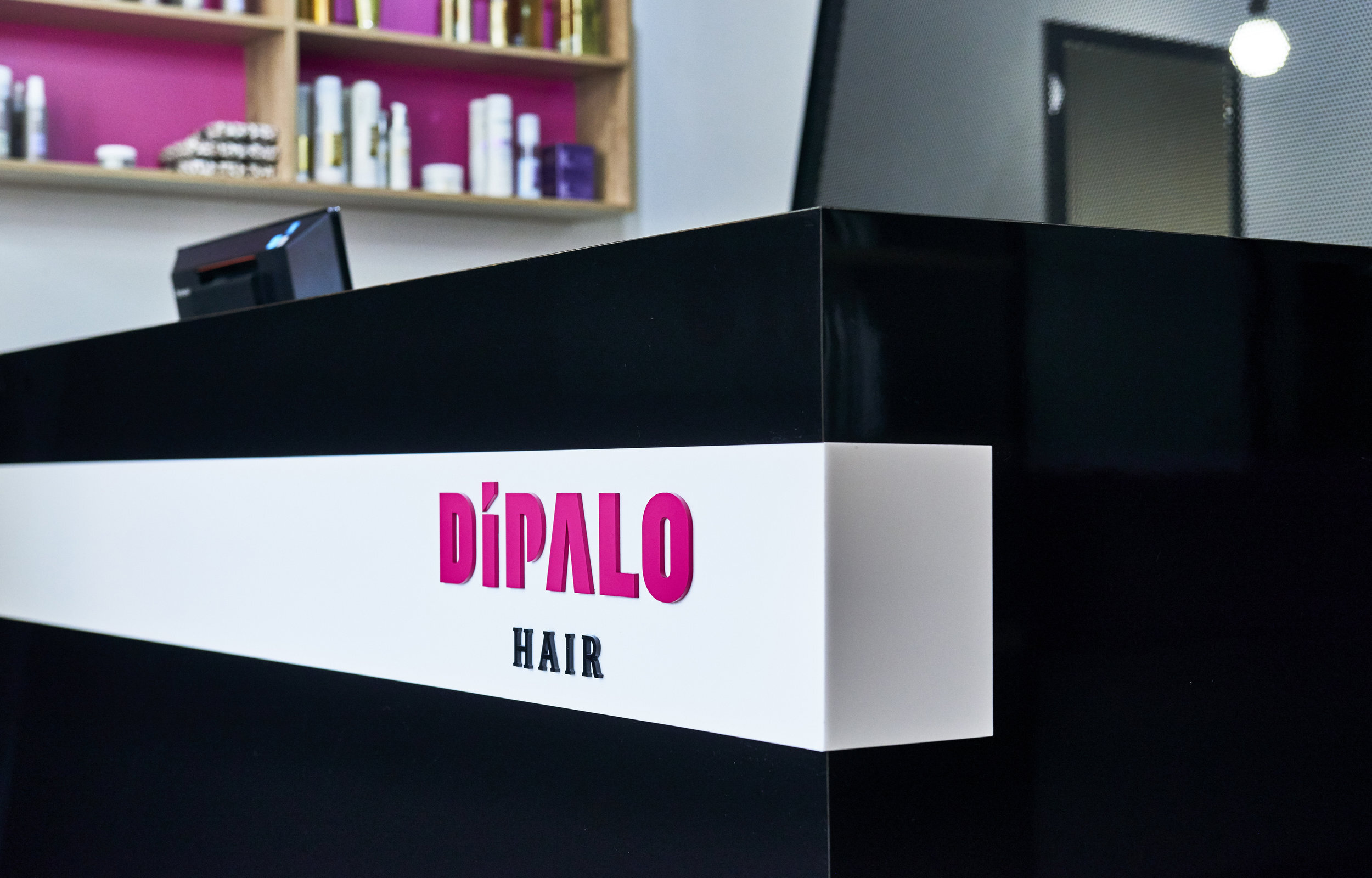
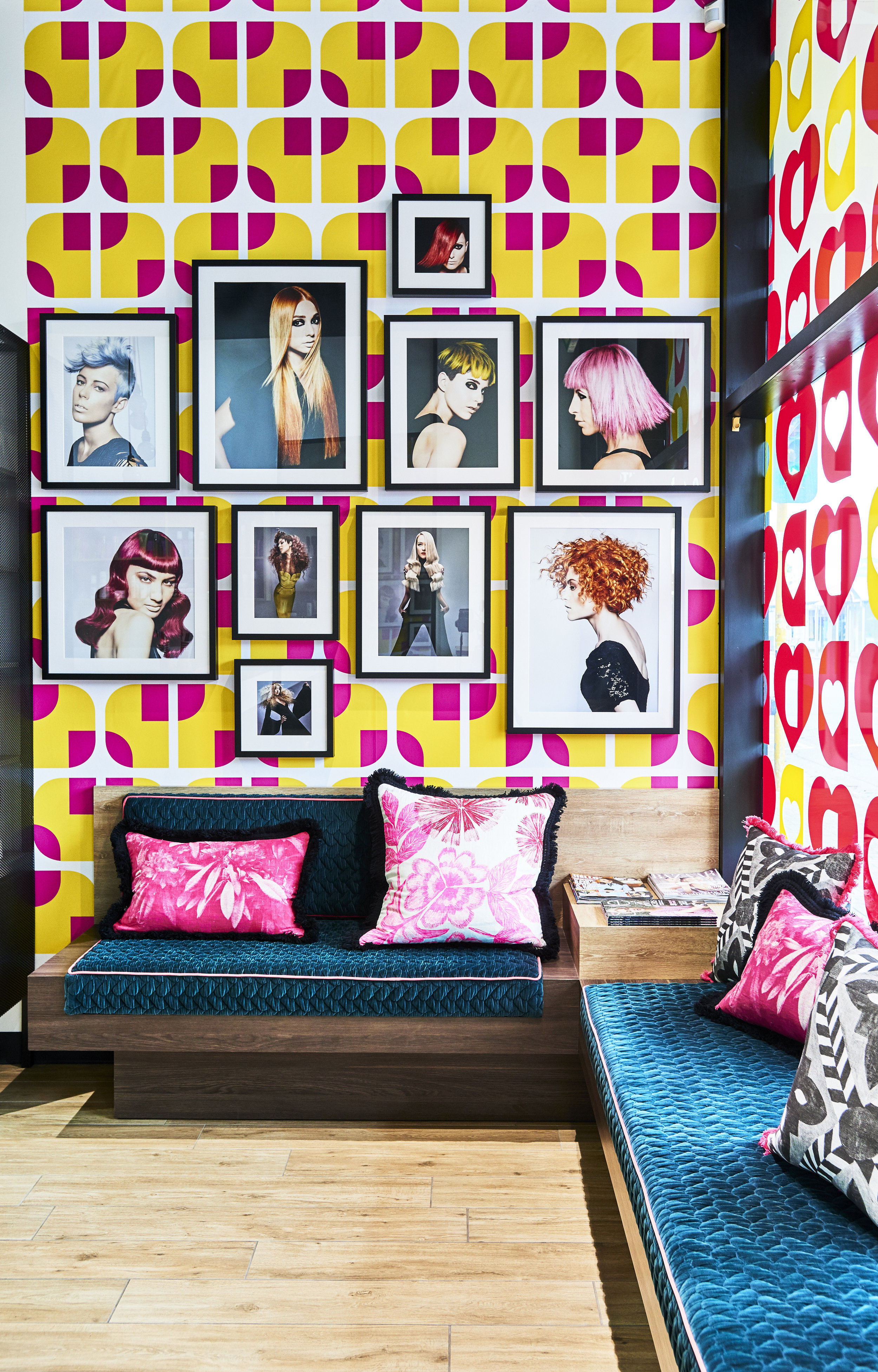
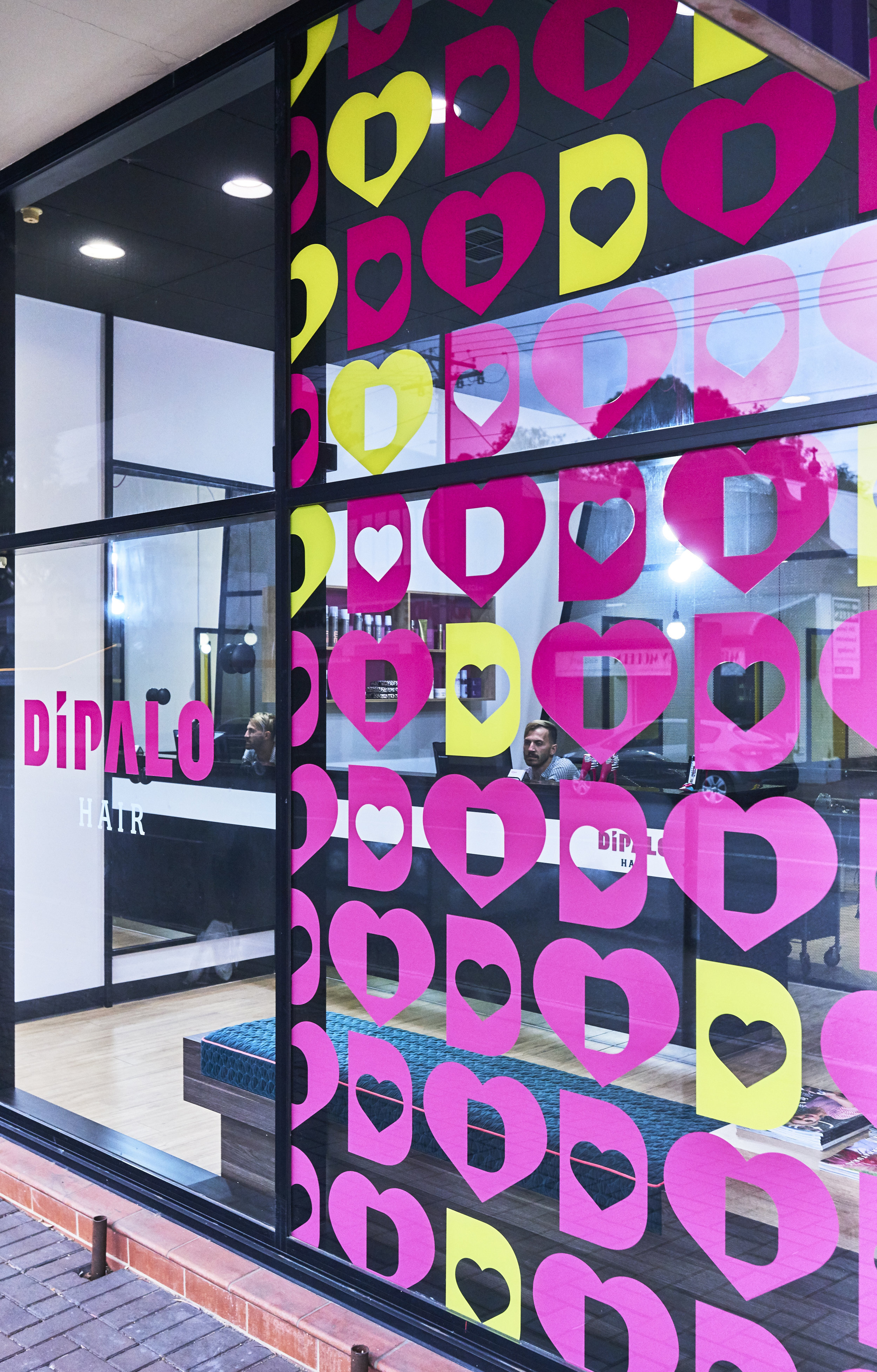
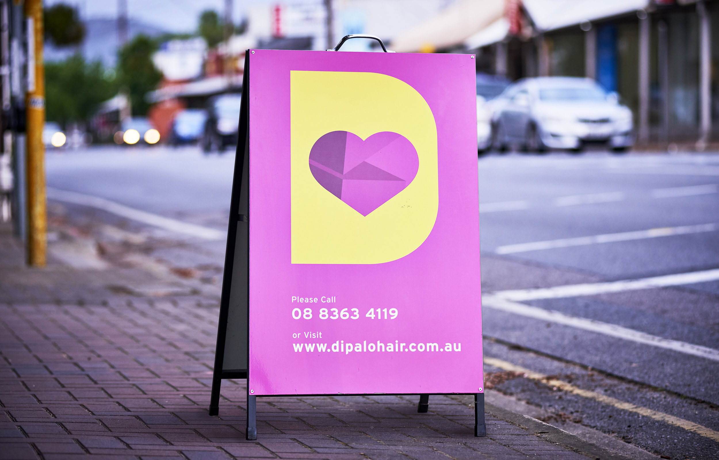
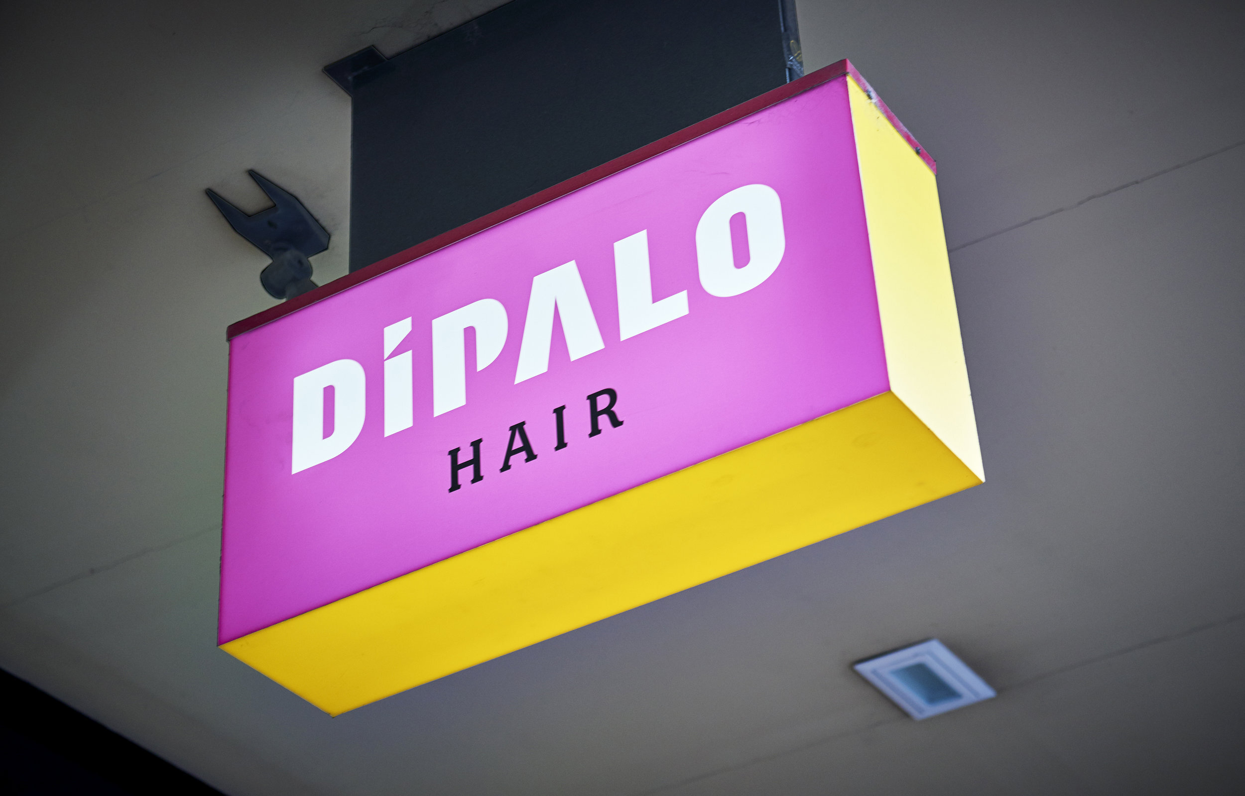
Photographer: Evolved Images
Goodpress
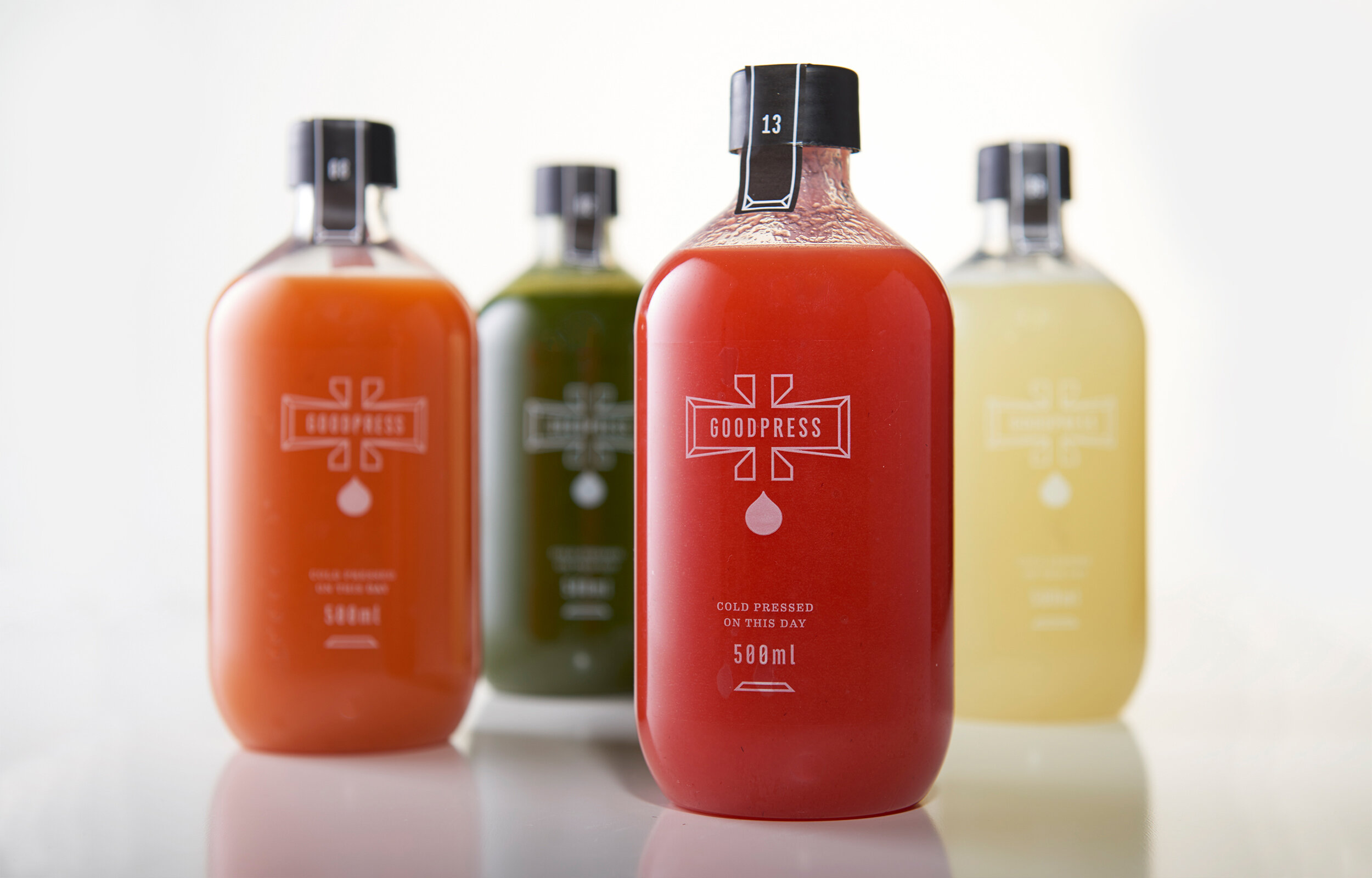
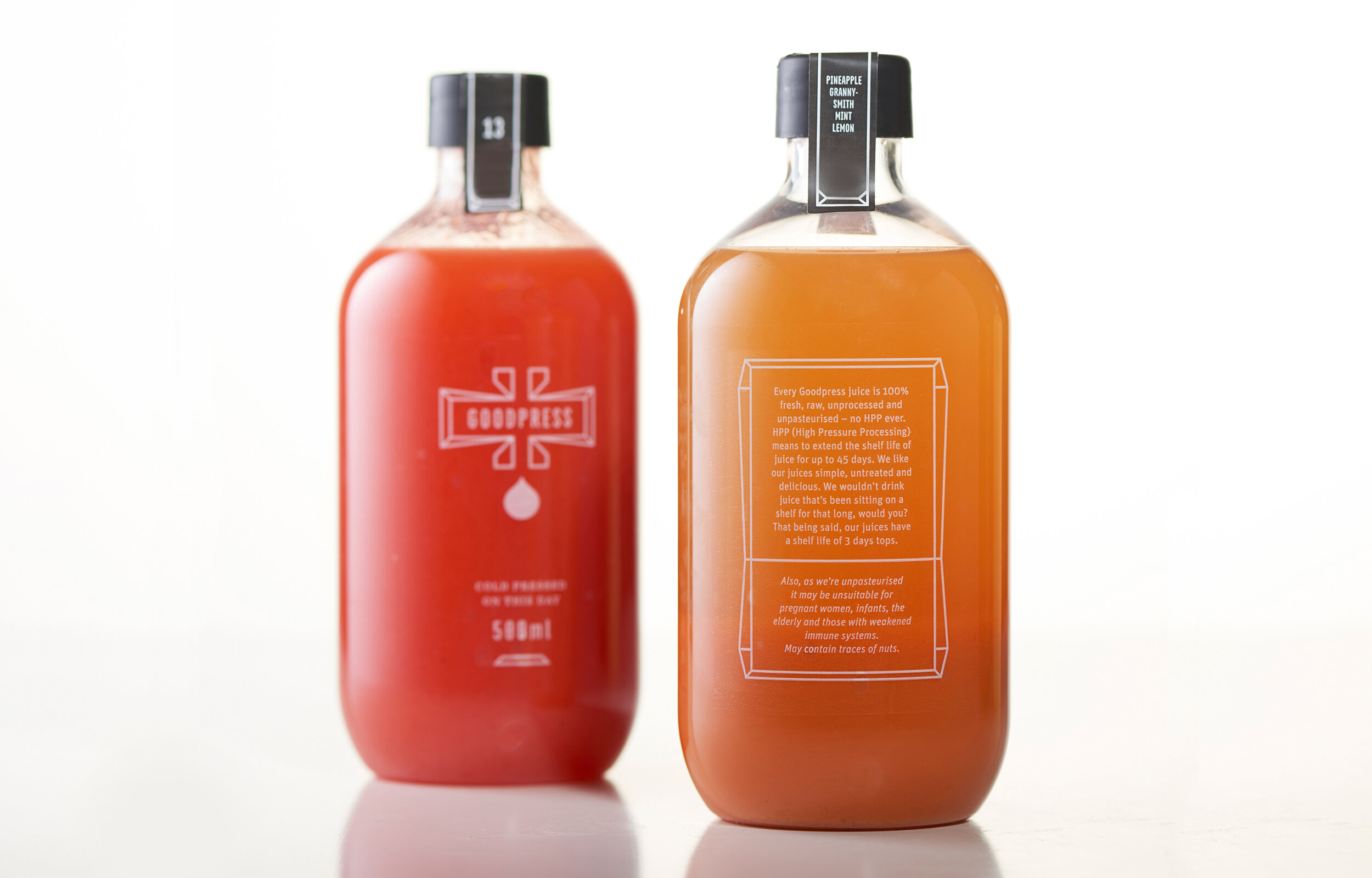
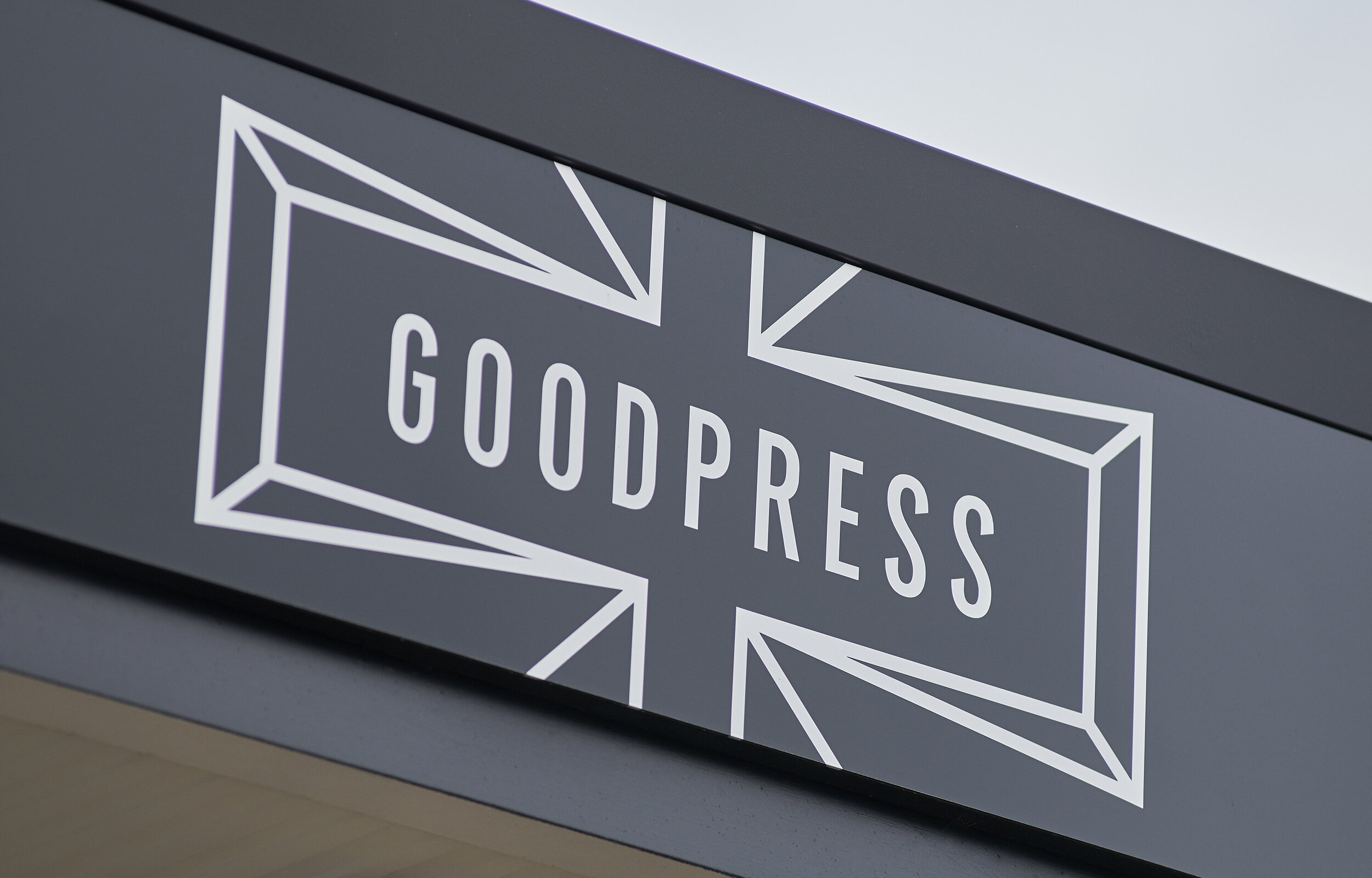
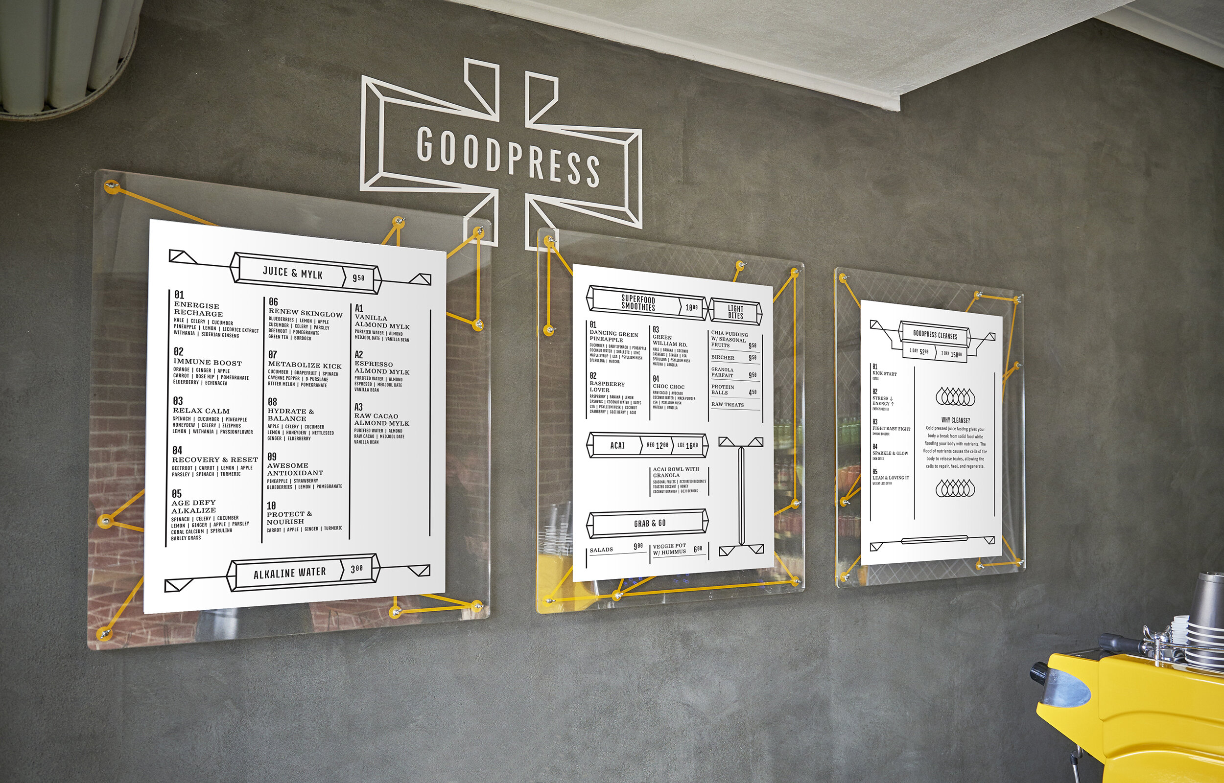
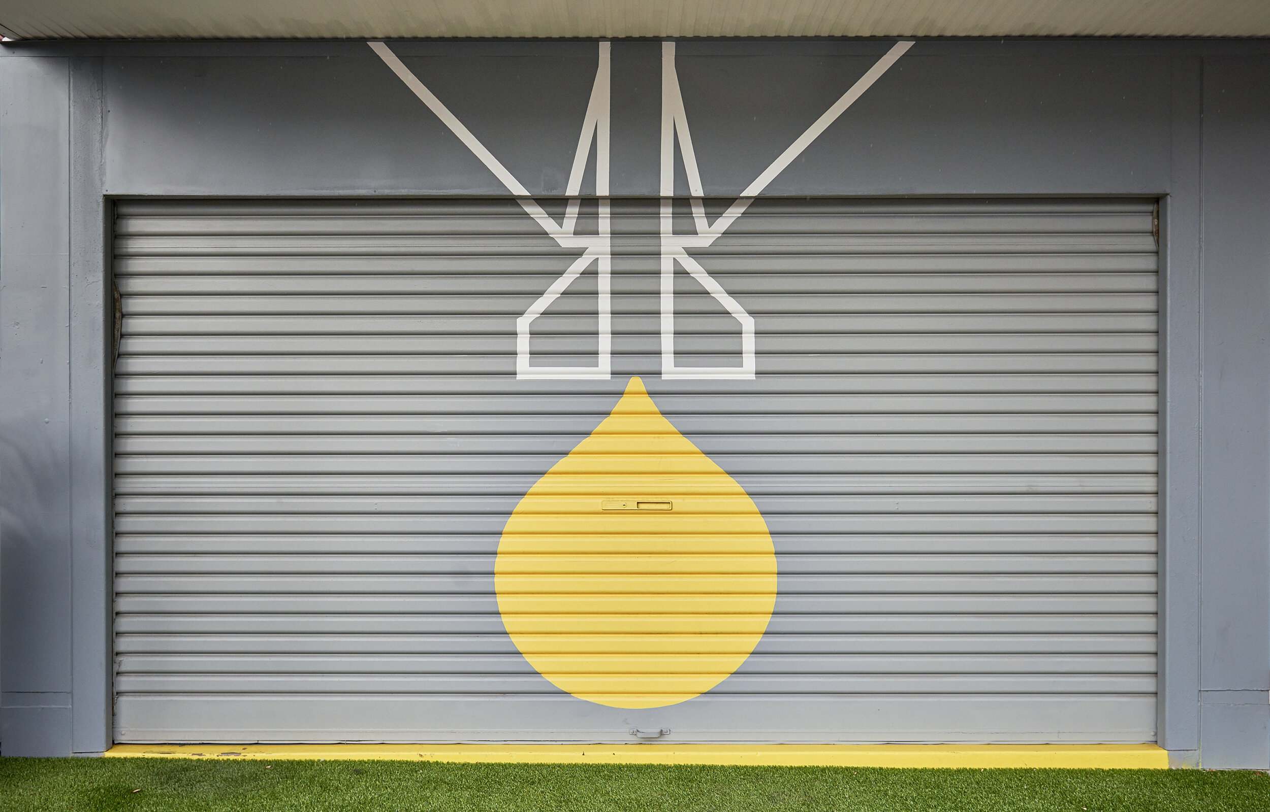
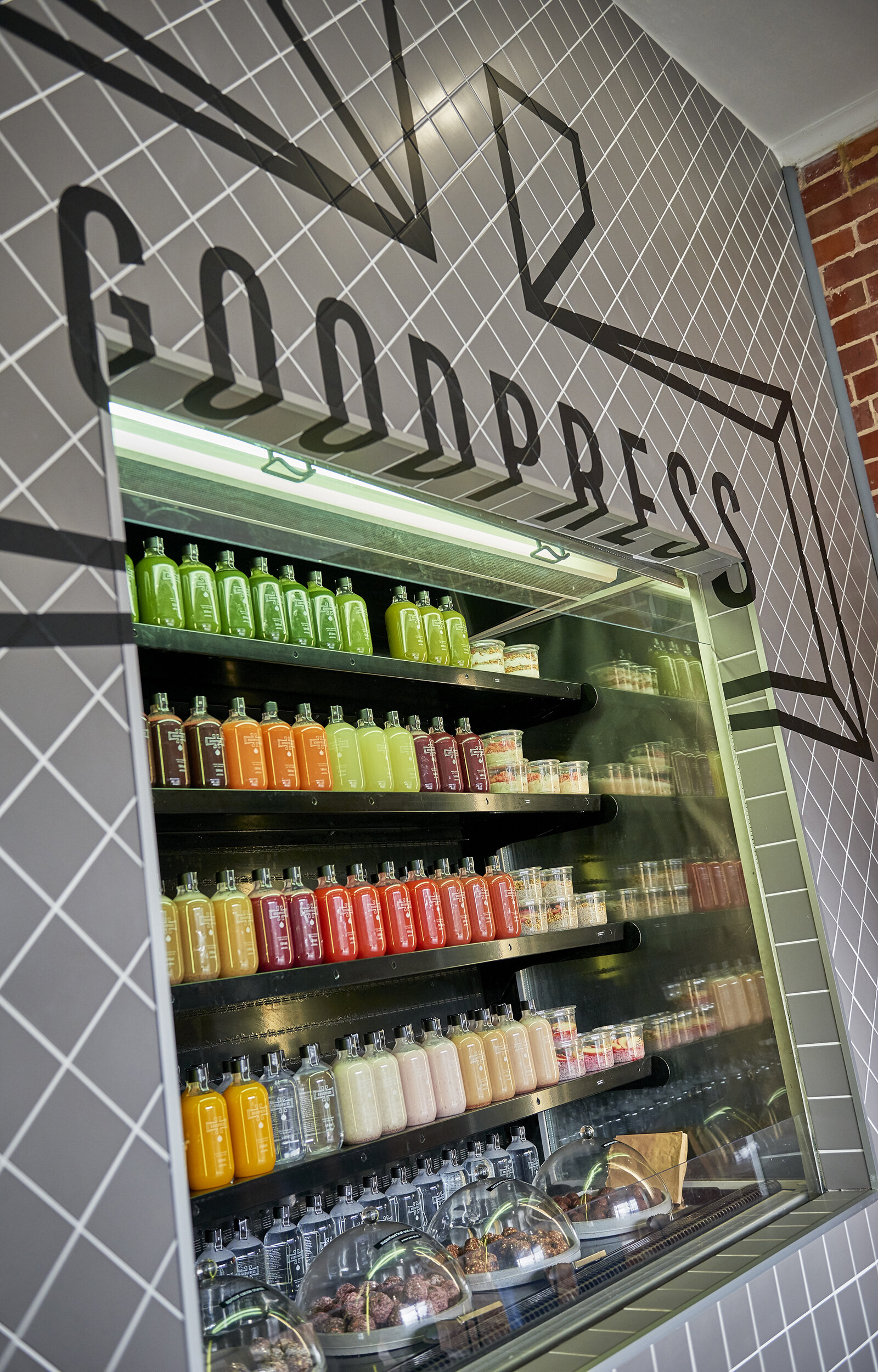
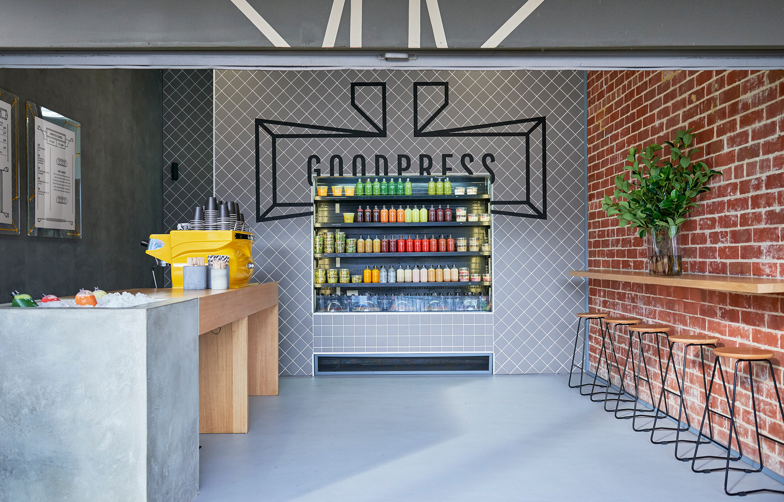
Photographer: Evolved Images
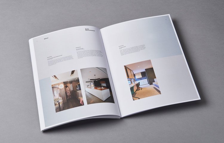
Escada Residences
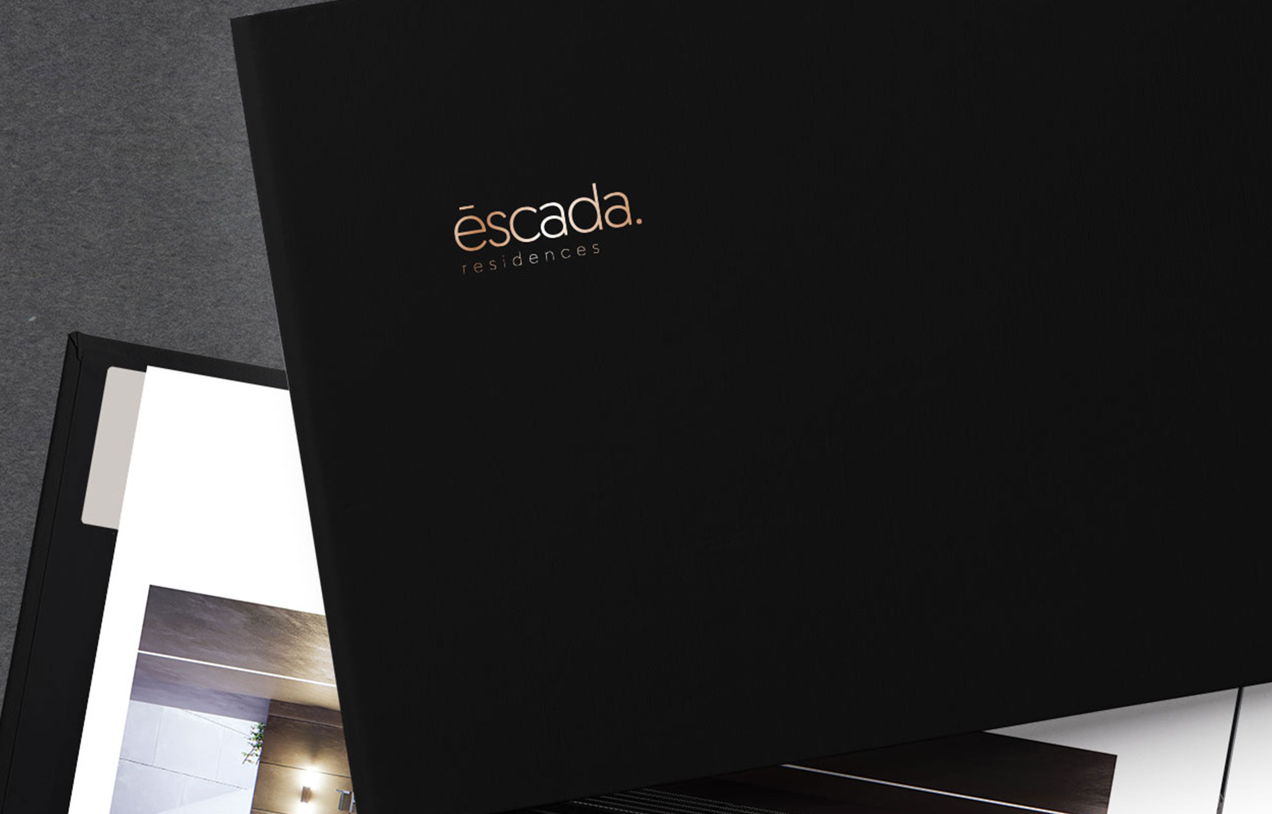
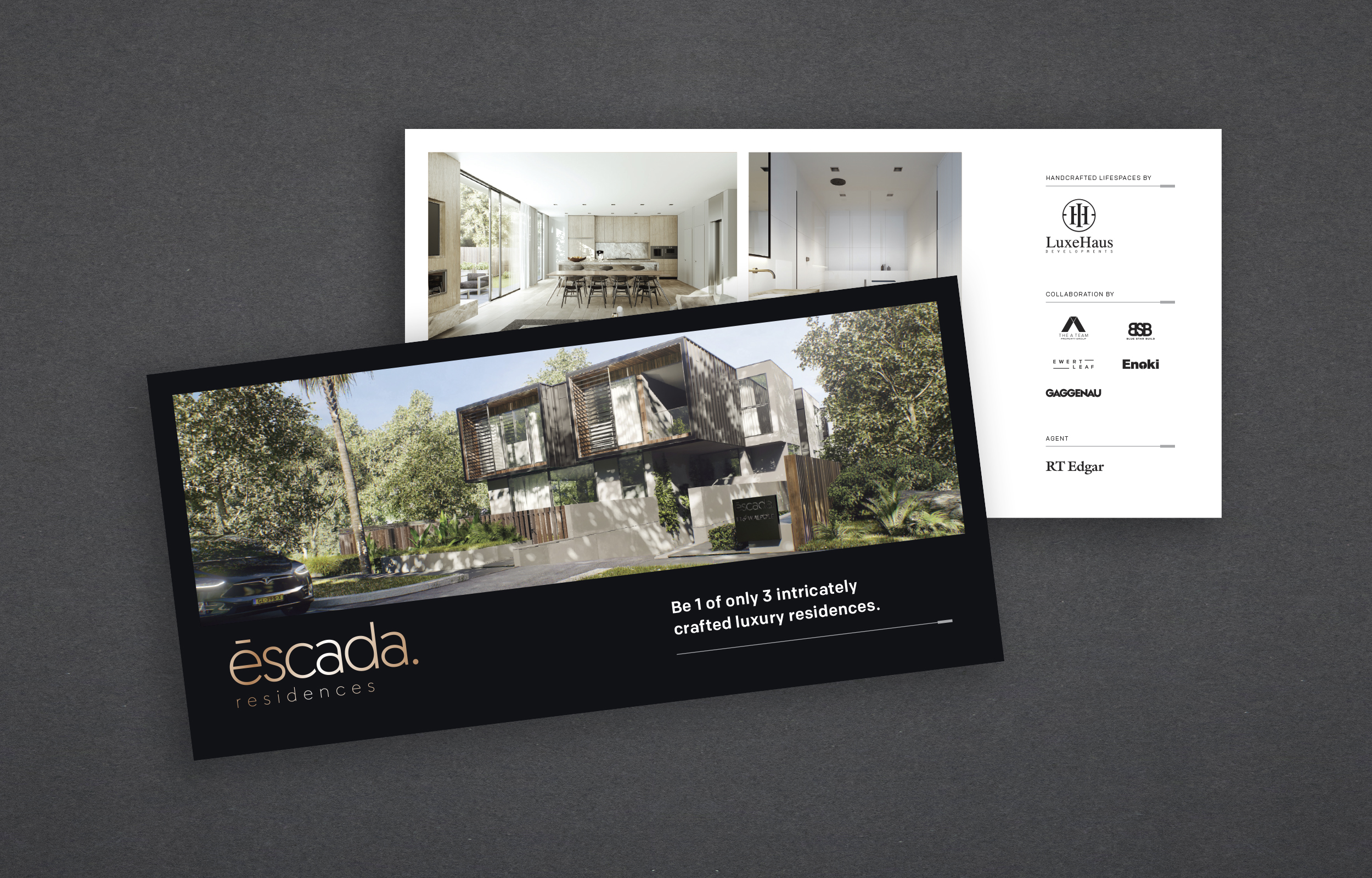
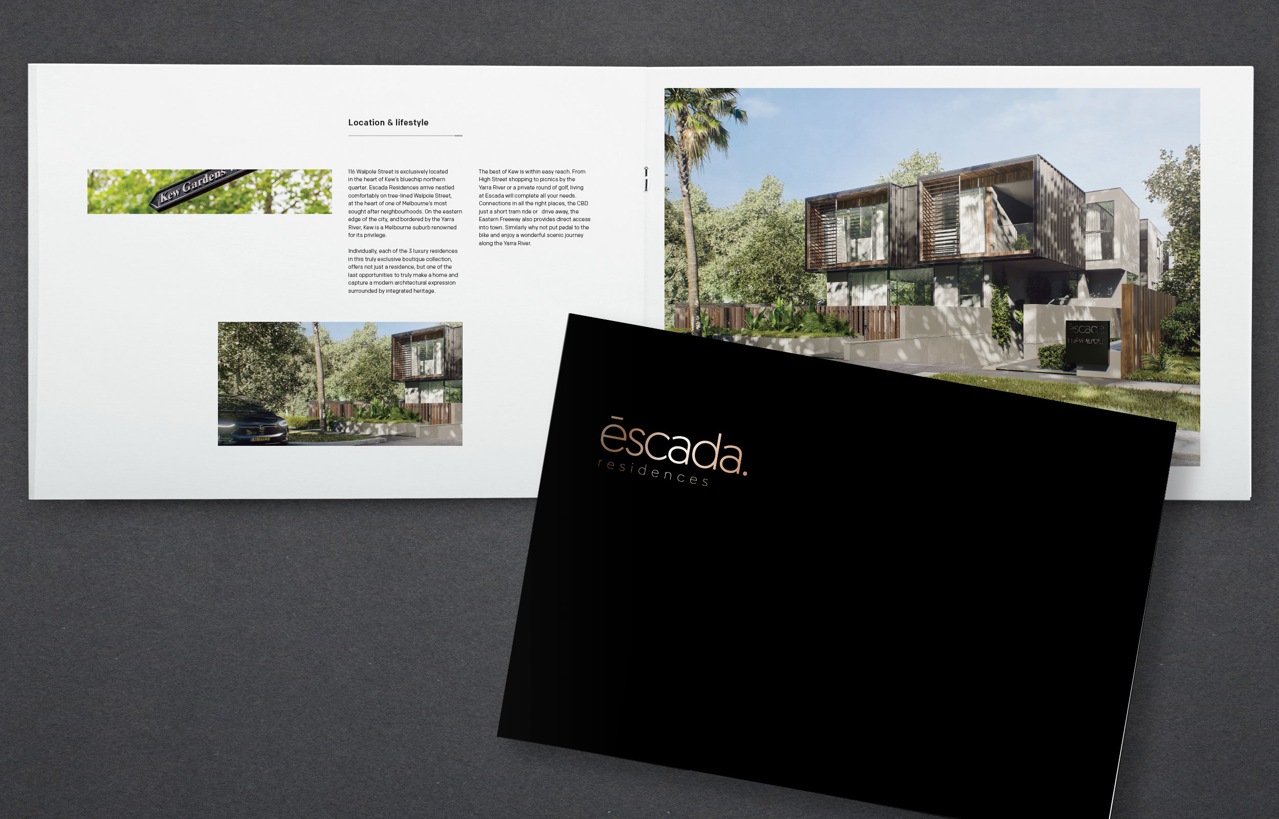
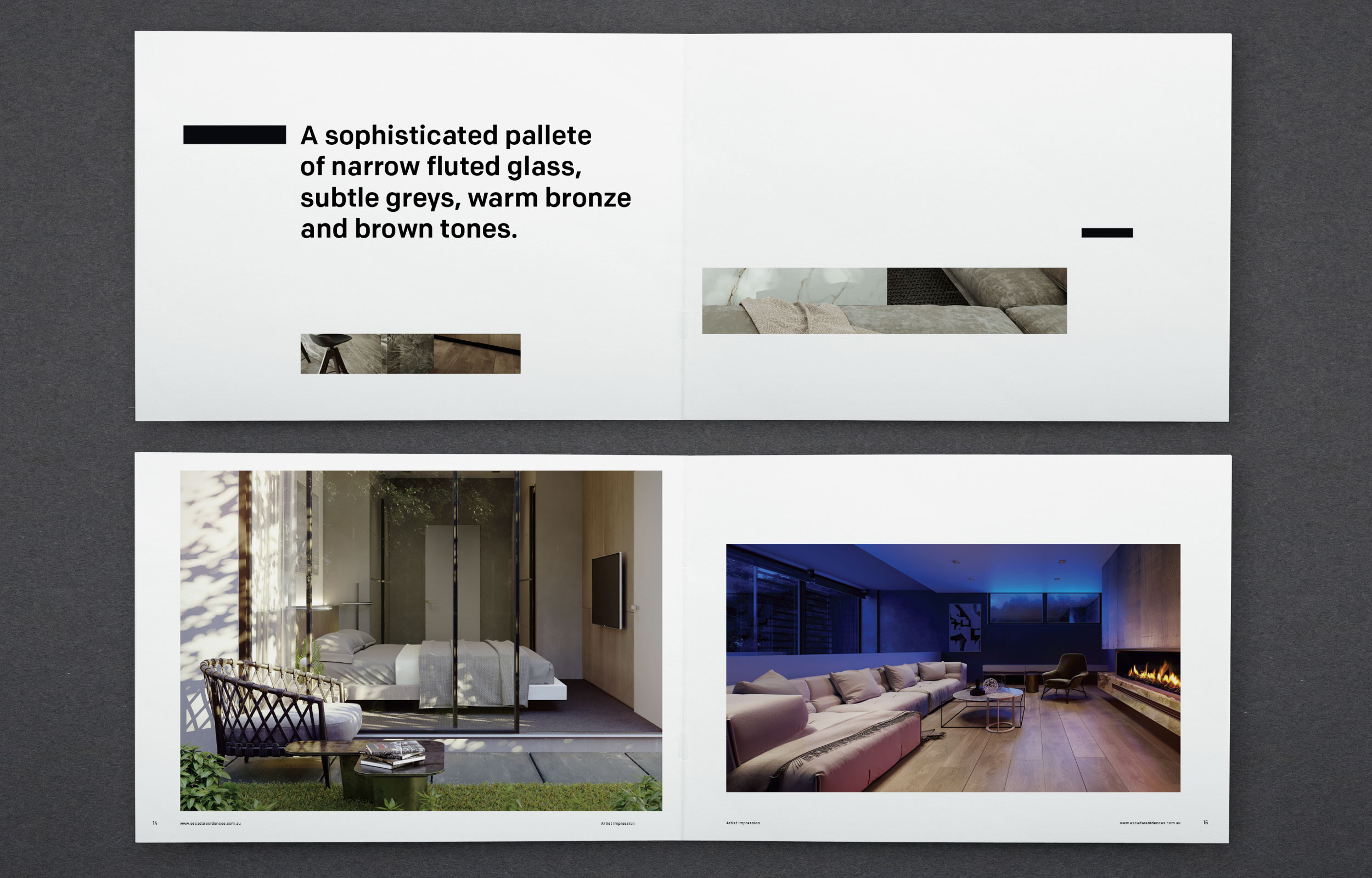
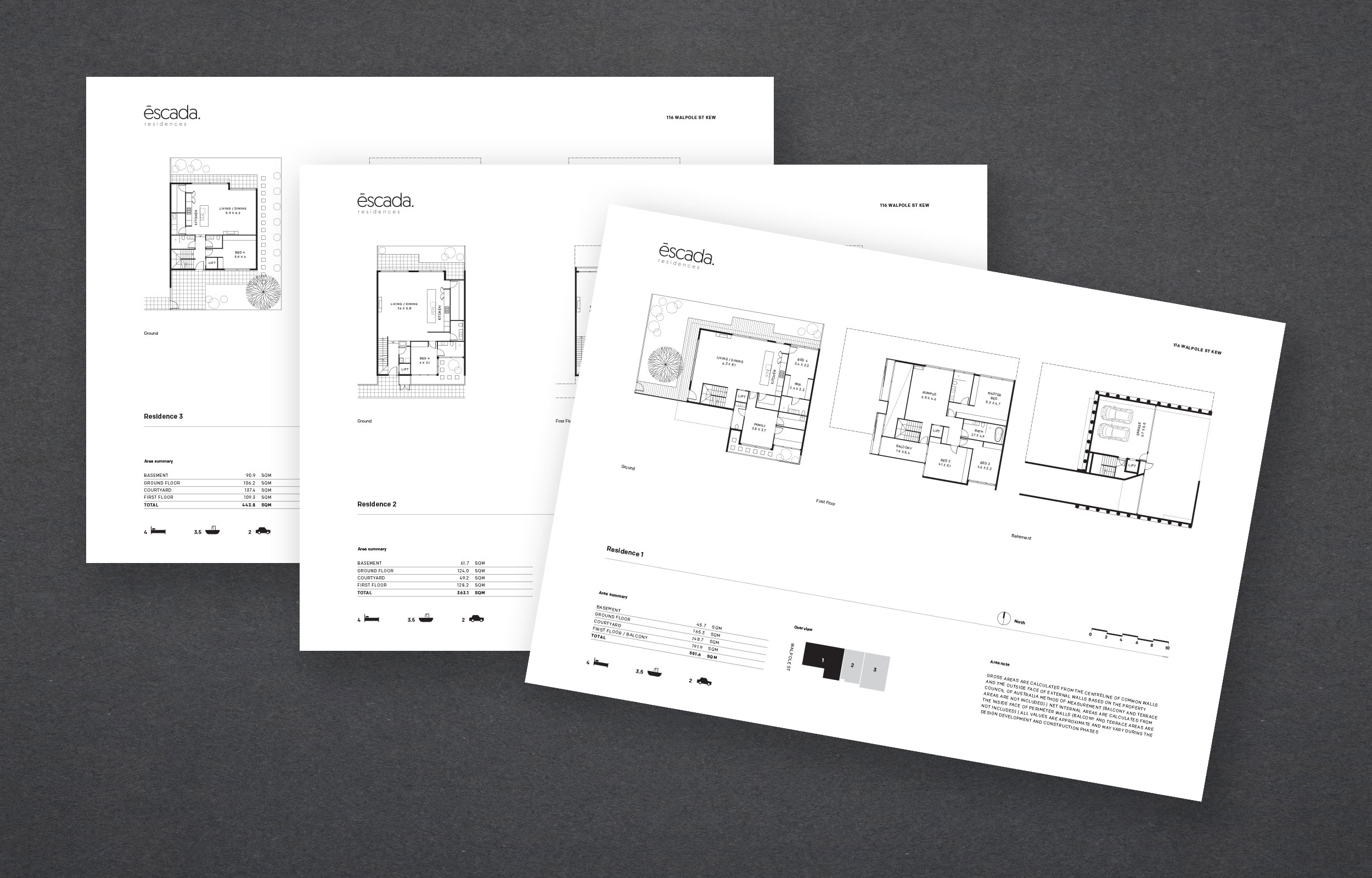
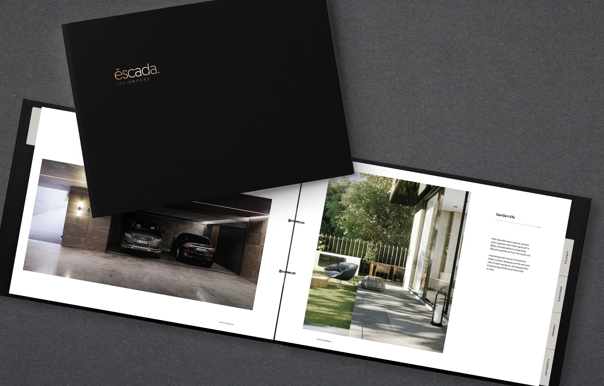
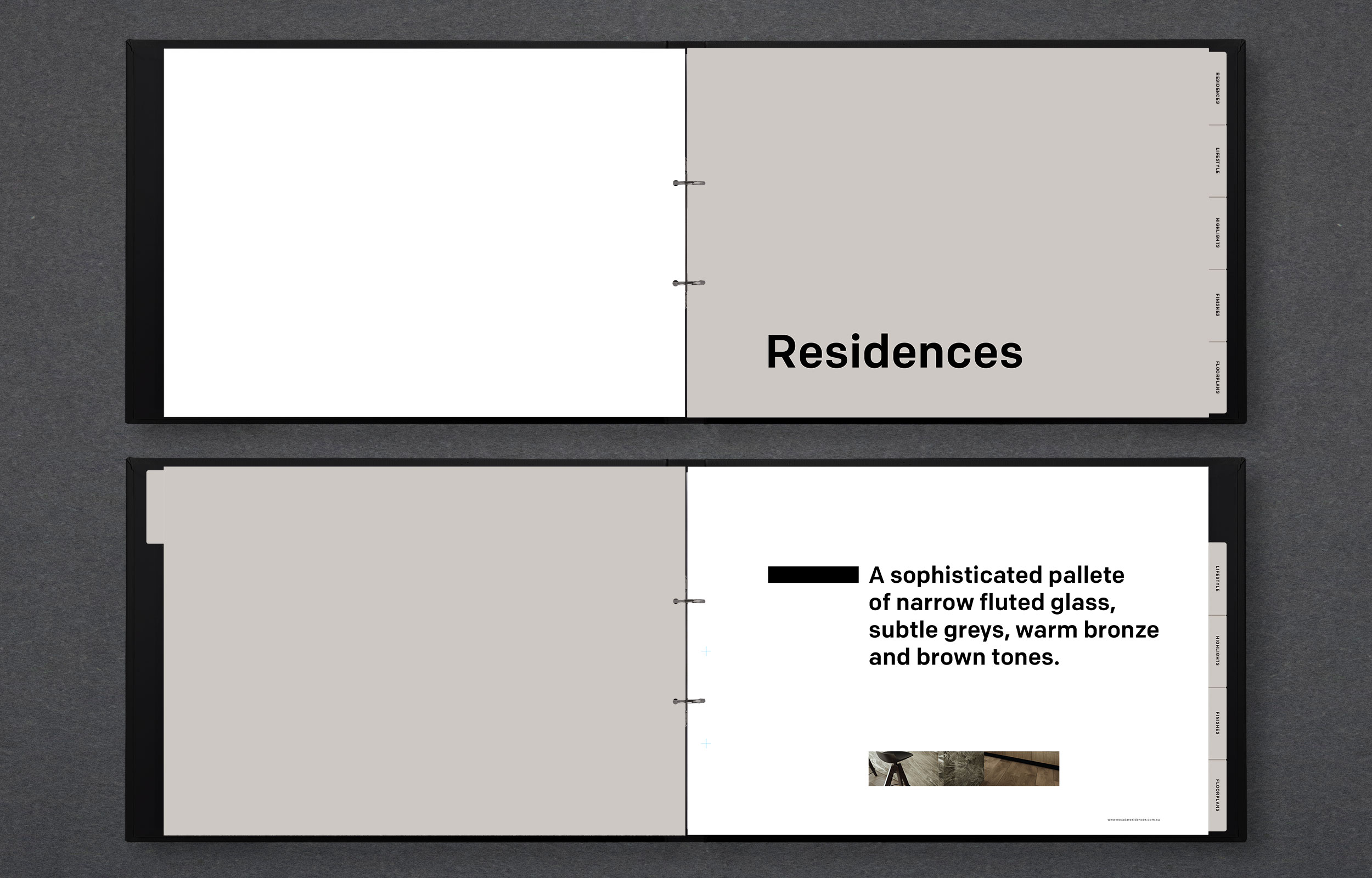
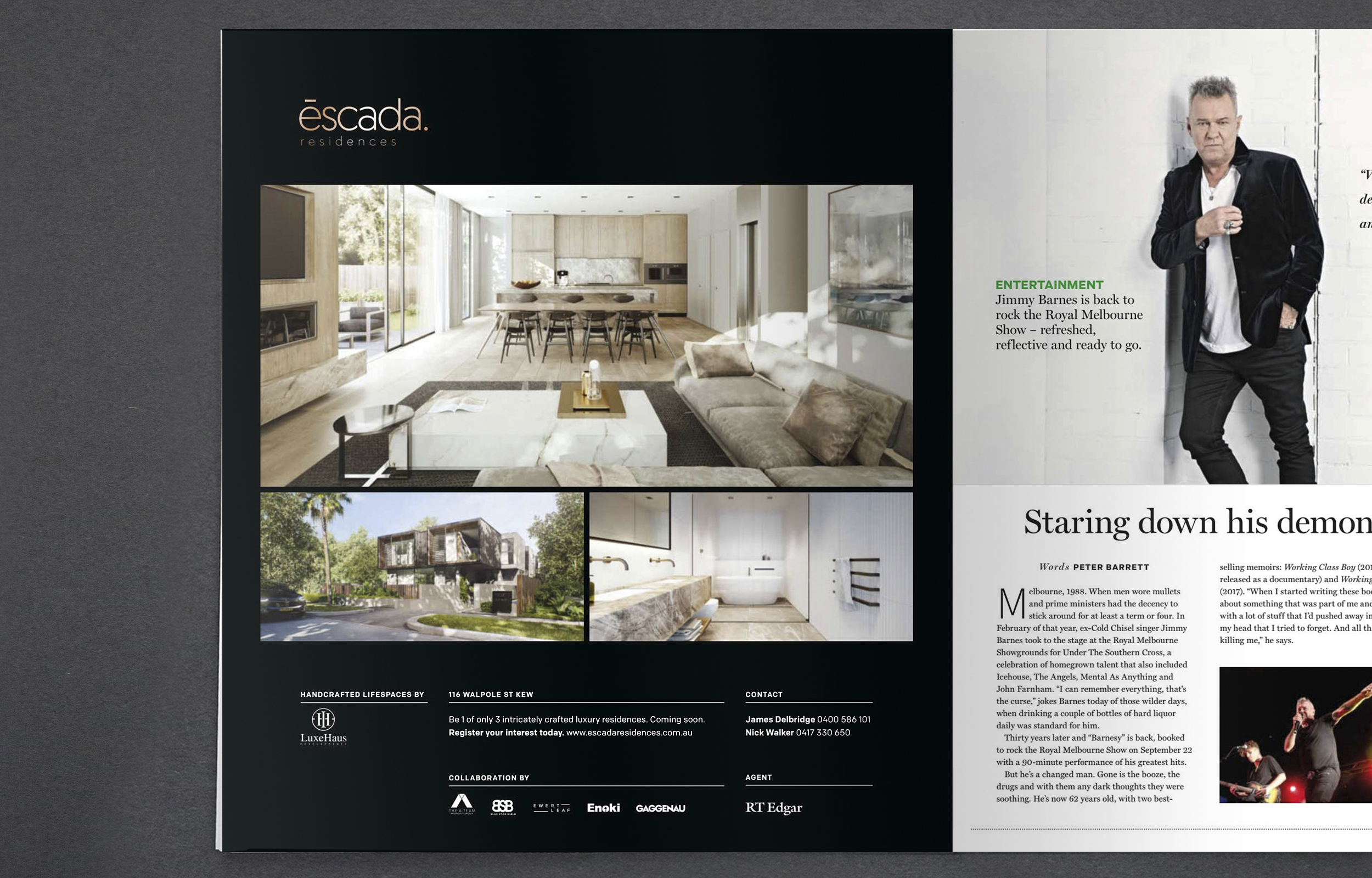
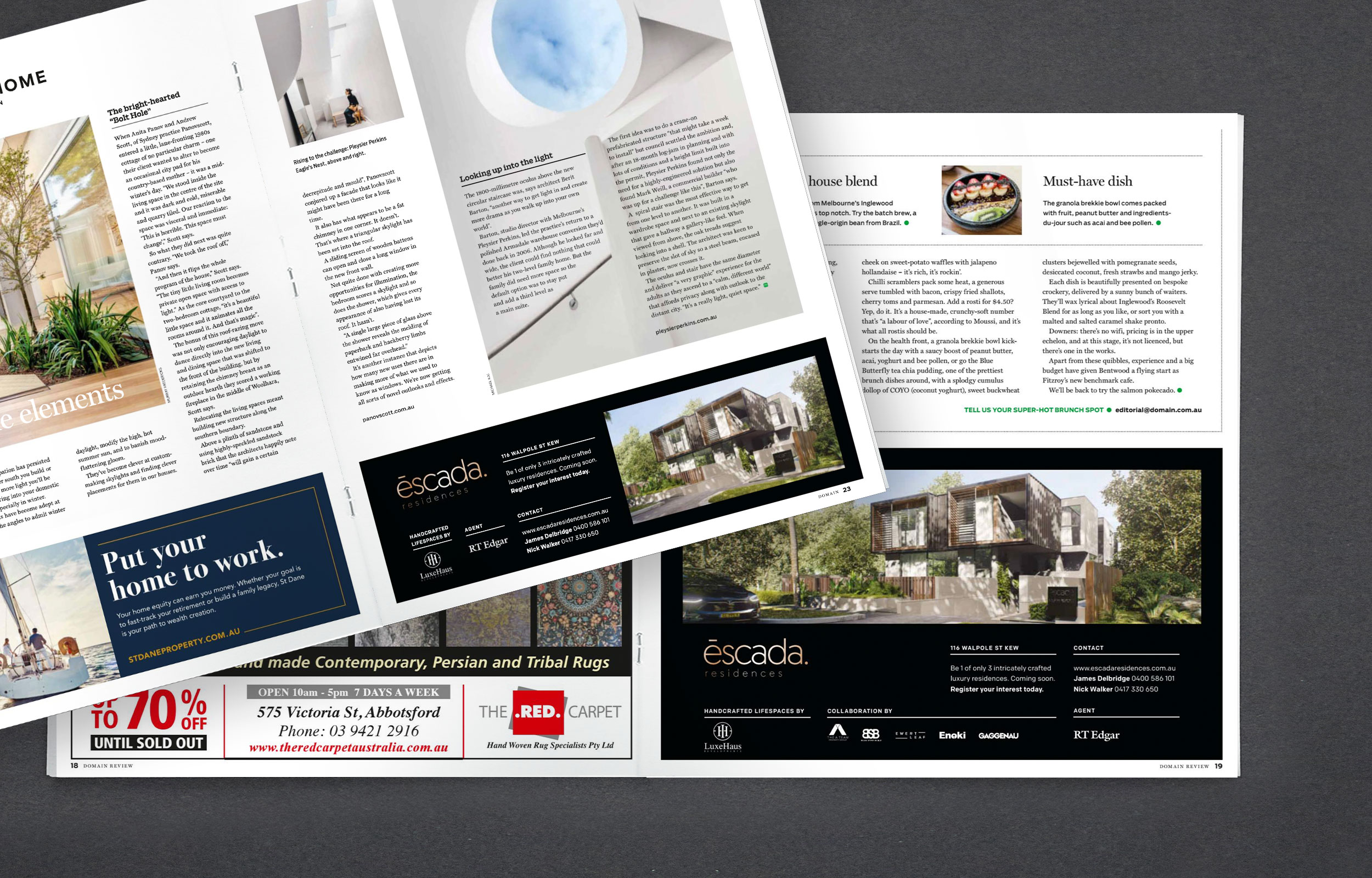
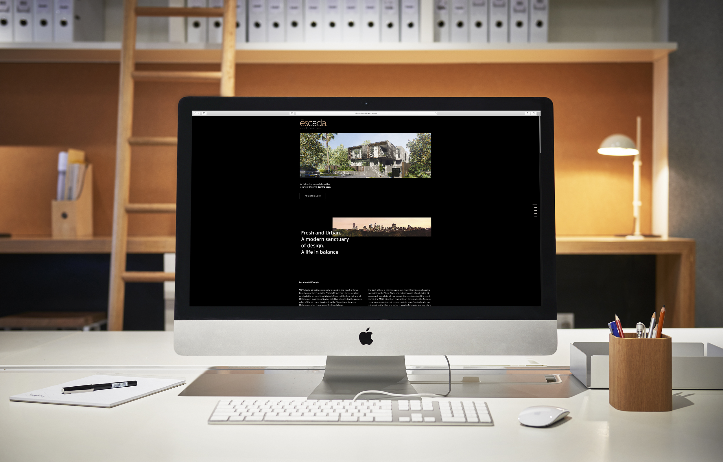
Photographer: Evolved Images
Qualia Residences
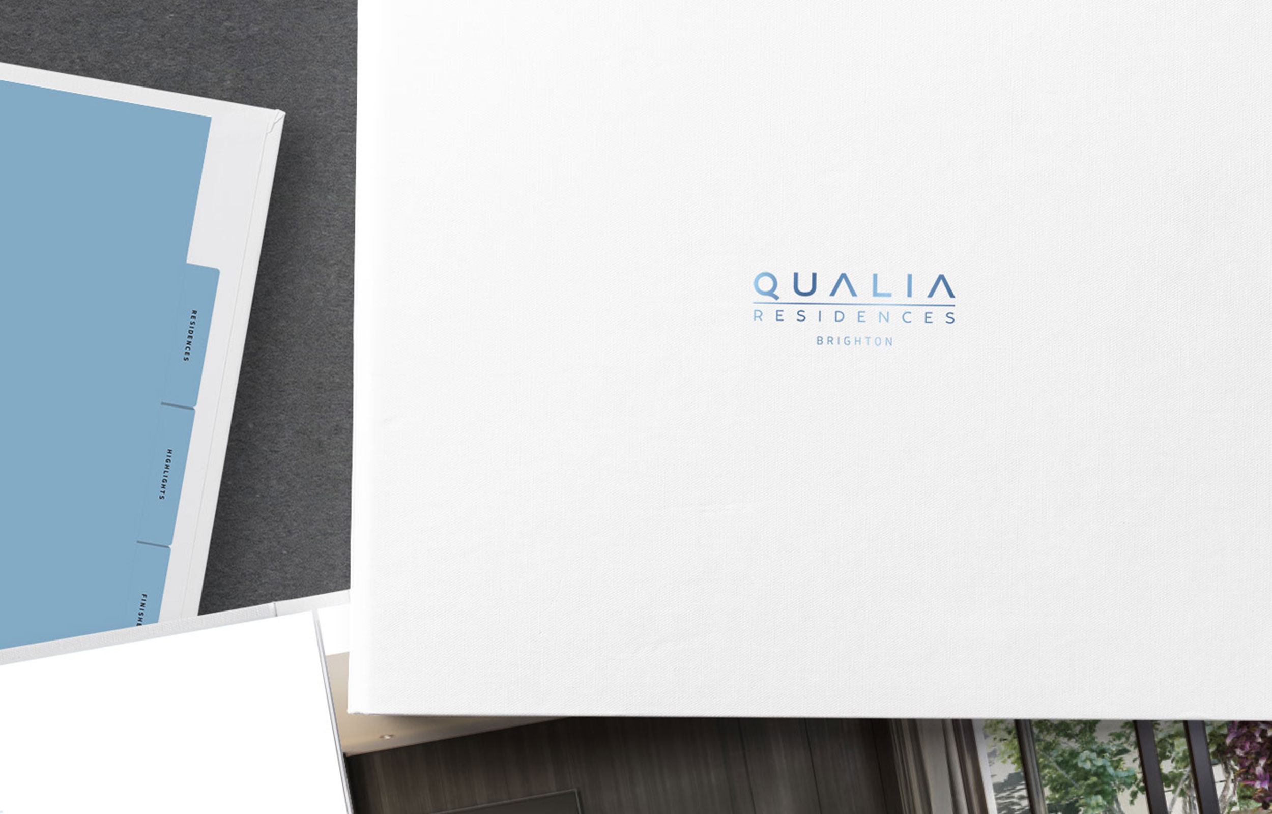
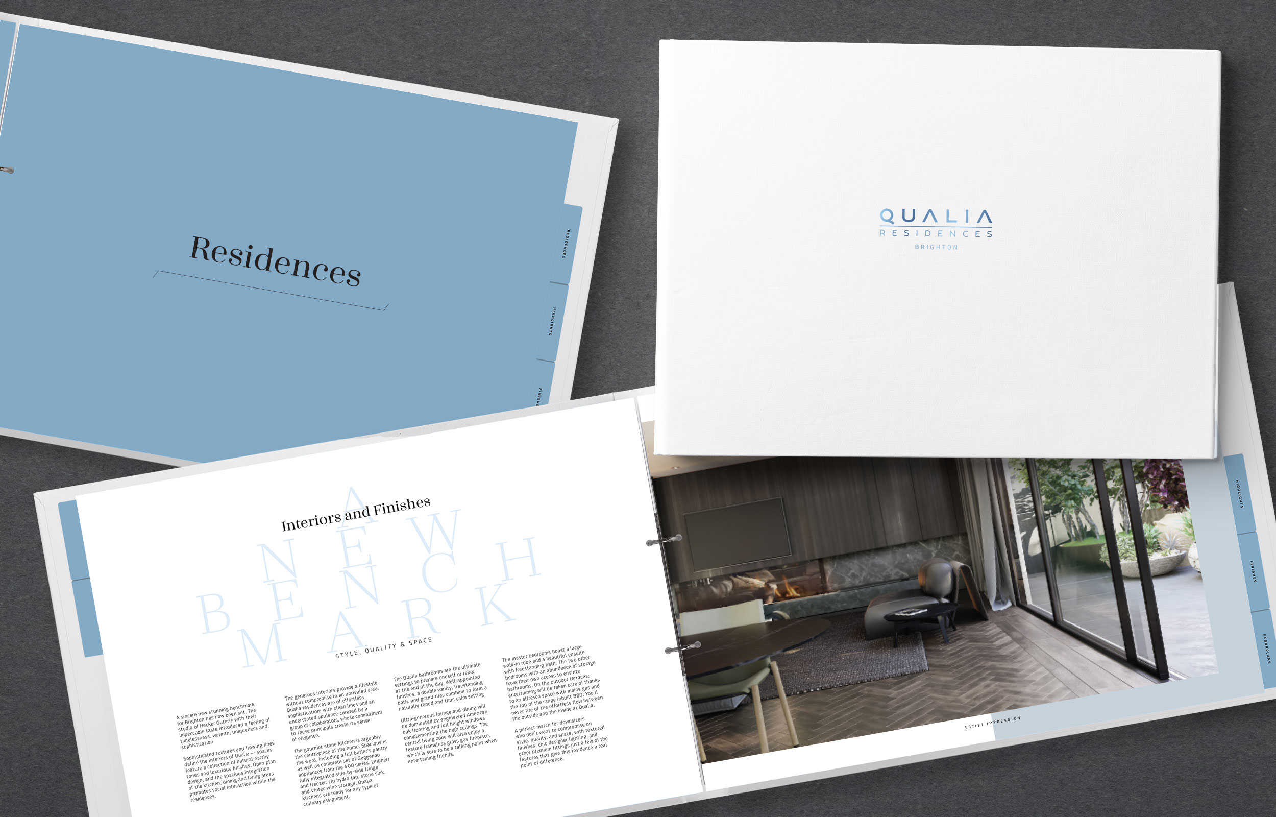
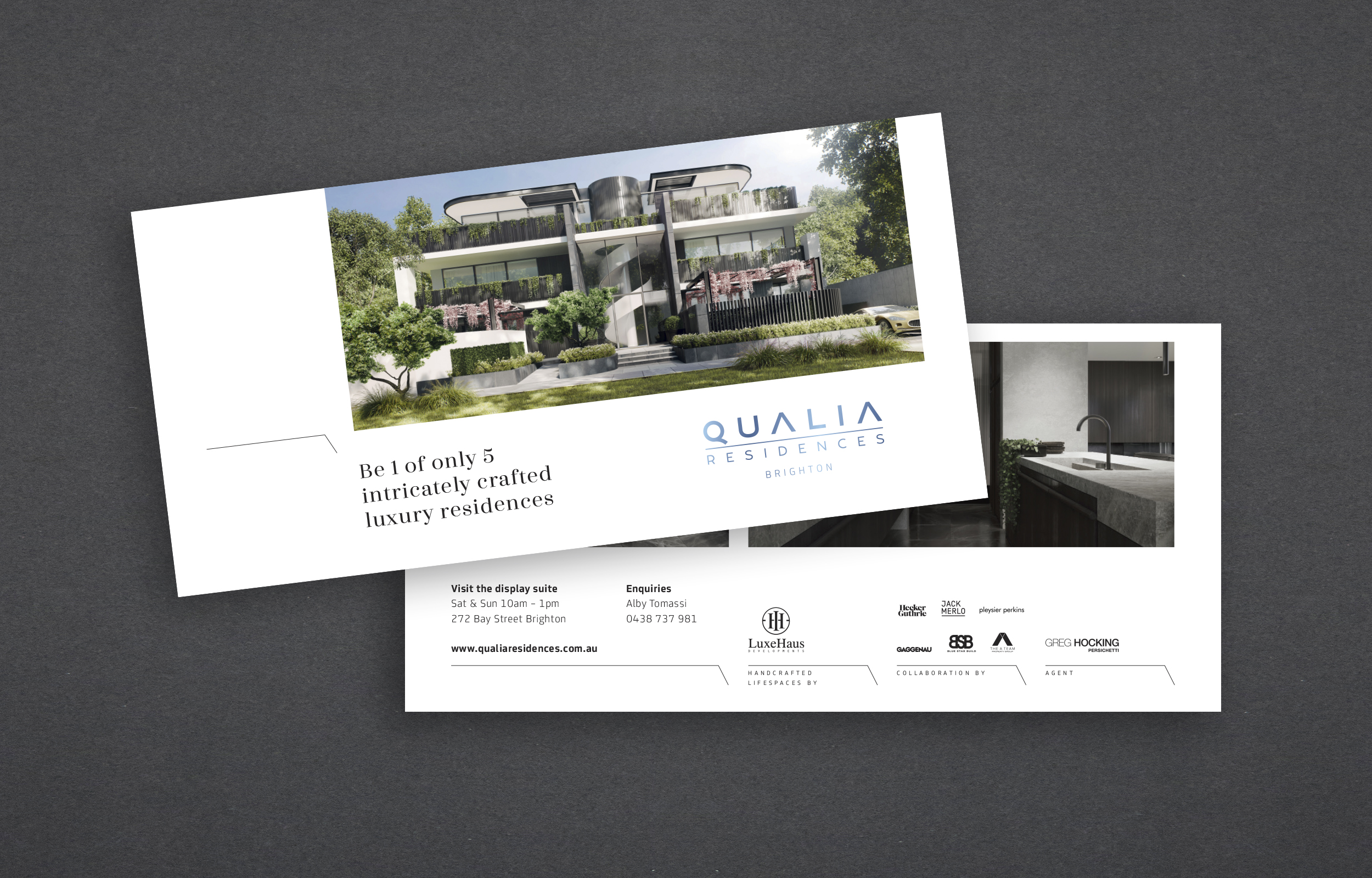
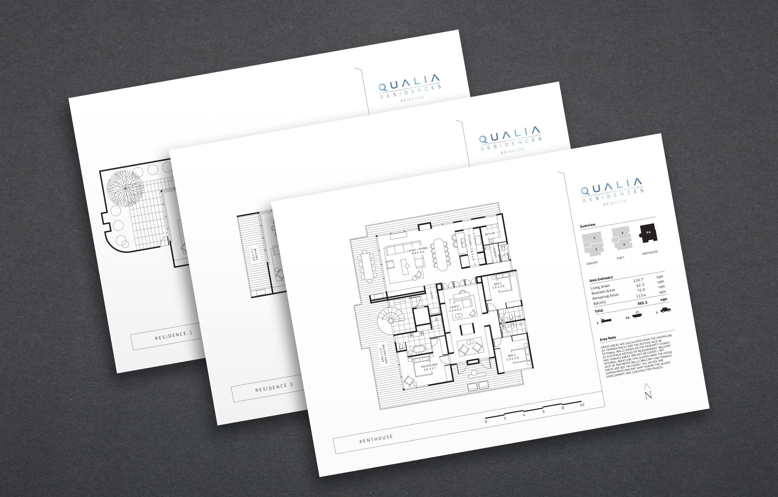
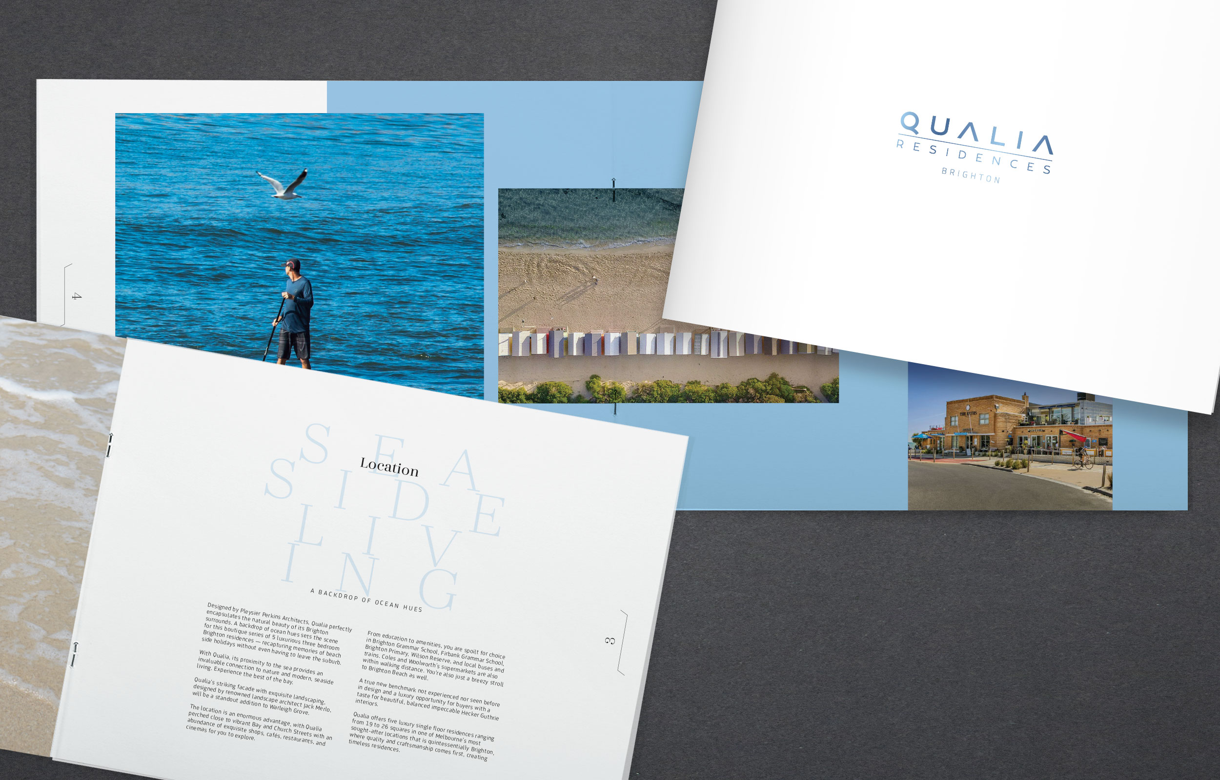
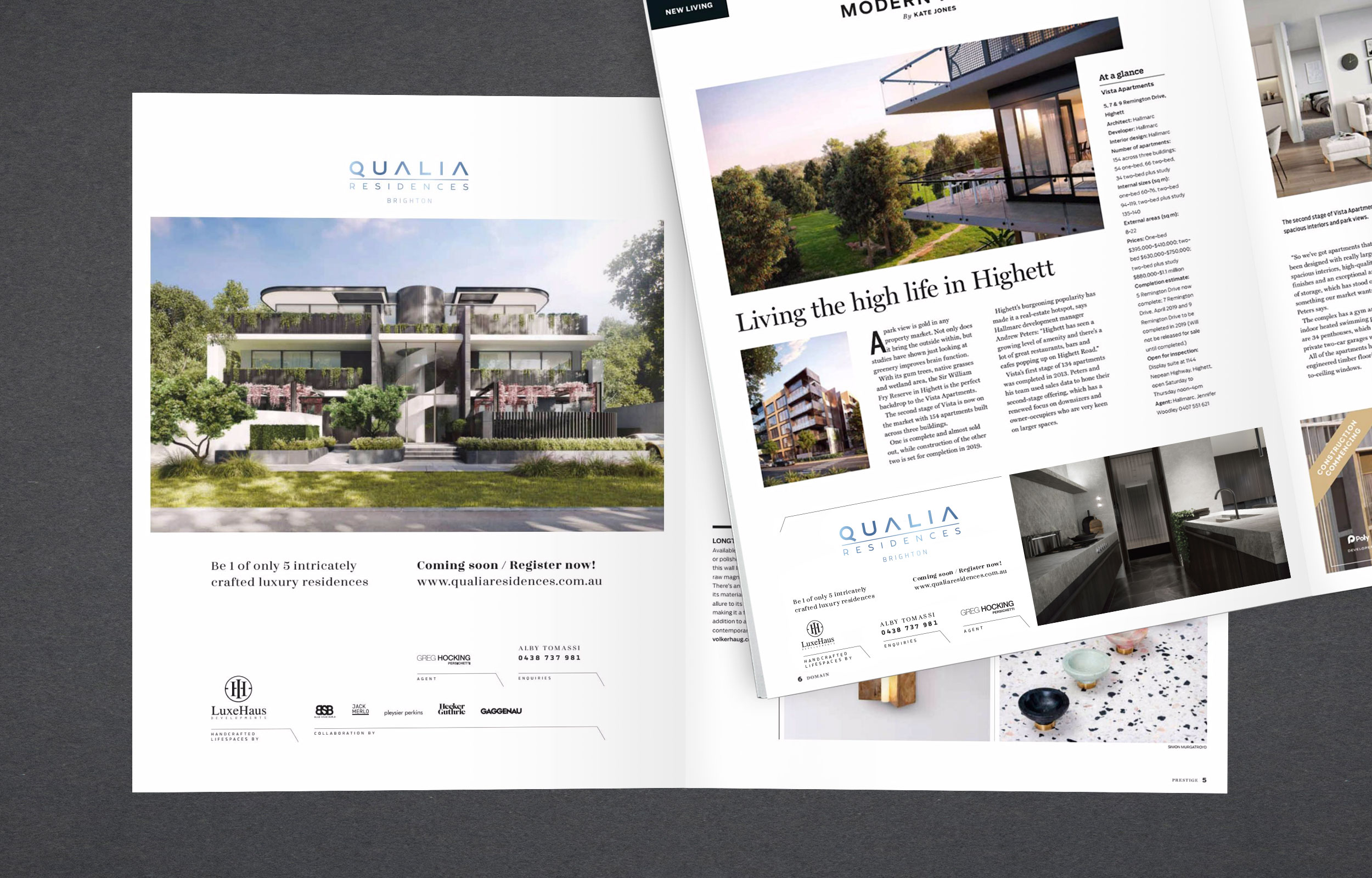
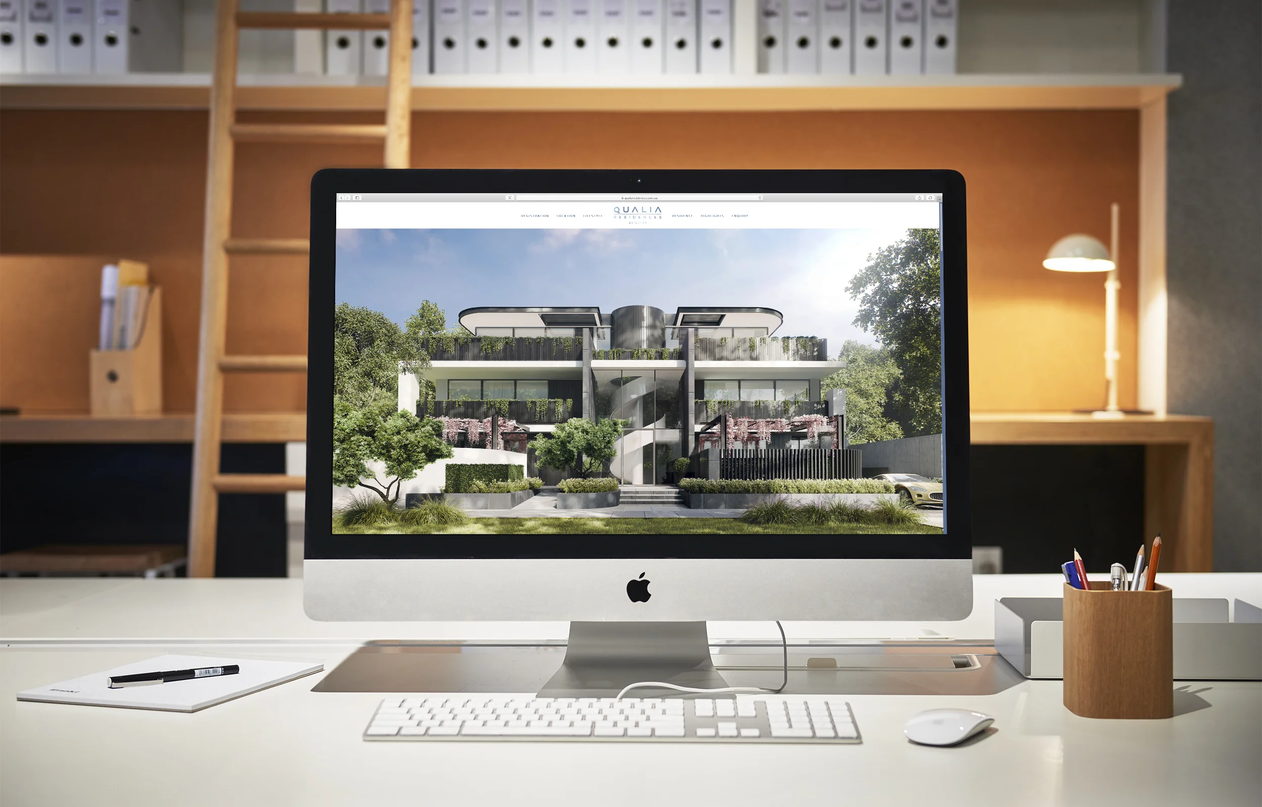
Photographer: Evolved Images
The Flower Hutt
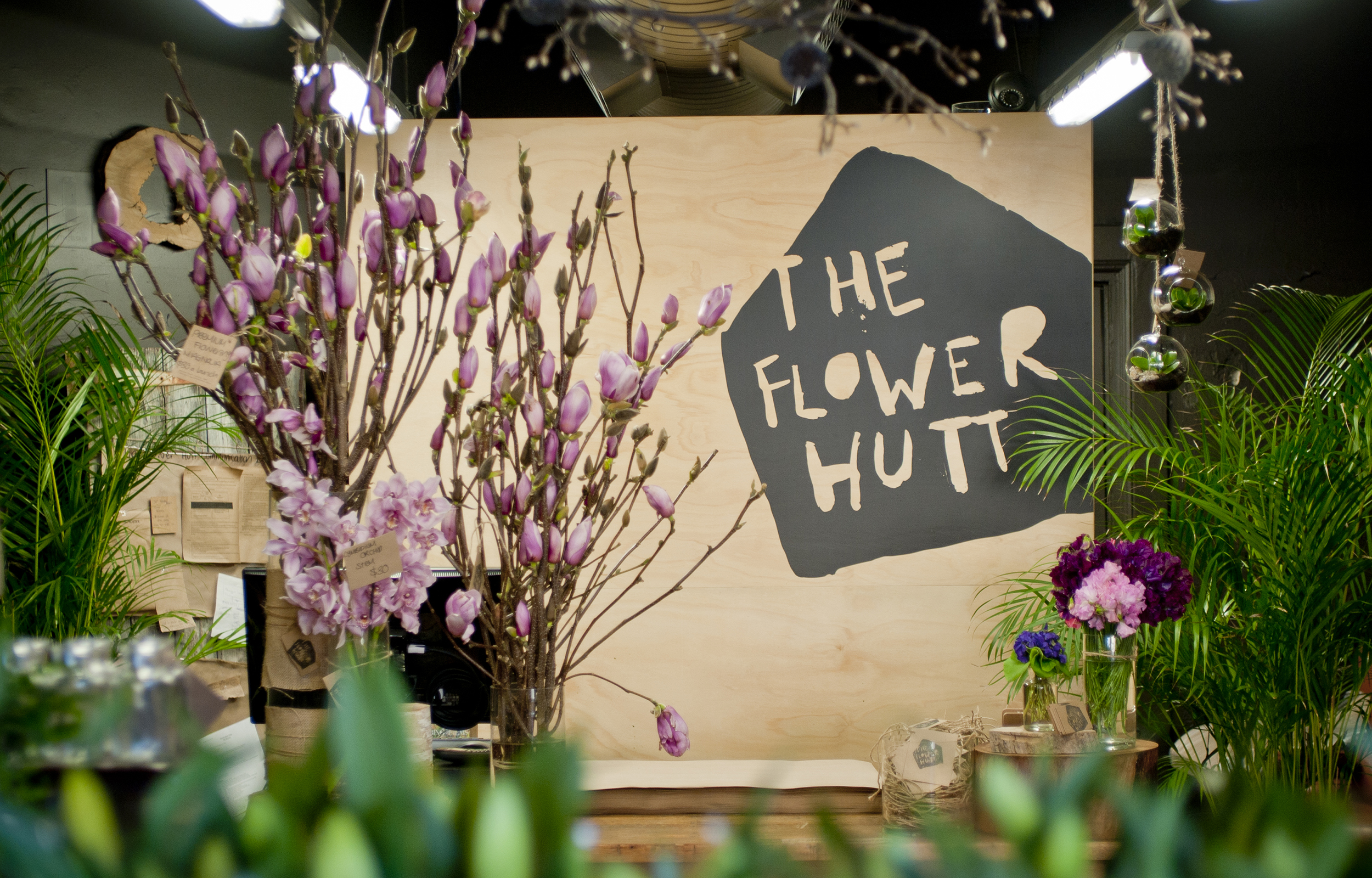
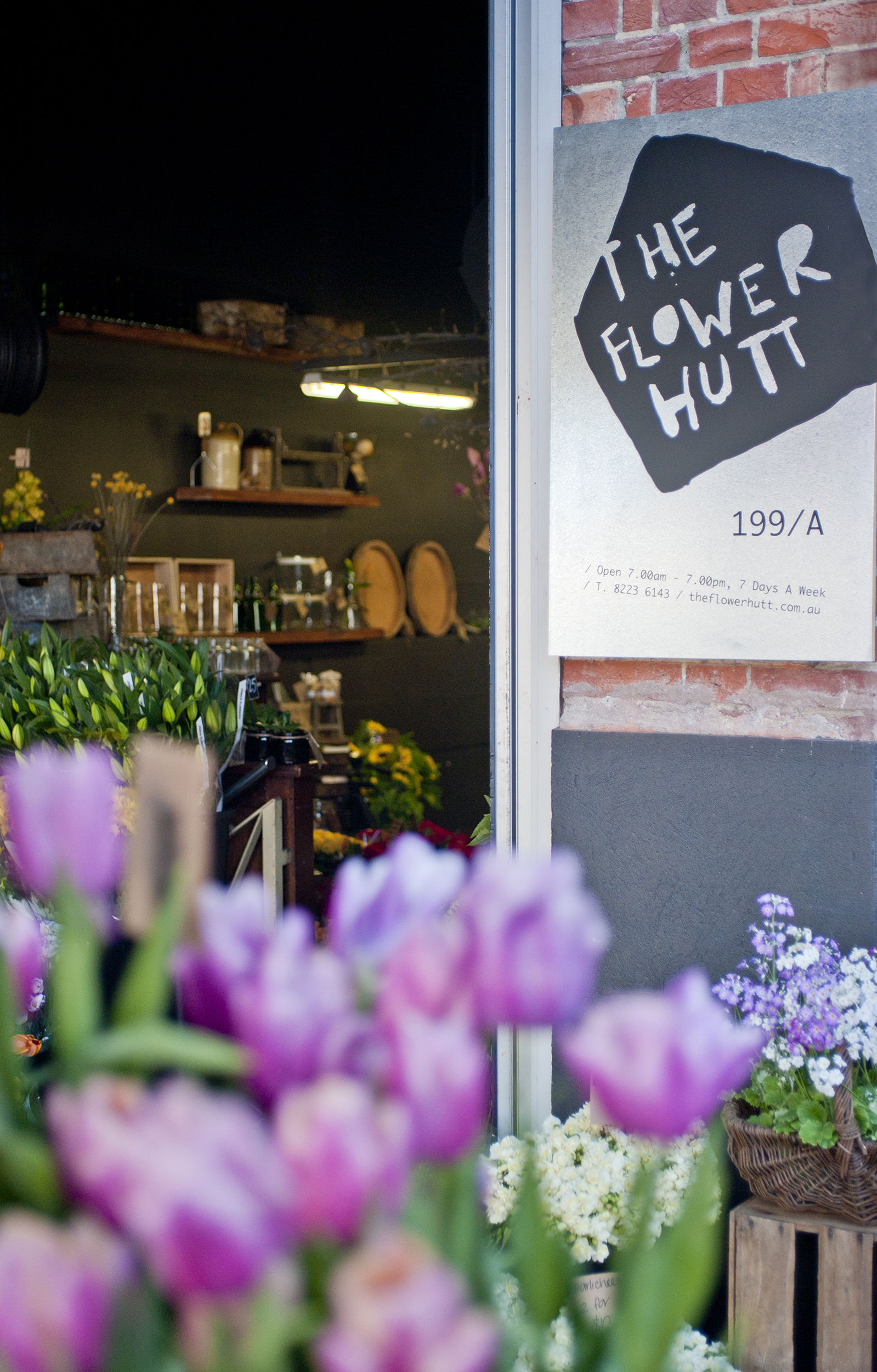
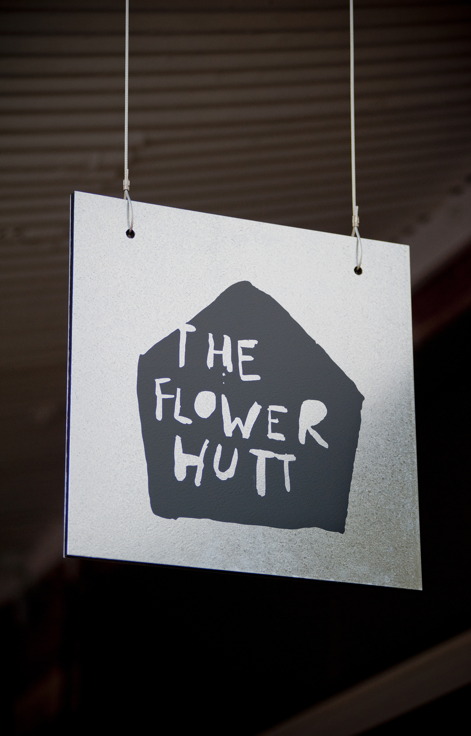
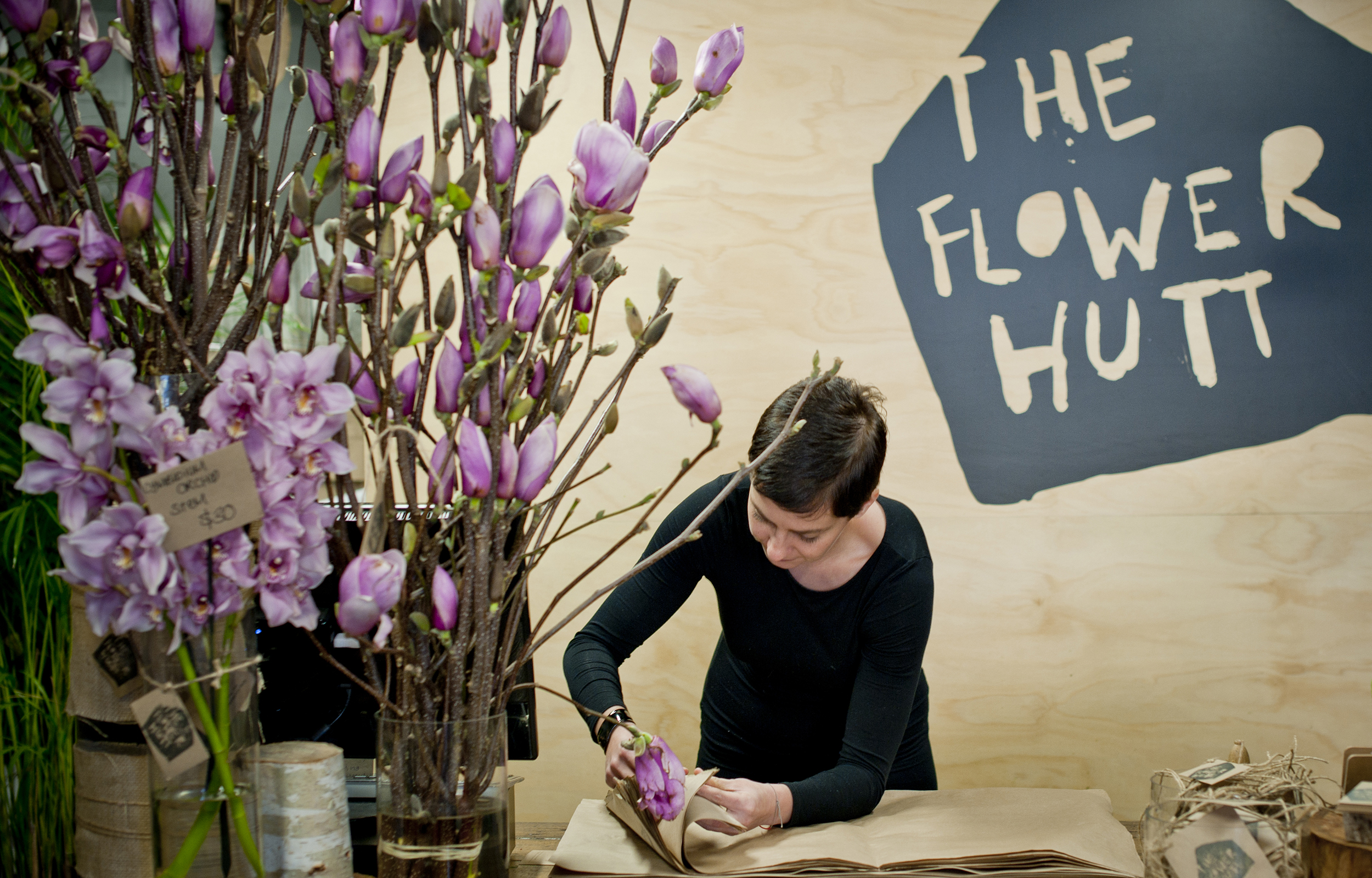
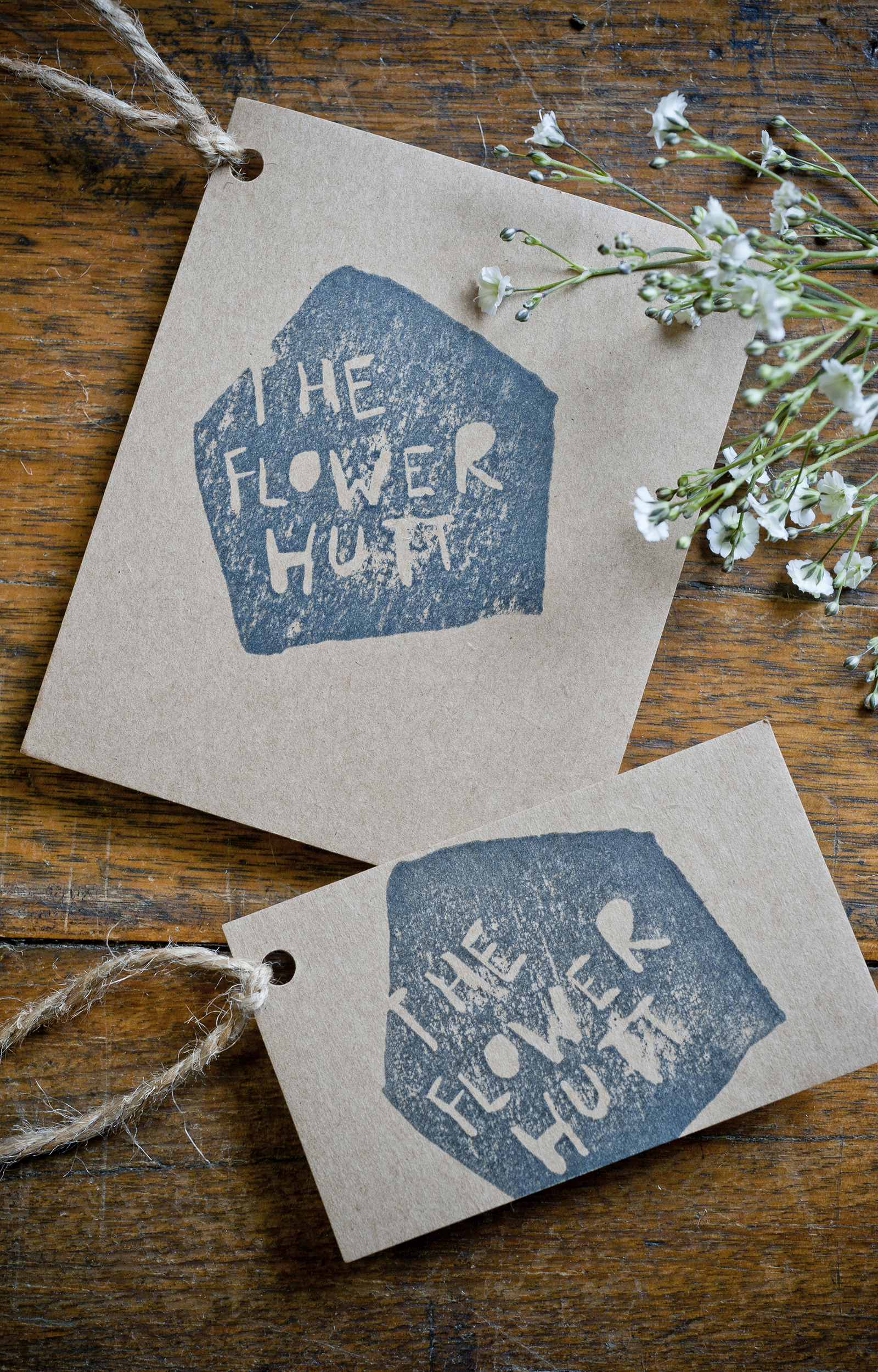
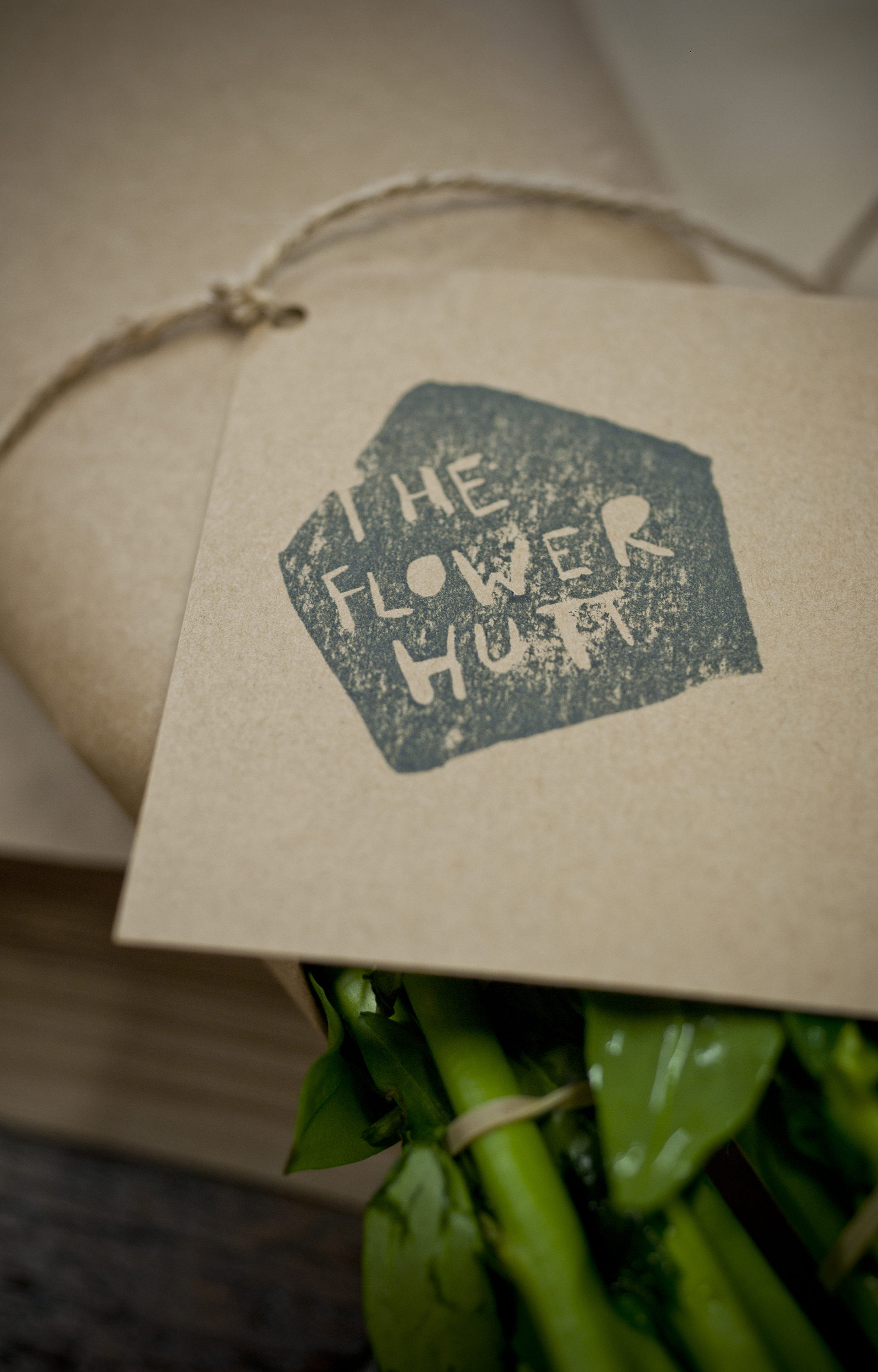
The Flower Hutt, a new flower shop located on Hutt street in Adelaide is based around the idea of a pop-up shop. The client asked for an identity that reflected the raw, handmade aesthetic of a pop up shop, yet was strong and memorable. A stamp was developed featuring rough hand written typography set within a hut shape. The stamp is used throughout the store for business cards, price tags and gift cards.
Photographer: Evolved Images
AEEC Signage
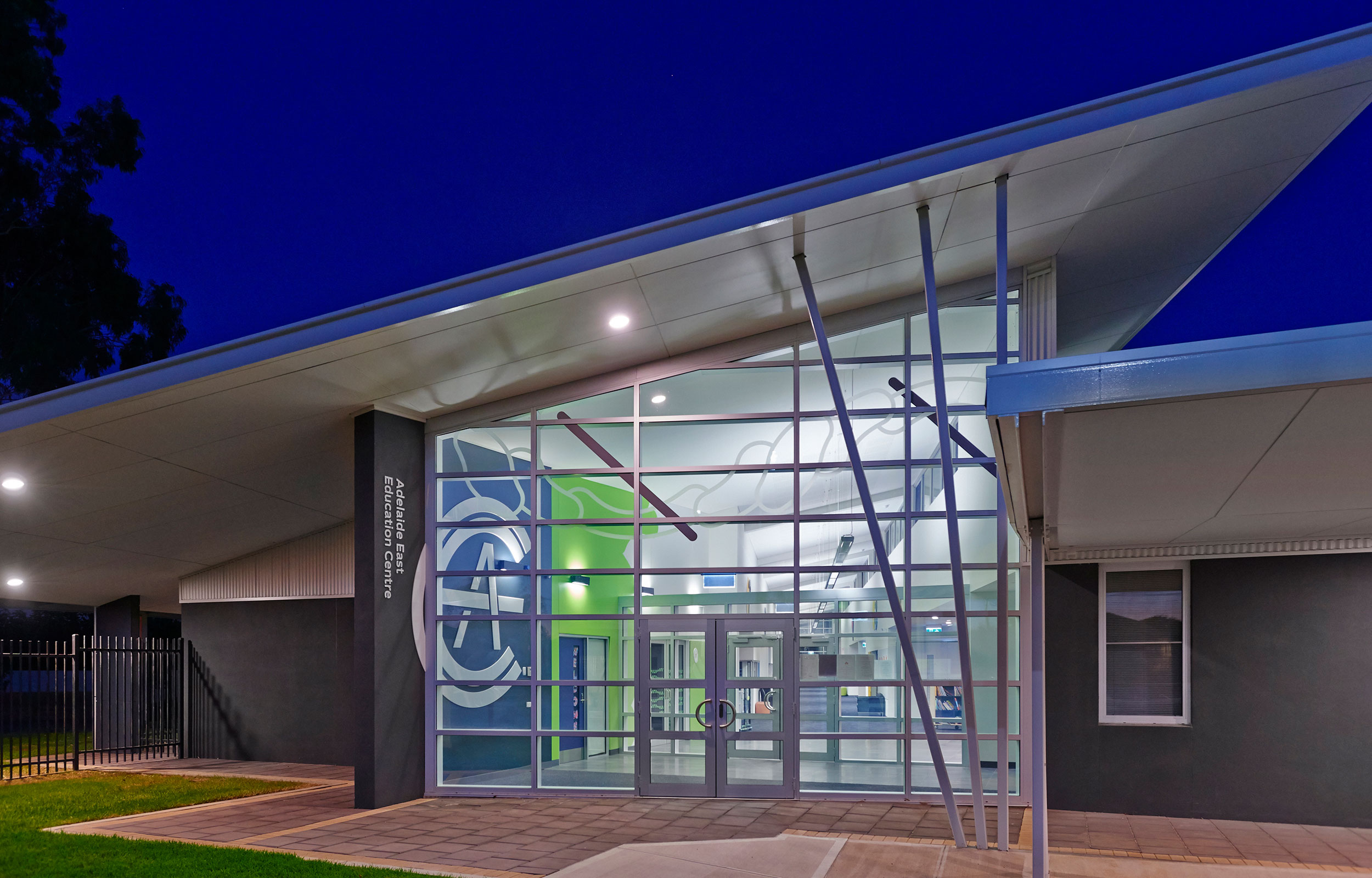
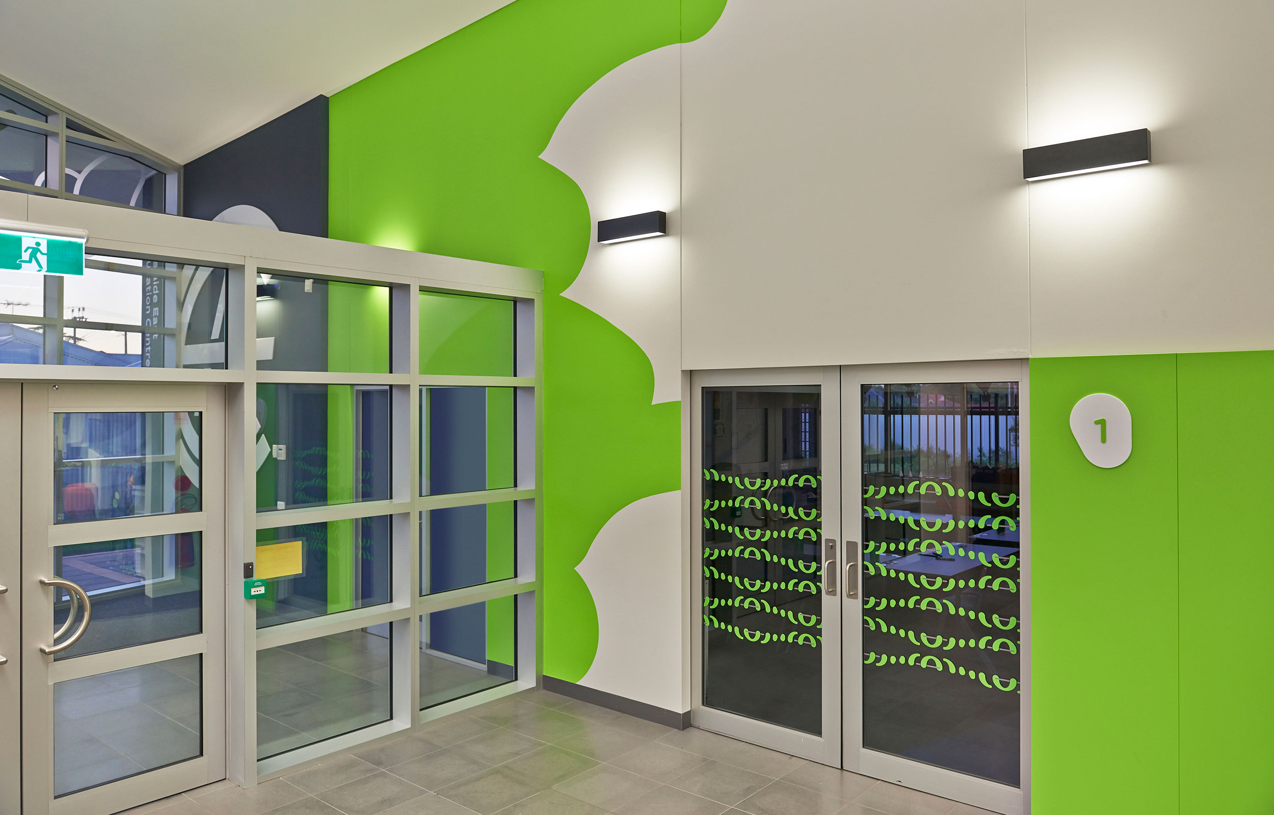
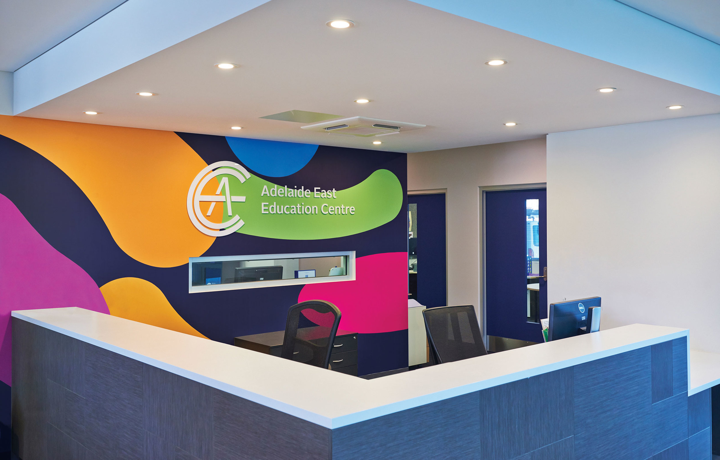

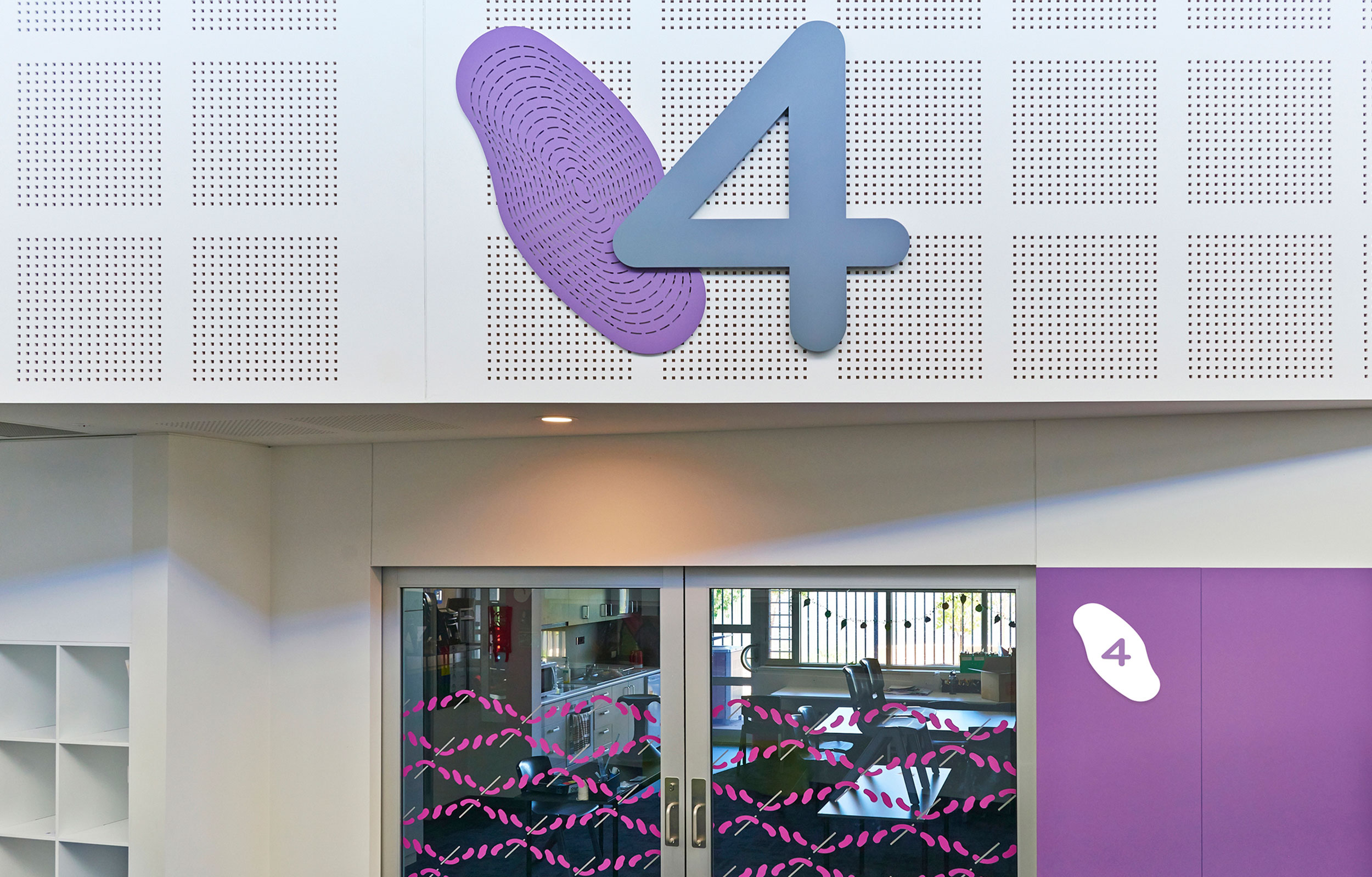
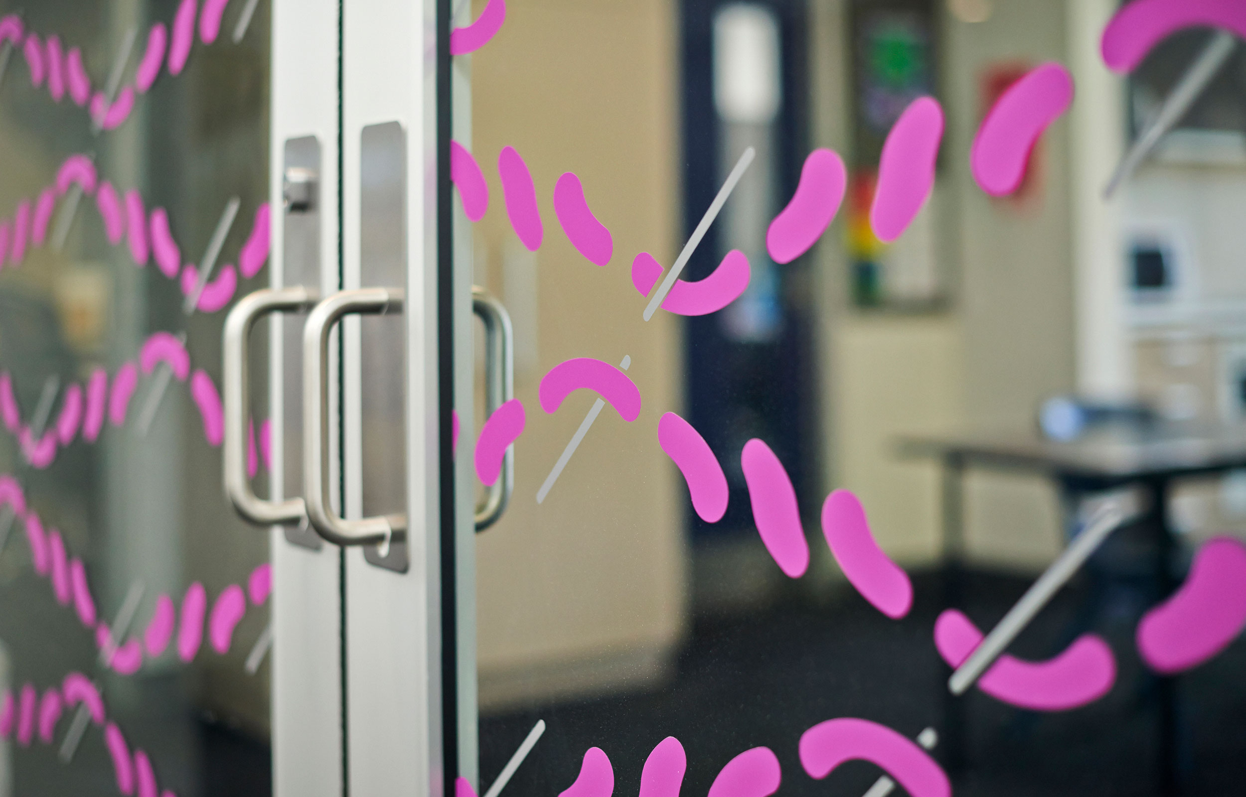
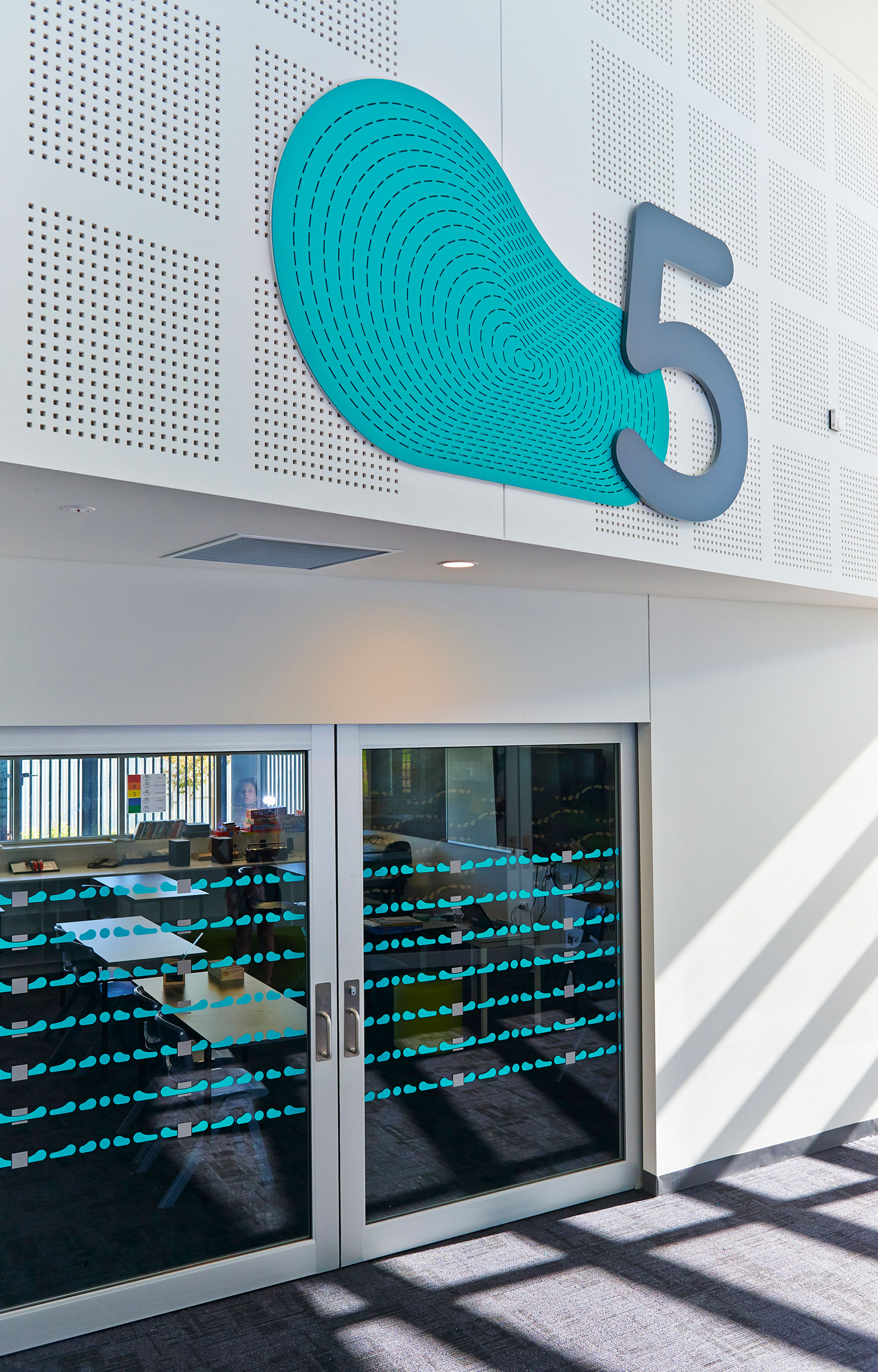
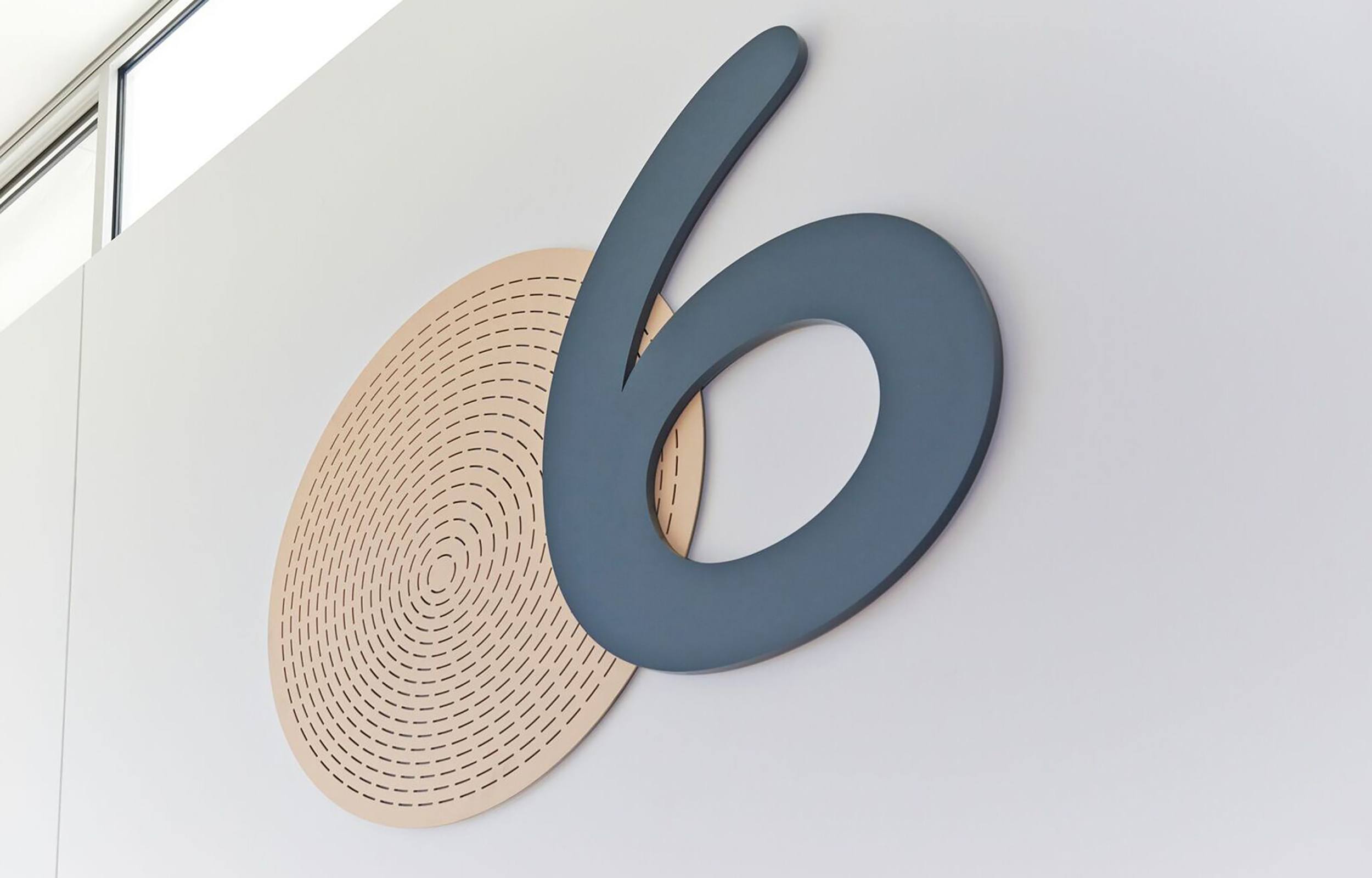

The Adelaide East Education Centre is a learning centre for children with learning difficulties. The brand is typographic and celebrates the close knit community that the school provides for students, carers and teachers. The environmental graphics depict problem solving from a broad perspective given that the children at the school learn in different ways. There are 8 class rooms each with its own problem solving graphic. Each graphic includes an obstacle and an energised abstract form that animates itself under over or around the obstacle. Bright colours were chosen to add life to the clinical white internal spaces of the building. The energised abstract forms work well in a series of large scale environmental graphics and instant wayfinding signage. The school is an uplifting environment that has filled its students with a new enthusiasm. Those that experience the school have displayed a positive attitude and look forward to developing a strong happy school community.
Photographer: Evolved Images
Enoki Studio
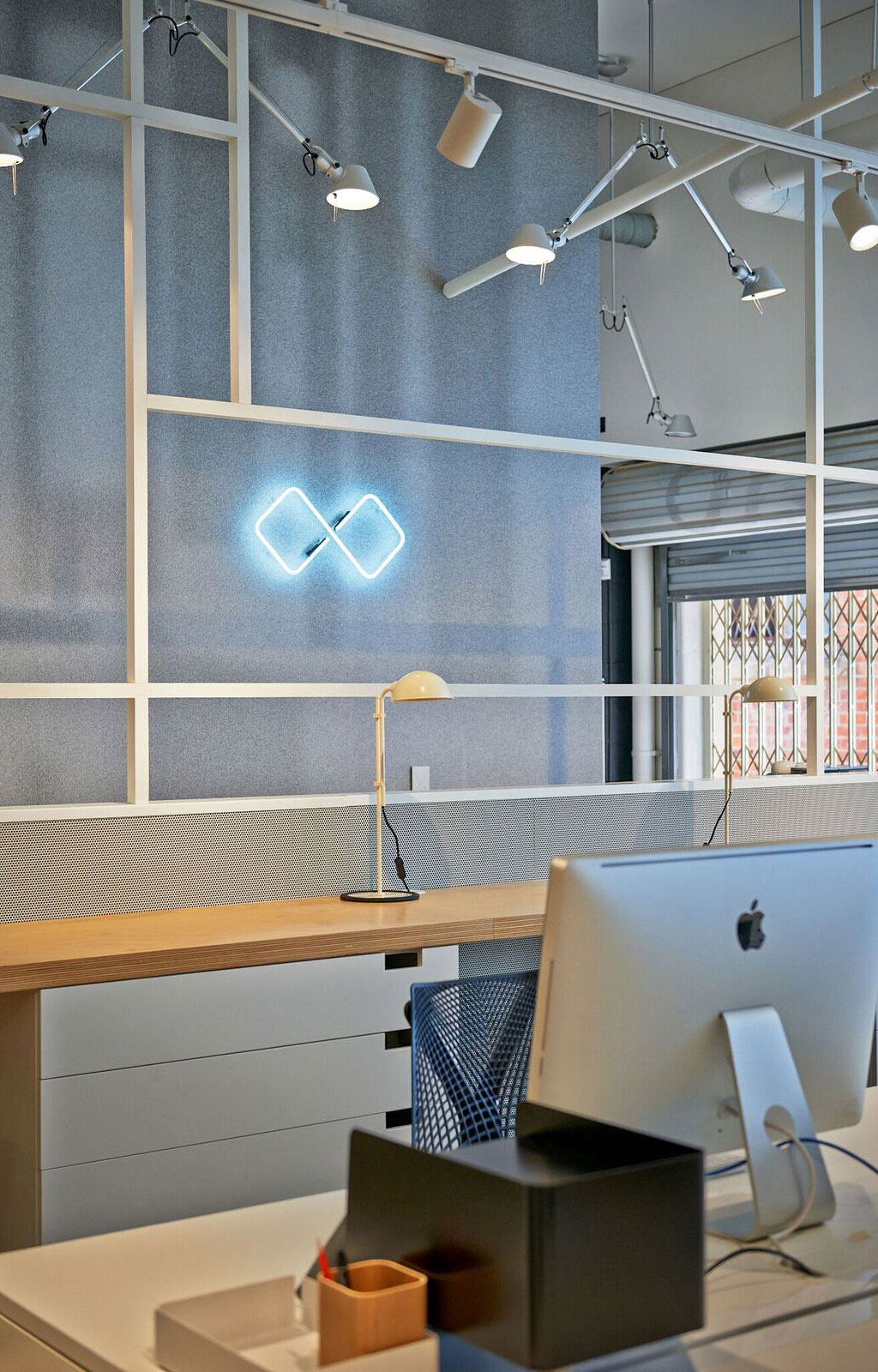
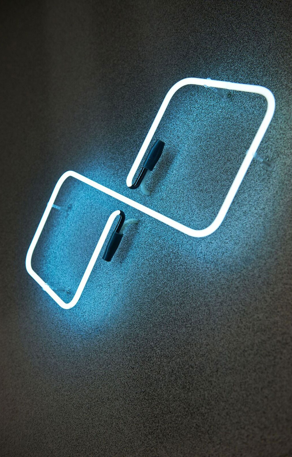
Photographer: Evolved Image
KW Cornerstore
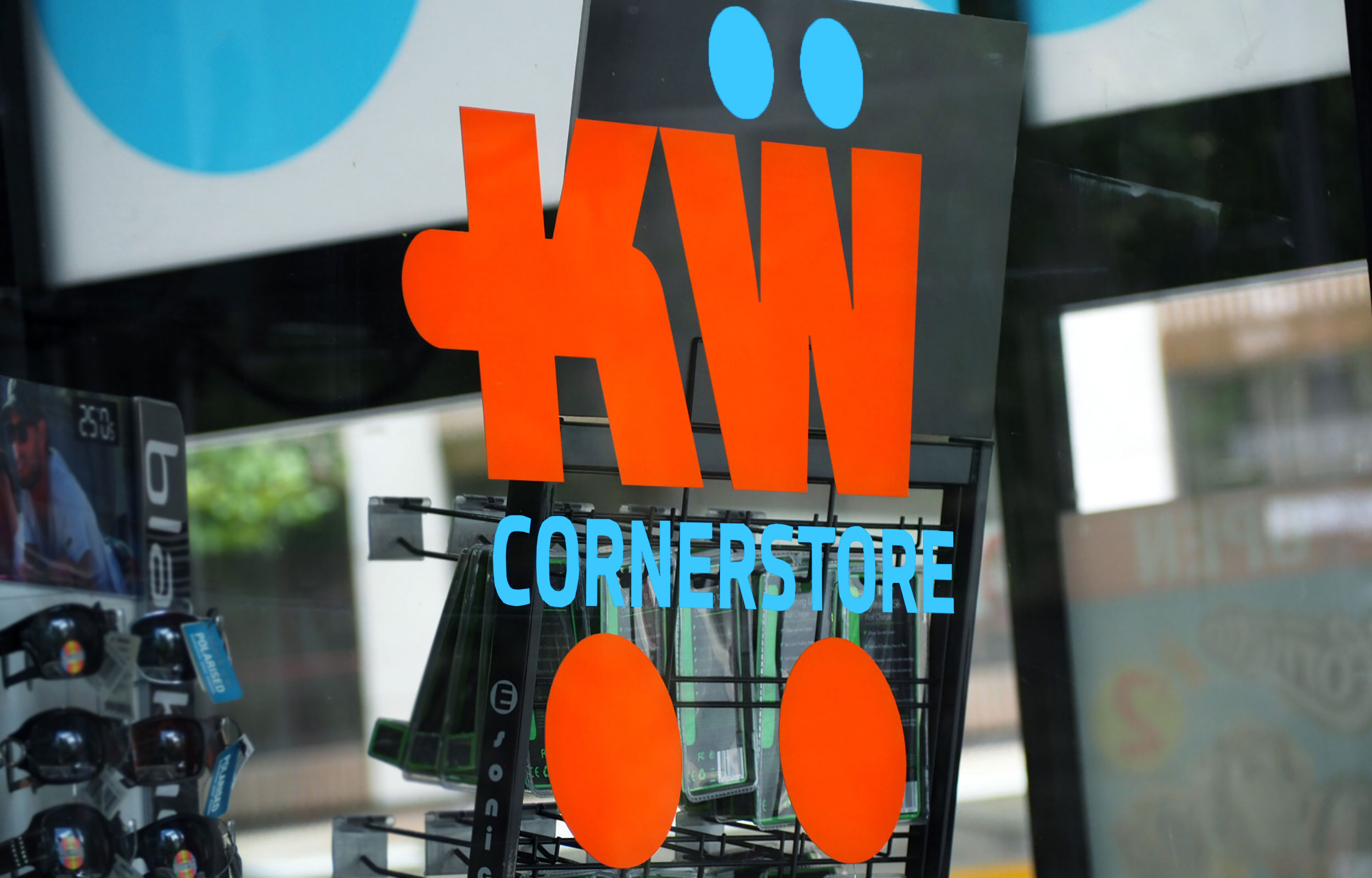
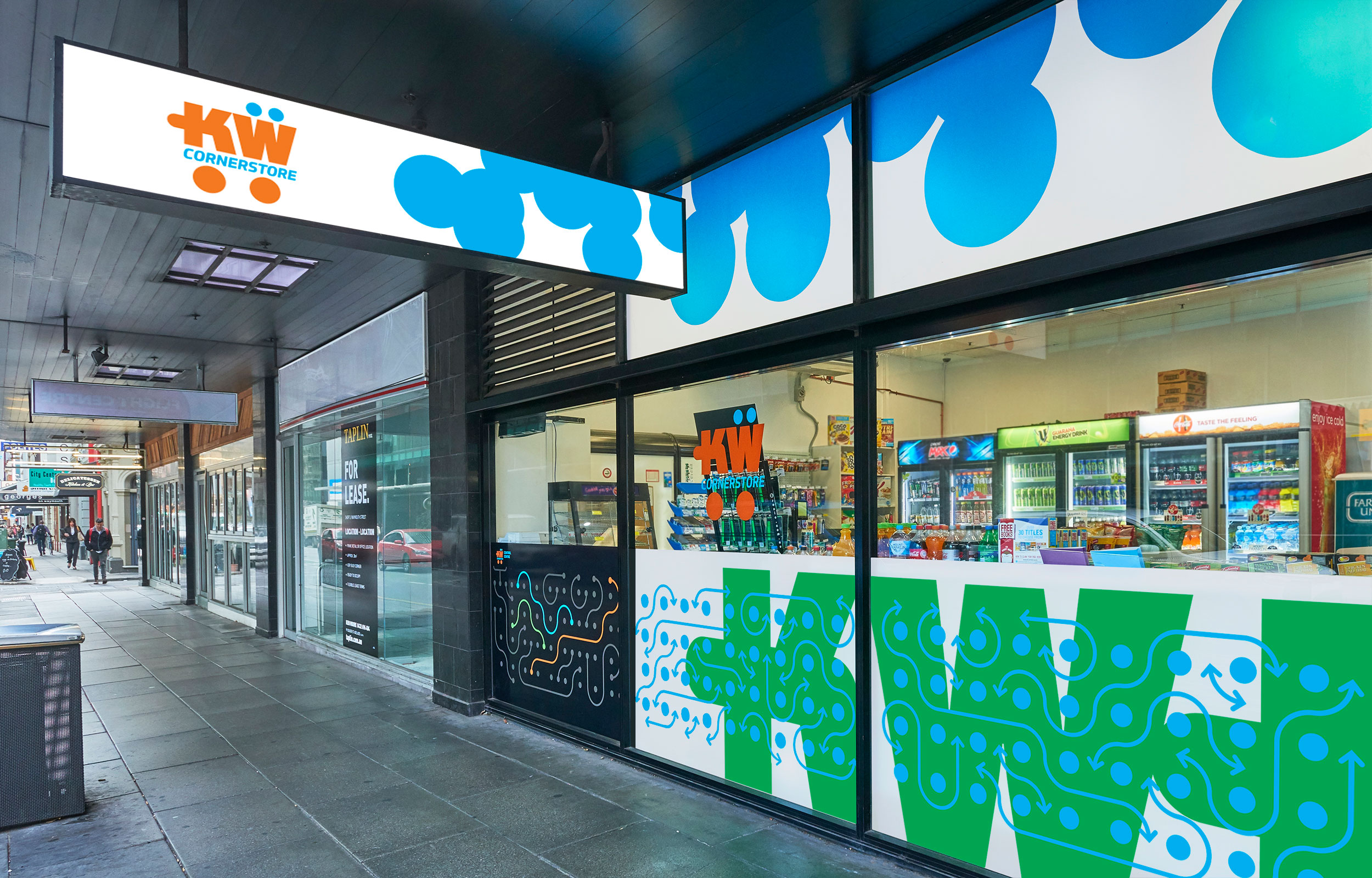
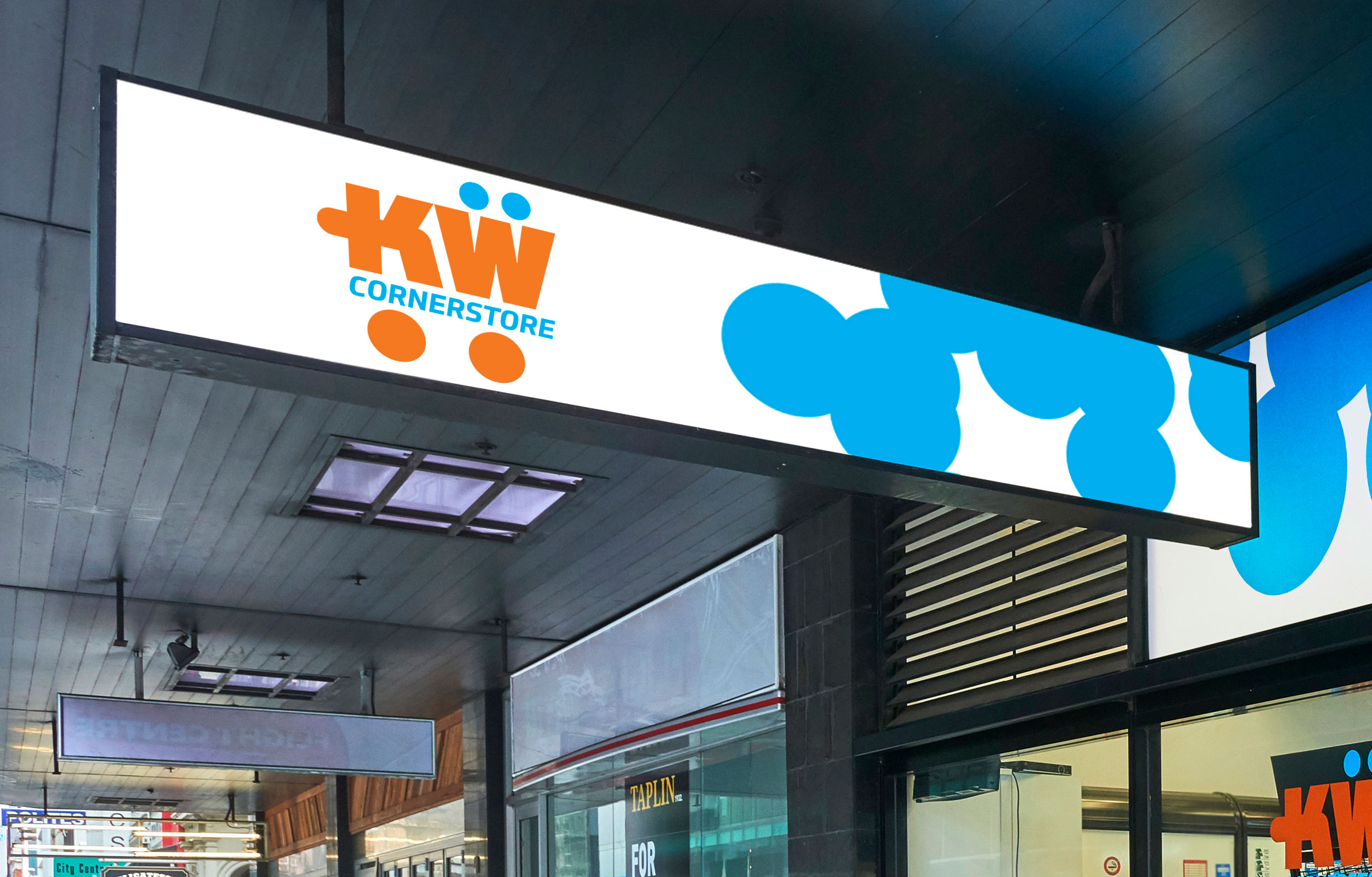
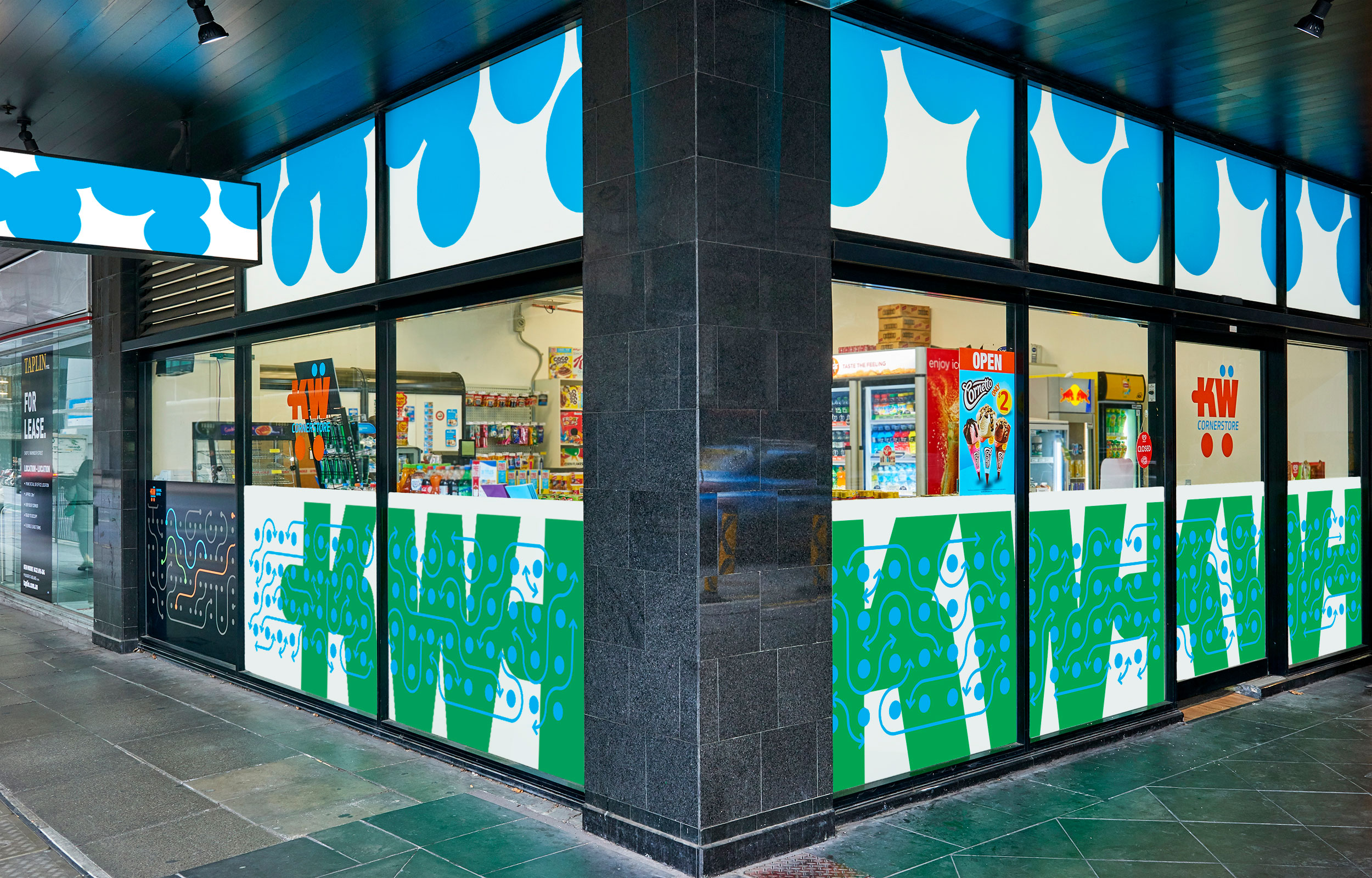
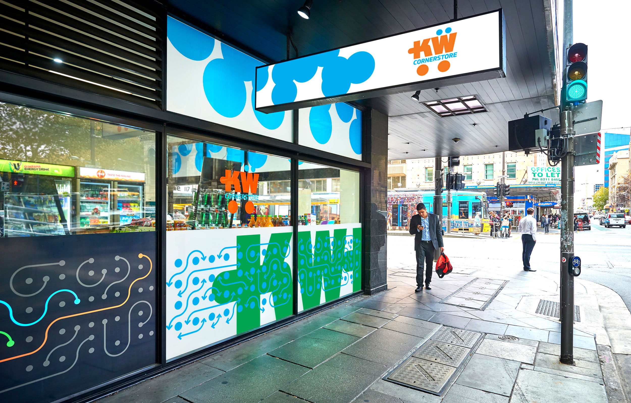
Enoki embraced this opportunity to create a fun brand among the throng of less than inspiring convenience store brands on a busy inner city intersection. Essentially a word mark, the logo loosely depicts a shopping trolley and the theme of mobility to communicate the on-the-go nature of the shop. The underlying arrow and circle graphic represents busy people stopping by KW Cornerstore on their way around the city.
Photographer: Evolved Images
The Foodstore
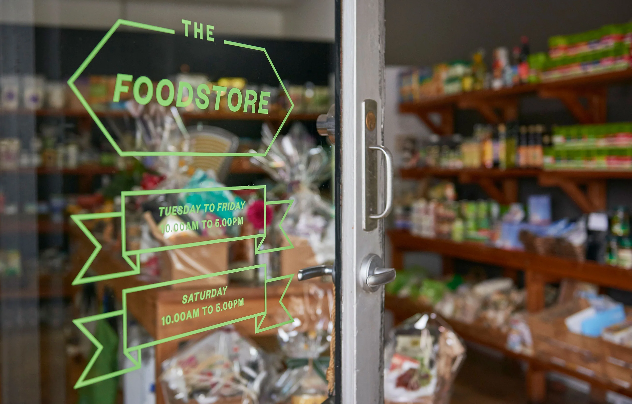
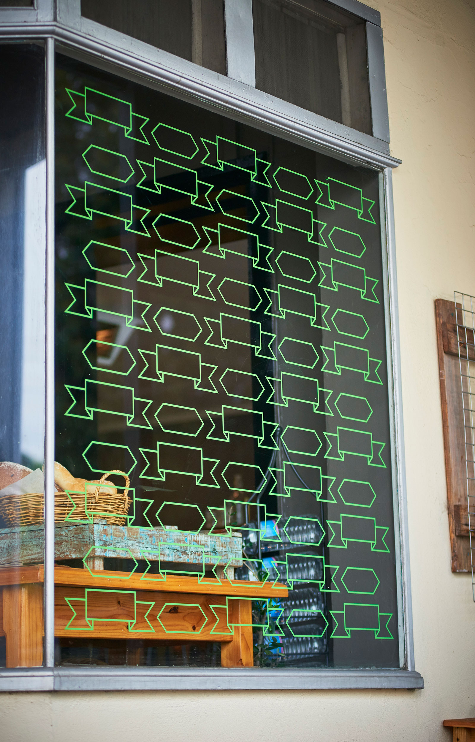
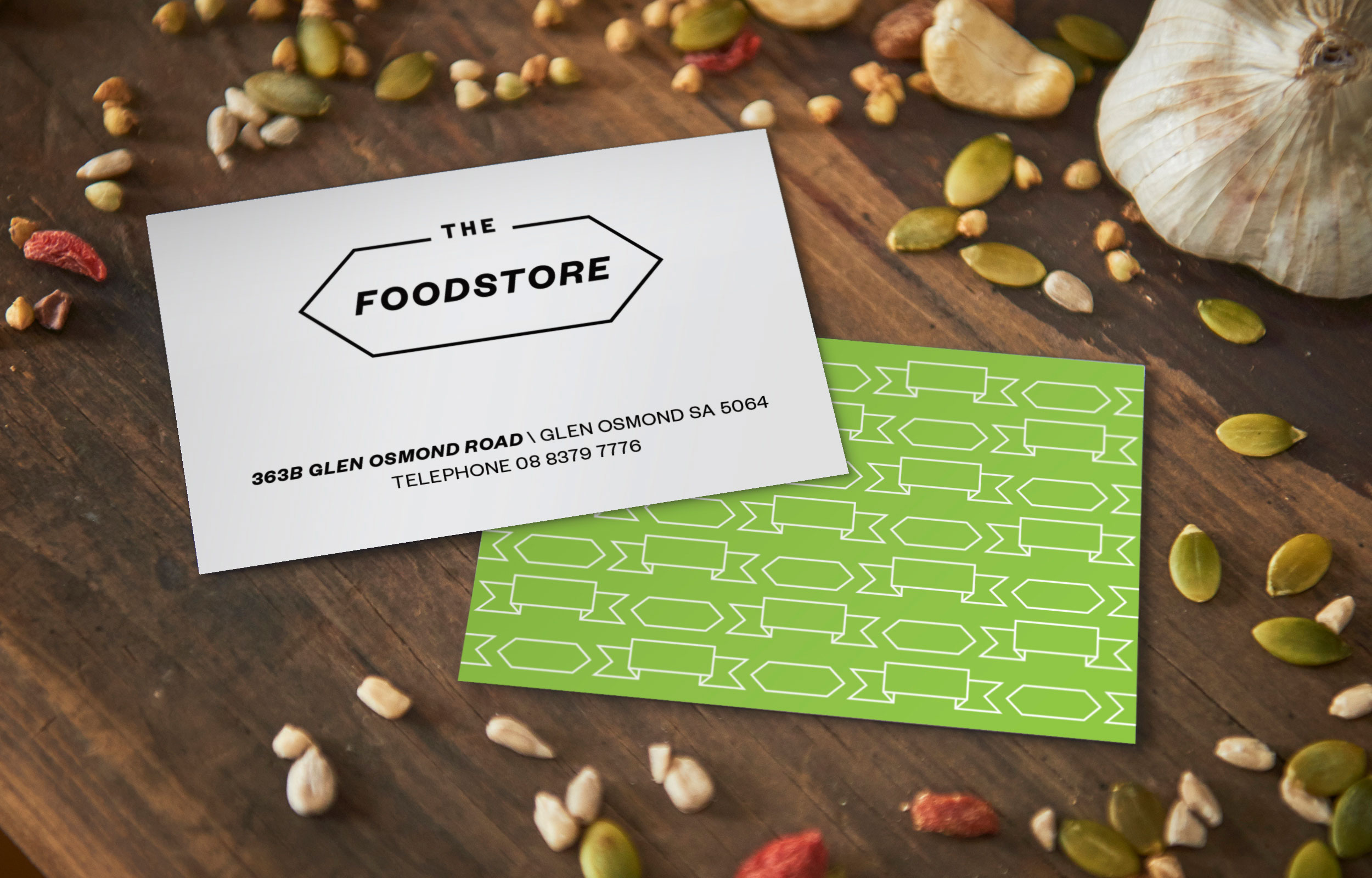
Photographer: Evolved Images
Green Bites

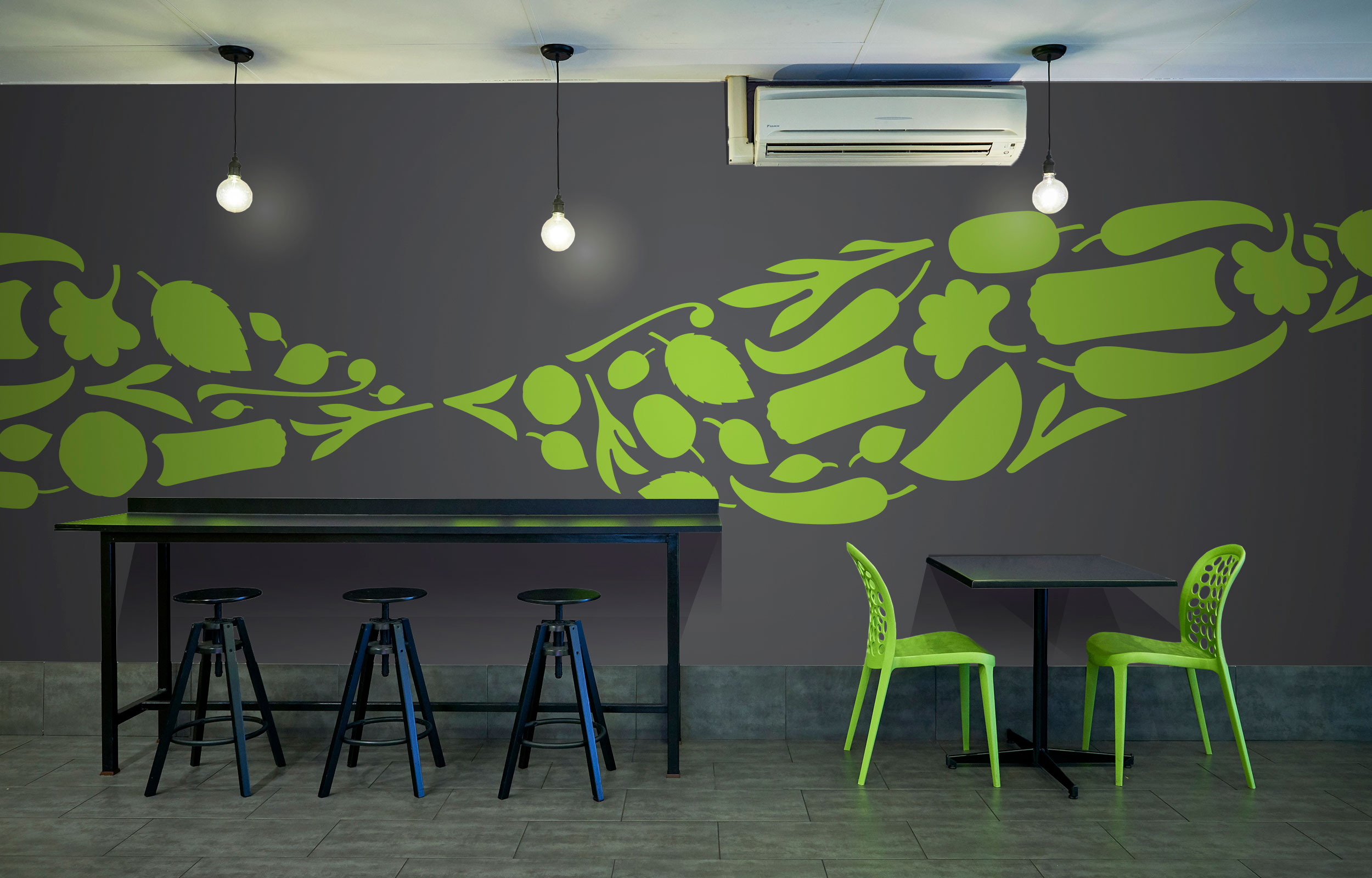
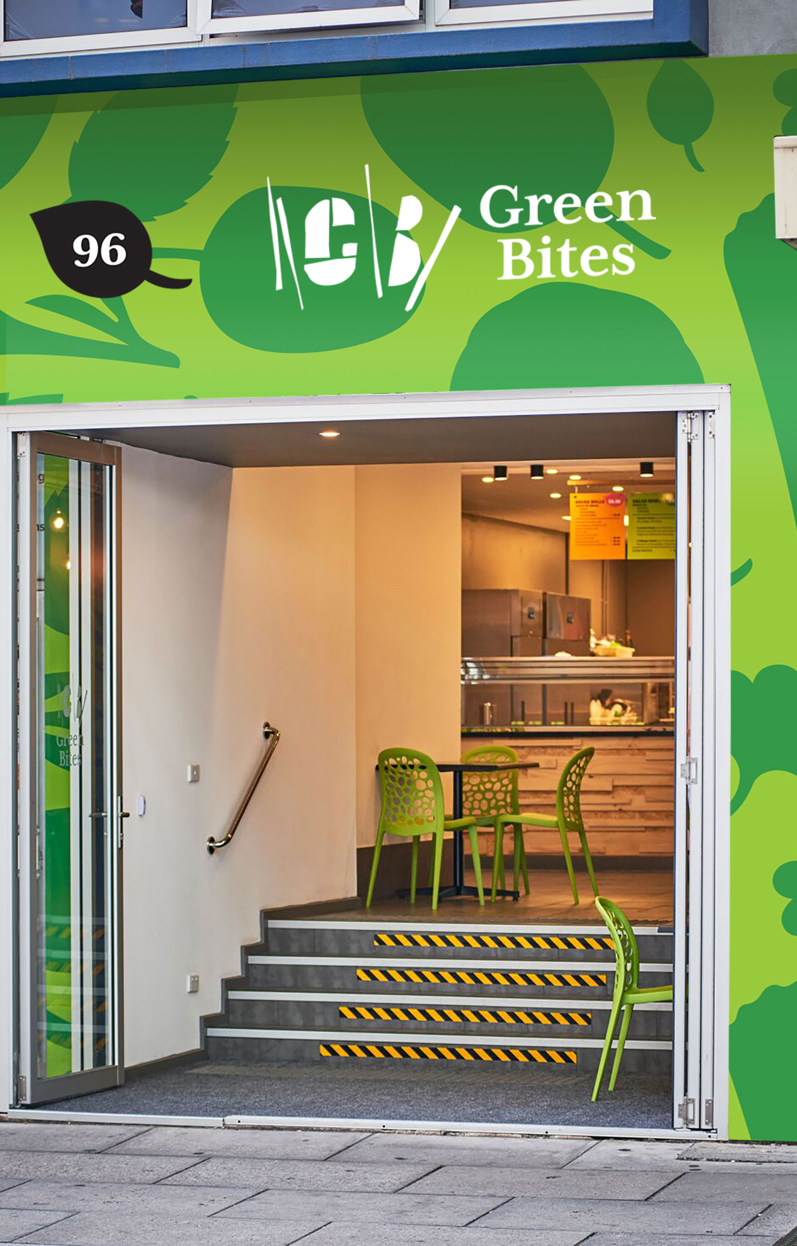
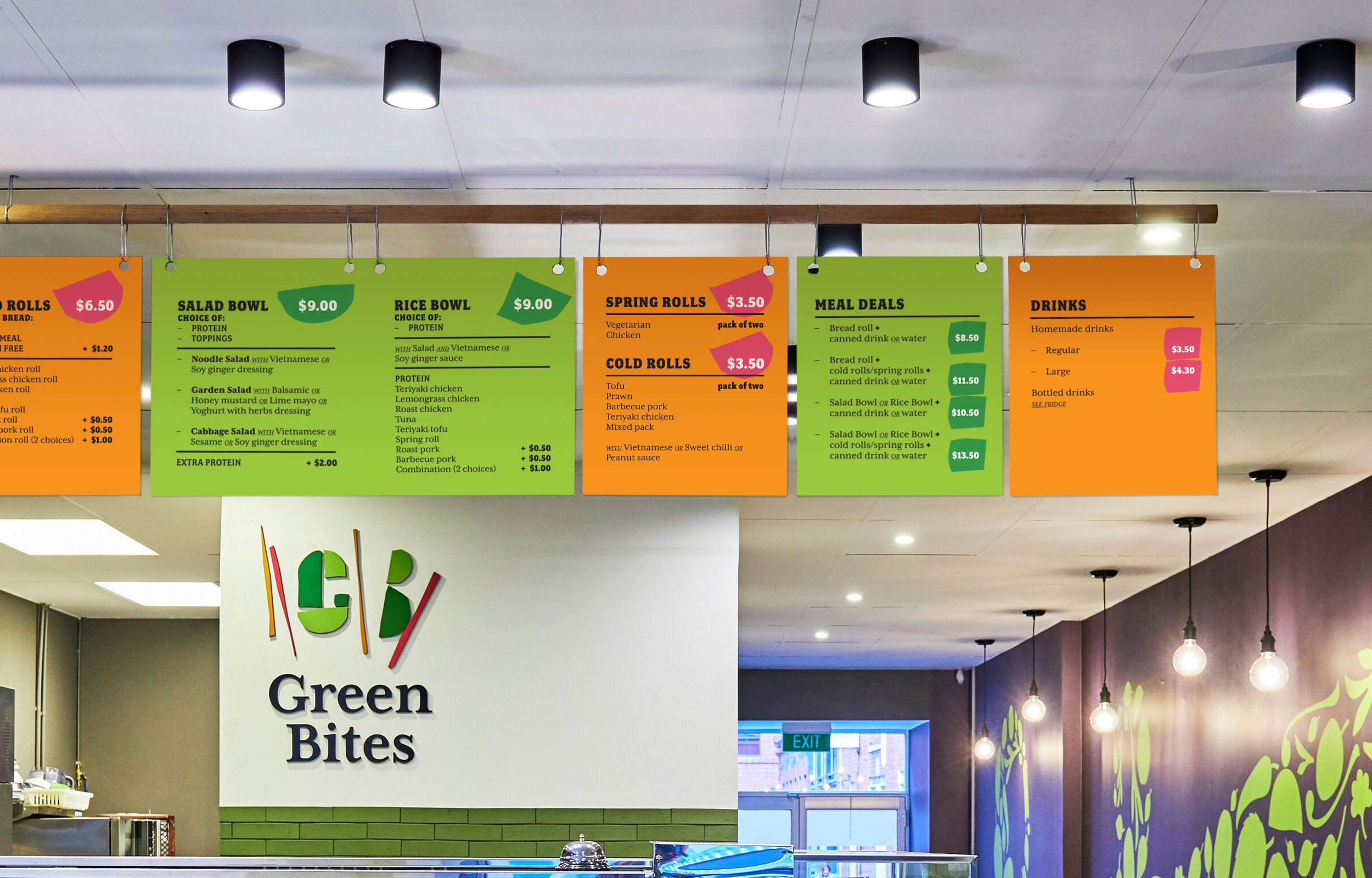
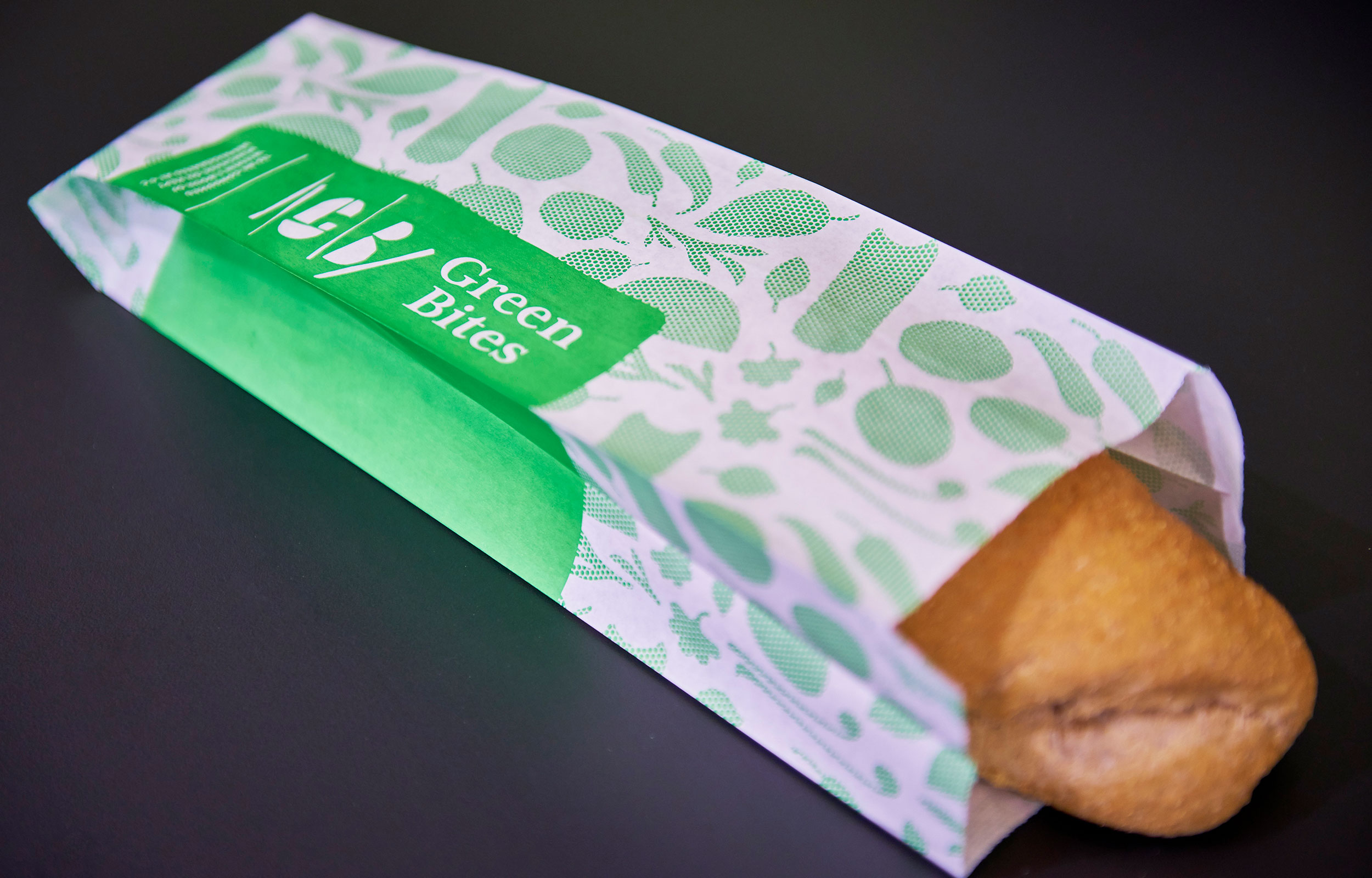
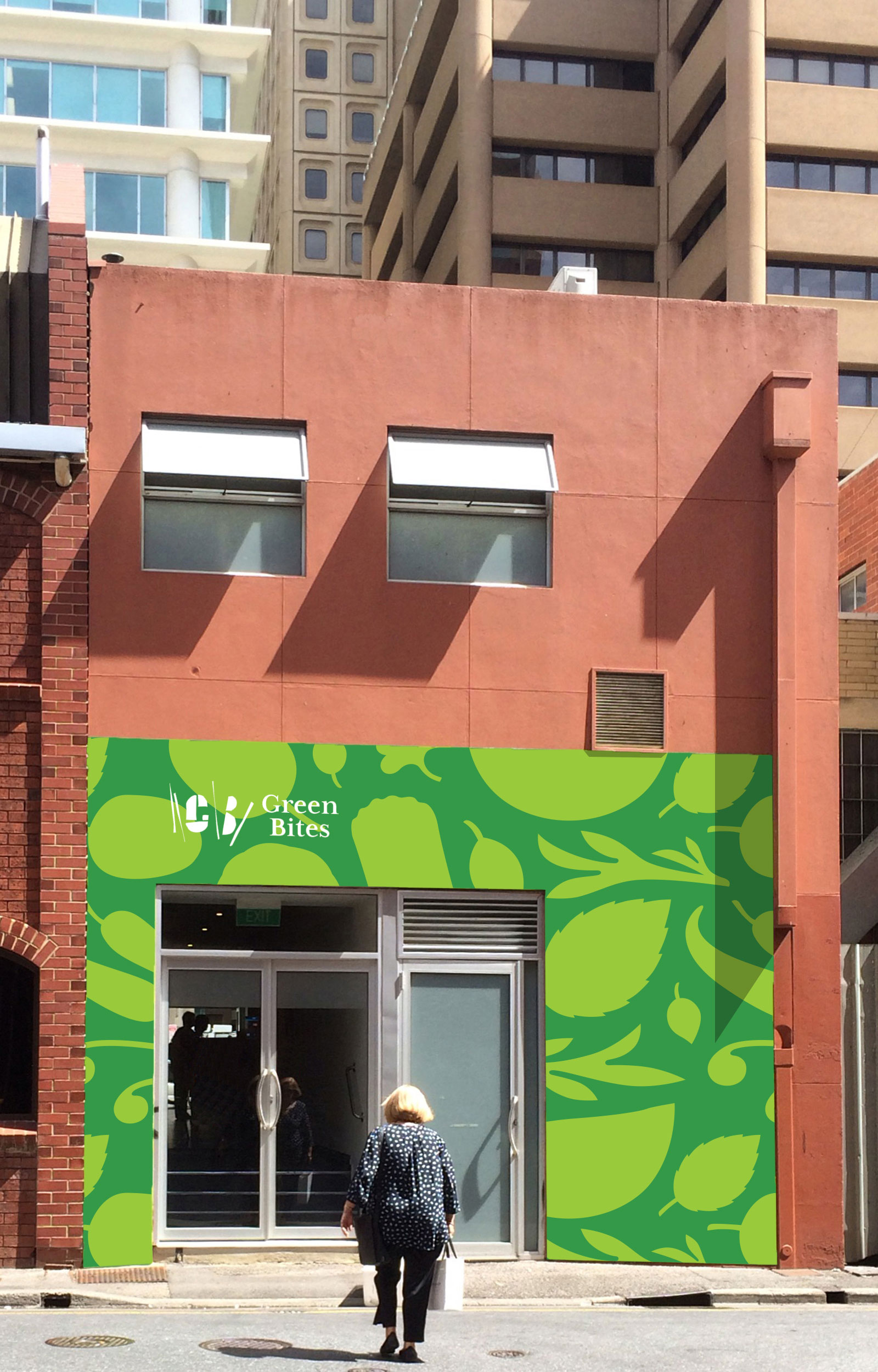
Photographer: Evolved Images